


D1.1 Patty Cakes Kitchen
A catering and custom dessert company, the Patty Cakes Kitchen brand identity was developed to demonstrate that all aspects of the kitchen–from a whimsical birthday party, to fine dining–are synonymous with the Patty Cakes Kitchen brand.
The complete corporate signature creates a modern and family-friendly aesthetic and applied to all facets of a comprehensive graphic guidelines manual and business plan.


D1.2 SASC Identity
The SASC is an organization providing the differently-abled community of Sudbury Ontario with access to local sports clubs and teams. The objective was to develop a dynamic logo and iconography to portray the organization.
Materials Include:
Logo: A dynamic fluid shape portraying the abstract form of an athlete and letter “S”, as well as various aspects from the sports and activities offered by the SASC. The typography and colour harmony for this identity conveys strength, professionalism, and elegance.
Icons & Brochure: The athletic icons incorporate the same shapes and lines used in the logo and were developed to promote the new SASC brand, and communicate the services they provide.


D1.3 WGA Identity
The World Goalball Association (Part of IBSA: International Blind Sports Association) aims to organize sports competitions and activities where blind and partially sighted people can compete in equal conditions with their peers. Goalball was invented in an effort to help in the rehabilitation of blinded war veterans and played at every Paralympics since 1976.
Utilizing an abstract approach with a typographic aesthetic, the dynamic corporate symbol was created to convey the face of Goalball–the athlete wearing the regulation goggles with the game ball in front. The typeface chosen for the corporate signature compliments the curvature of the design, accented by a strong blue and grey colour palette.

D1.4 RHPO Promotional/Awareness Materials
The Richmond Hill Philharmonic Orchestra is comprised of professional, amateur, and talented university and high school student musicians. The orchestra represents cultures from across the globe and its musicians practice daily professions from every area of the community. Designs created in this project were contributed to the Richmond Hill community in support of the RHPO and their various musical performances. The objective was to convey the ambience of the Orchestra’s concerts in each design.
Concert Posters & Flyers:
The letter-sized posters and pocket-size flyers were the primary marketing materials to promote the seasonal RHPO concerts. The design objective was to convey the musical ambience and theme of their concerts. Utilizing elegant typography and corporate colours creates brand continuity, incorporating the main visuals with mainly the negative space and association elements to evoke curiosity, enticing the viewer to attend the event.
Mystique Fundraising Gala Poster & Menu:
The objective was to raise awareness and funds for the RHPO’s percussion section, while communicating a mysterious masquerade theme.


D2.1 Audi Quattro Cup Event
The design concepts developed for the 2010 - 2012 Audi quattro Cup Canadian National Finals (golf tournament) utilize simple geometric graphics to convey a sense of movement and depth. In contrast to the “horizon” motif, the bold corporate colour scheme and photography further encompass the sophistication of the Audi brand.
Materials Include:
• Event Collateral Materials
• Itinerary & Reference Guide
• Event Signage & Wayfinding
• Itinerary & Reference Guide
• Event Signage & Wayfinding


D2.2 Canadian Tire Infographics (11” x 17”)
The objective was to design a series of six infographics displaying the data Mediacom gathered for each of Canadian Tire’s 2011 consumer profiles for their corporate locations.

D2.3 Volkswagen Event Signage (28” x 22”)
The objective was to develop versatile and clever pieces to portray the unique Volkswagen brand for their Hole-in-one contests, displayed at various promotional golfing events held by Volkswagen.
Each sign concept uses typographic and golf-related visuals to further incorporate the Volkswagen brand with their branded golf events.


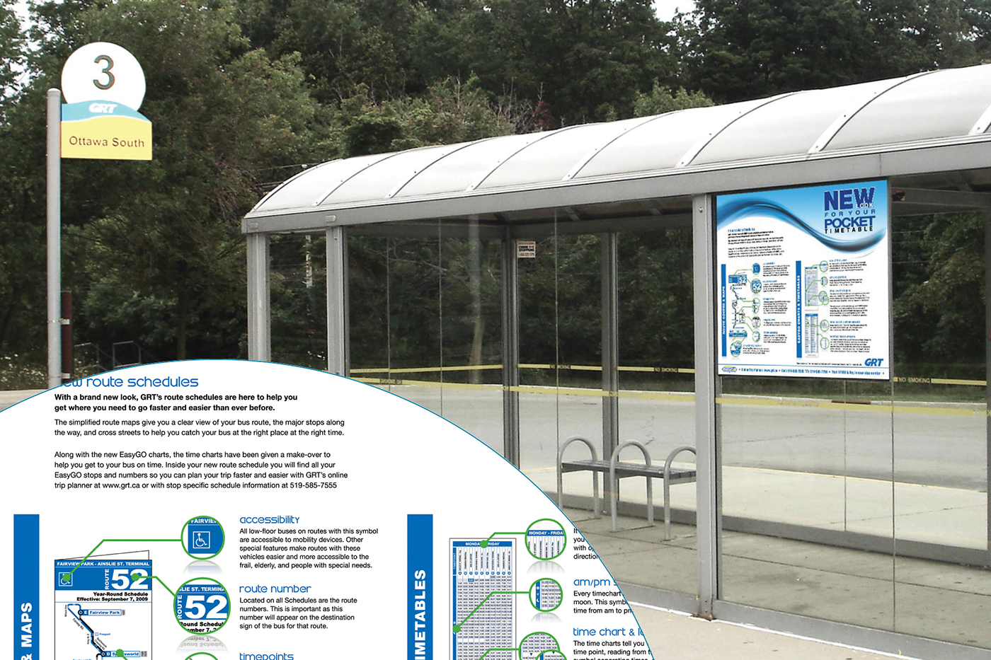
D3.1 Pocket Transit Timetable Redesign
The objective was to completely redesign the pocket time tables for the Cambridge area bus routes and promote them to the transit patrons.
The information structure and layout refinements led to a clean, legible design, resulting in a 50% reduction in production material costs.
Materials Include:
• Pocket Timetables
• Bus Shelter Signage & Brochure

D3.2 Corporate BBQ Event
The objective was to promote the annual GRT Employee Barbecue and Company improvement survey. The design concept incorporates a warm colour scheme with abstract visuals of plastic utensils.
Materials Include:
• Event Poster & Decorations
• Signage & Ballots

D3.3 Kids Day Event
The objective was to convey a whimsical and energetic concept appealing to the demographic and promoting the annual Kids Day event hosted by Grand River Transit.
Materials Include:
• Promotional Poster (11” x 17”)
• Colouring Contest Page (11” x 17”)
• Staff T-shirts

D3.4 U-Pass Brochure & Webpage
The University Pass (U-Pass) program is dedicated to providing discounted transit services to University students. The objective was to communicate the transit information to appeal to students which allowed for a more visually impactful design using an angular layout and typography, inspired by the Bauhaus design movement.


D4.1 People Making a Difference Book
A corporate piece, the People Making a Difference book highlights the Chartwell employees who demonstrate their corporate “R.E.S.P.E.C.T.” values. Using vibrant colours and asymmetrical balance of rectangles gave the corporate piece a modern and unique appeal.


D4.2 Corporate Vehicles
Chartwell’s recent rebranding provided the opportunity to give the corporate vehicles a fresh look to help visualize the brand. The vehicle graphics were applied to various makes and models to accommodate the existing transportation options at each residence across Canada. Vehicles include Lincoln Towncars, Dodge Caravan Minivans, Mercedes-Benz Sprinters, and Mid-size to large- size Ford Starcraft Buses.

D4.3 Senior Star DVD
Chartwell’s Senior Star has grown over the last seven years to become Canada’s largest musical competition dedicated to seniors. Over 3,000 performers have auditioned, sharing their incredible talent and shattering traditional misconceptions about slowing down in one’s later years. The event is televised and an annual DVD distributed.

D4.4 Rendezvous Magazine
Chartwell created a corporate newsletter starting as a two page, two-colour document that evolved into a magazine style communication, connecting their retirement homes across the country. Using corporate colours and typefaces, the Rendezvous magazine was a piece that helped put a face and voice to the Chartwell brand.


D4.5 Recognition Toolkit
A corporate initiative to recognize and appreciate employees, Chartwell created the recognition toolkit providing their residences with items to help show employee appreciation.
Materials Include:
• Recognition Box & Guide
• Recognition Card Holder


D4.6 Residence Brochure
A bilingual company, Chartwell often requires French and bilingual materials. Incorporating a multiple panel layout with high contrast colours and imagery, a double-sided, bilingual brochure was developed to highlight the unique aspects of a Quebec residence. The objective of the design is to compliment and contrast with the existing corporate materials.


D5.1 Primo Pasta Packaging
Simplicity is the primary objective for this conceptual design, using tints and shades of the one-colour application with subtle visuals. A modern, high-end appearance is achieved through typography and simplifying the graphics to convey each unique type of pasta.
Materials include:
• Package Flat: (14.375” x 12.5”)
• Package Mockups: (3” x 3” x 10”)


D5.2 Biodiversity Postage Campaign
Each year Canada Post has a commemorative exhibition to raise awareness for an international issue. 2010 was the International Year of Biodiversity, a world-wide cause for living creatures to coexist harmoniously while having to adapt to the changing environment. The name “Adapterra” is a combination of the words Adapt + Terra (meaning Earth), accompanied by visuals of a the word map and a chameleon; a creature known to visually adapt to its surroundings to survive.
Materials Include:
• Stamp (1” x 1.5625”) & Cancellation Postmark
• First Day Cover: (A8 Envelope) 5.25” x 8.25”
• Commemorative Issue Item: Folded: 5” x 7.5” / Unfolded: 8.5” x 7.5”
• Poster (11” x 17”) & Event Signage


D5.3 Family Food Guide
The objective of the design thesis is dedicated to informing consumers about the maintenance of a healthy lifestyle and meal plan.
The simplified symbols and colour application help clarify the recommended daily food intake, organized by gender and age, categorized into the five major food groups; fruits, vegetables, meats, grains, and dairy.
Materials Include:
Mobile App:
A free downloadable application on mobile devices to easily reference the dietary data.
In-Store Folding Cards:
Located on the existing store shelving or pricing signs of each corresponding food group.
• Folded (3.1875” x 2.75”)
• Unfolded (3.1875” x 5.5”)
• Unfolded (3.1875” x 5.5”)
Store Signage (sizes vary):
Constructed of low-gloss heavy card stock, fastened by glue and small rivets, and attached to store pillars with wire, the signage appears as though the sign is floating around the pillars. Providing a visual cue to the consumers for the hand-held guides.


