Lost In Lunar - Typography Project

My original concept was based on the phases of the moon, therefore throughout my characters I used different 'phases' embedded in between the letters themselves to create the moon.

Here shows my development of the letters, for example the letter 'A' I used different line weights to differenciate between the different parts of the letter.
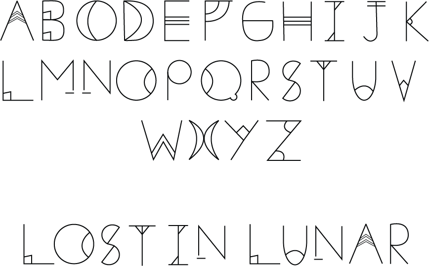
This is my final typeface, I am extremely happy with the outcome. I even looked at ligaments between the 'm' and the 'n' as I thought it would be quite fancy to introduce within a typeface.

This concludes with the advertisement poster I created, I kept the colour pallete extremely simple as I wanted the focus to be on the moon and the typeface itself. I'm extremely happy with how this project turned out.
