
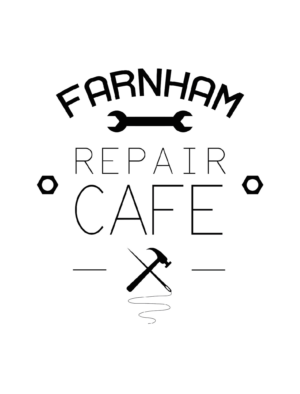
My initial idea involved elements that reflected the groups goal of repairing broken items, instead of throwing them away and creating waste. I used a spanner, a hammer, a needle and thread, and some hex nuts. I was inspired by the "Make Do and Mend" movement and created a sign-like style with a vintage feel.
It quickly became apparent that The Farnham Repair Cafe needed a a simpler and more streamlined image that had a friendlier feel and incorporated their community and earth-friendly values.
I was able to use elements from my original design to create a more focused logo and chose a friendly font to communicate the idea of community and social values.
I was able to use elements from my original design to create a more focused logo and chose a friendly font to communicate the idea of community and social values.

I created some smaller elements to be used in places where a tall, stacked logo doesn't work, such as profile pictures or app icons.


