Spindlebox Logo Development
Potential clients can be unaware of the time and thought that goes into logo development and consequently may find the associated cost unreasonable. While several factors will play into any price I felt it may be helpful to document the process as I developed the logo for my own business.
This quote from Casey Hyrnkow @ Herrainco: If you believe your business is truly unique — that you have some competitive advantage — then your logo should reflect that. It should reflect your pride and it shouldn’t just be a picture of what you do, but a representation of your passion in doing it. When you hire a professional designer to work with, you generally get someone with a whole lot of training who asks a lot of questions rather than doing whatever you ask them to do. That’s because they are good at what they do and they respect that you are good at what you do.
Spindlebox was a moniker I had established some years ago but hadn't given much thought to the connection between the name and myself until I began to develop a proper logo. I wanted a graphic that represented my individuality and creativity but wasn't sure how this name could represent those things. After an initial research phase I discovered that the term "spindle" has biological meaning: Spindle apparatus – a cellular structure organizing and separating the chromosomes during cell division. From this definition my thoughts turned to the concept of DNA and the double helix structure – what could be more individual, unique and creative? This discovery was the creative spark I needed and demonstrates just a part of the creative process that occurs for every logo development I undertake.


Brainstorming and sketching to generate ideas and get them onto paper quickly. I've thought about using my Wacom drawing tablet for this phase but the nice thing about pen & paper is that it can be used anywhere and requires little power to operate.

Typeface selection; logomark development. Selecting the right typeface is absolutely important and often the first step I take after the initial sketching phase. Transferring the sketches from paper onto computer and committing to simplicity can help determine which ideas have the most merit.

Further logomark development; beginning of wordmark development. The double helix-like icon emerges as the top contender and I begin to refine the idea by playing with various aspects of the graphic such as line width and negative space.

Custom typeface edits on the wordmark; pairing with the logomark. Several attempts were made to bring my own modifications to the typeface I had chosen for the wordmark until finally arriving at the simplest but least visually distracting version. Finding the right balance when pairing the two logo elements together also posed some difficulty that took time and many small adjustments to work out.
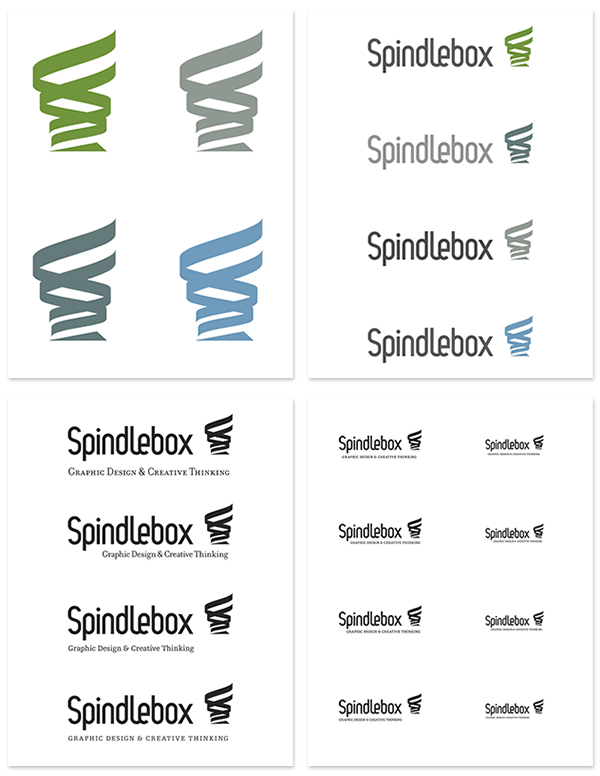
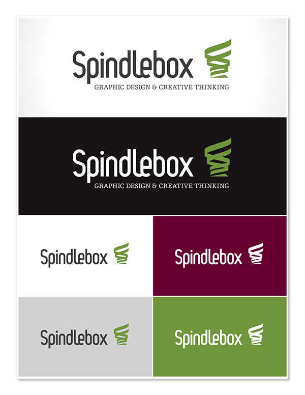
Colour exploration; full logo with tagline development. After viewing and printing a great deal of green and blue Pantone colours I chose what I felt best represented my personality – green also happens to be my favourite colour. With regards to the tagline, sometimes a more literal reminder of my skills and services may be necessary so a tagline was developed to appear in such instances.

Refinement of full logo; finalizing colours and typeface selection for branding material.

Business cards. More frames could be dedicated to the process of developing these but for now I will show only the end result. One of my goals was to reduce some visual clutter and combine the email address and website into a single line without losing the key information contained therein.

The finished product. Matte laminate coating on both sides with a spot UV finish over the logo on the back.