


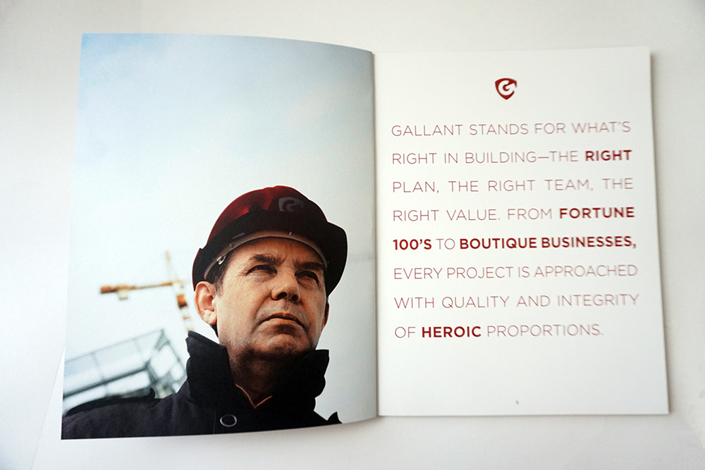

Because the new Gallant brand didn't yet exist, existing stock images had to be retouched. In this case, jackets and helmets were recolored and the Gallant typography was embroidered on the pockets

Semi-translucent pages punctuate the brochure, allowing for layered effects.


A small but tricky photoshop addition required placing the logo beneath the mud and grime of this stock construction worker image.

The use of a spot color in the Gallant brand red allowed for gorgeous large floods of color on the thick, textured paper.

