

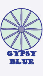
This Logo is for the company Gypsy Blue which produces all natural and organic bath and body products. I decided to use a blue monochromatic theme to represent the company's name. I chose the font because of it's Bohemian flair that I thought embodied the brand. I wanted the graphic image to resemble the Gypsy symbol, but not copy it. The wheel is meant to represent a wagon wheel from a caravan gypsies use to travel. The wheel also reperesents balance. I also like that the logo looks similar to a daisy, which brings an organic and natural feel to it. I wanted the logo to be clean and simple. I used contrasting blue's to create depth in this logo. repetition can be found in the monochromatic theme. I chose a middle alignment for the text in order to create balance and make it easily readable. I chose to put the text close to but not on top of the wheel because I didn't want it to over power or pull attention away from the wheel.
This is the front of the business card I designed for Gypsy Blue. I chose a monochromatic theme of blues, and kept it simple. I wanted the name of the company to stand out, So I chose a light background to create contrast and let the logo speak for itself. I stuck with a middle alignment for the text to make it easily readable. I decided to place the logo in the center of the card vertically because the logo is vertical, and you don't see many vertical business cards. I placed the logo close to the edge so that it would appear large and be the main focus.

This is the back of my business card. I chose the font Wankhands because it is clean and simple and organic looking. I added a QR code that can link to the company's website where consumers can purchase products. I decided to use a transparent watermark of part of the logo in the right hand corner to add depth and interest. I chose left alignment for the text to make it easily readible. I used a monochromatic theme for repetition and to keep it clean looking and to help it flow with the rest of my designs. I chose to add the blue bar at the bottom to add contrast as well as to break up the space.

This is the back of the envelope I designed for Gypsy Blue. I used Wankhands font to add repetition to my design package. I placed the company's logo in the top center so that it would draw attention to the eye. I placed a blue bar at the bottom to match the blue bars on the business card and letterhead. I continued the monochromatic blue theme for repetition and to contrast with the white envelope. I left aligned the bar to leave space for the mailing code that goes in the bottom right corner.

This is the back of the envelope I designed for Gypsy Blue. I used a monochromatic theme to keep repetition with the rest of my desings, and to add contrast against the white envelope. I placed part of my logo in the bottom right hand corner as a transparent watermark to match the letterhead and business card I created. I placed the logo in the top center of the envelope to match the back of the enevelope.

This is the letterhead I created for Gypsy Blue. I used part of the logo as a transparent watermark in the bottom right hand corner to match the business card and envelope. I wanted to show depth and interest. I placed a blue bar accross the bottom to match the business card and envelope as well. I stuck with a monochromatic theme to keep repetition within my design package. I also continued the use of Wankhands font to add repetition and organic feel to the letterhead. I left aligned the text to make it easy to read and to match the business card. I placed the logo in the top left corner to add emphasis and to guide the audience's eyes to the text.

This is a sample of the leterhead with text aded to it to show what it would look like in use. The text sits nicely on top of the watermark symbol and is still easy to read.

This is a newspaper ad I made for Gypsy Blue describing an online spring sale. I chose to use lighter grey tones for the logo so that it would contrast with the text. I chose to center align the text to make it easy to read and to match the logo. I placed an image of the company's lip balms on the left to guide the audience's eyes to the text. I used Wankhands font because I use it in all of my design package and I wanted to keep with that repetition. I placed the logo in the botom right corner so it would be the last thing the audience sees.

This is the magazine ad I created for Gypsy Blue. I used center aligned text to match the newspaper ad and the logo. I placed an image of the company's lip balms at the bottom to add interest and contrast. I used a blue monochromatic color scheme to add contrast to the white background and repetition since I stuck with a monochromatic theme throughout my design package. I used Wankhands font for repetition and the organic feel it lends the ad. I placed a transparent logo in the background to add depth and to draw the audience's eyes to the text.


