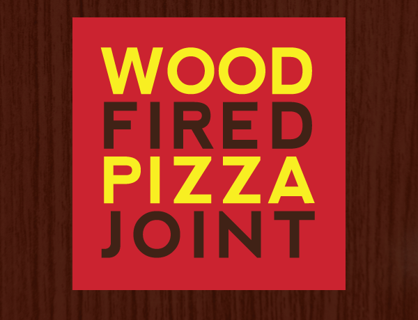
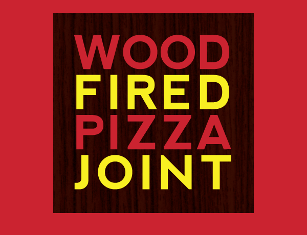
Pie - Wood Fired Pizza Joint
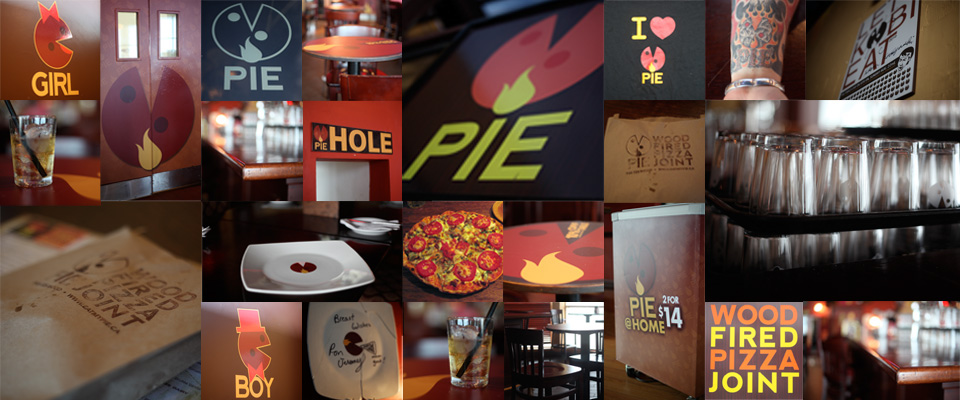
Brand Identity & Collateral
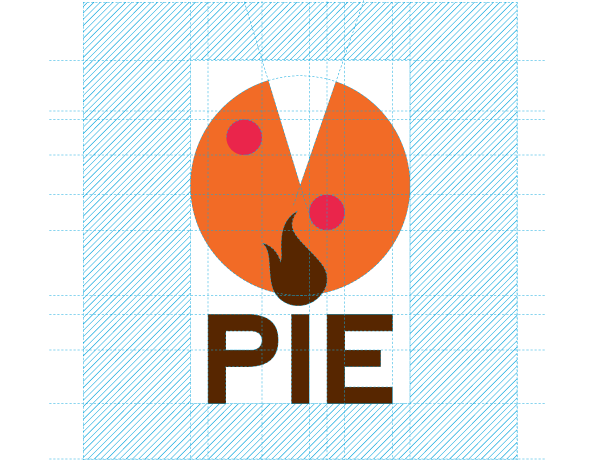
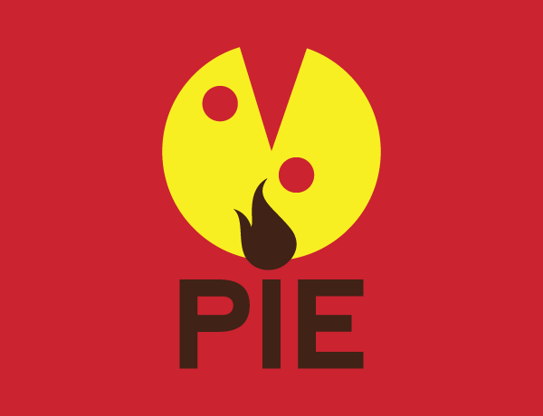
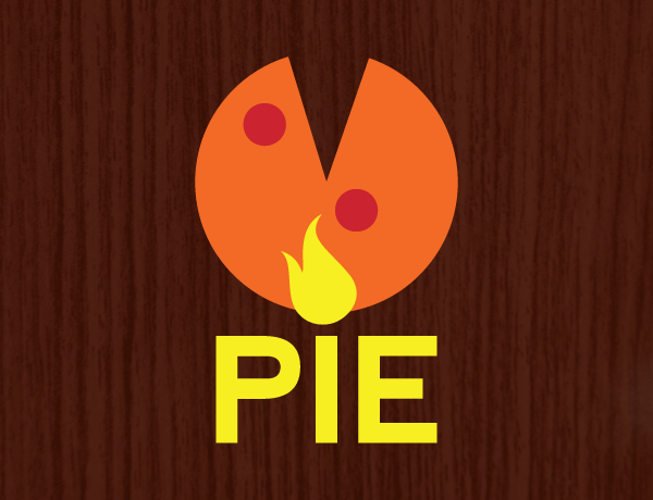
When we were approached to design the restaurant identity for PIE, we took one look at all the other pizza places and went completely in the other direction with our creative - no gradients, bright red and blues, just wanted it so simple a baby could recognize it. Pie was born. In the first year, the colours were a more subdued set of browns and retro colours, but the client wanted brighter so we changed the colour scheme in the second year. Probably the first time one of our logos was tattooed on someone. Lets hope its not the last. Cheers!

Ron Jeremy Sporting a Pie T-Shirt