
SAVE ENERGY - BRANDING
Para o seguinte estudo de branding da marca Save Energy e suas embalagens, considerou-se muito importante a “essência” da marca, podendo mudar seu visual, sem perder essa identidade que ela já possui, para que não haja dúvidas com consumidor final.
Para isso, realizou-se pesquisas a respeito e a seguir será apresentado os itens essenciais da marca e os que podem ser modificados.
Os conceitos que foram aplicados a estes estudos foram a simplicidade (objetividade de compreender o que é a marca e o que ela faz e vende), a conectividade (a ligação da marca antiga com a nova, conectando com novas possibilidades, com o novo mundo), atratividade (na gôndola ou no PDV, as embalagens devem ter um destaque visual perante as concorrentes) e a evolutividade (compreensão da evolução da marca com o consumidor final, melhorando ainda mais a relação empresa-consumidor).
For the following study of the brand Save Energy and their packaging, it was considered very important to the"essence" of the brand, and can change your look without losing that identity that she already owns, so there are no doubtswith final consumer.
For this research was about and the following will be presented the essential items of the brand and that can be modified.
The concepts that have been applied to these studies were simple (objectivity to understand what is the brand and what shemakes and sells), connectivity (connecting the old with the new brand, connecting with new possibilities, with the new world), attractiveness (in the gondola or PDV, packagings shall have a visual highlight in the face of competitors) and theevolutionarity (understanding of the evolution of the brand with the final consumer, further enhancing the company-consumer relationship).

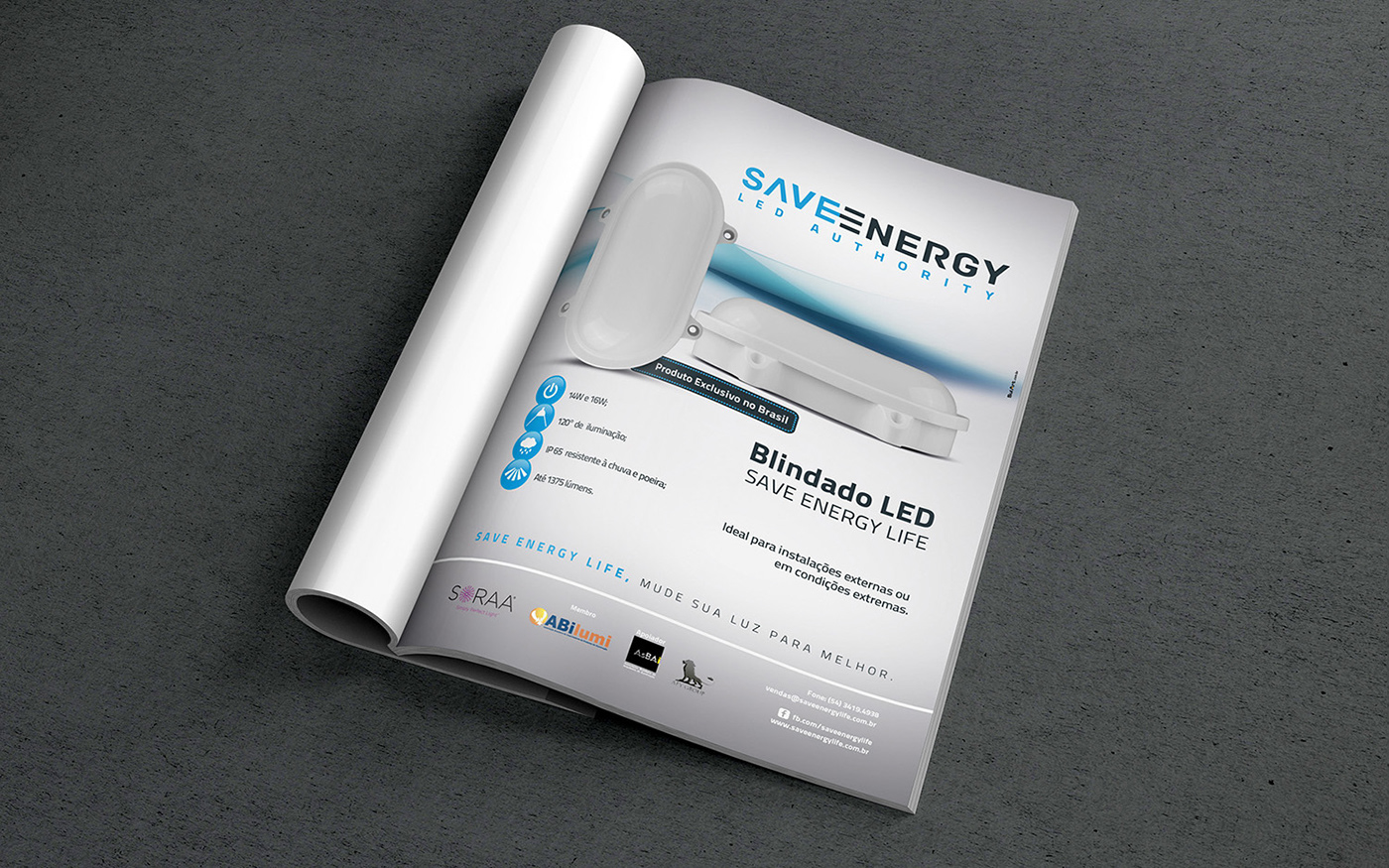
A fonte TitilliumText25L é a fonte atual da marca, porém ela pode ser alterada, desde que a divisão de cores entre as palavras SAVE e ENERGY e o estilo de fonte sejam mantidas, pois está ali a essência do logotipo, com sua divisão tonal e uma fonte “tecnológica”.
Para o redesenho, manteve-se a divisão colorimétrica, porém alterou-se a fonte, principalmente buscando alternativas para a repetição da letra e entre as duas palavras, para que não haja essa repetição visualmente desnecessária.
Nas cores da atual marca, não devemos mudá-la, pois o consumidor já está habituado e conheçe a marca pelas suas cores, sua divisão tonal no logotipo e seu símbolo em cinza.
Para que não haja dúvidas no entendimento da marca, os estudos foram baseados a partir do cinza e do azul, variando levemente seus valores colorimétricos, afim de manter a identidade e agregando mais contraste e visibilidade para a marca.
The TitilliumText25L source is the current source of the brand, but it can be changed, since the Division of colors betweenthe words SAVE and ENERGY and the font style is kept, because there's the essence of the logo, with its tonal Division and a source "technology".
For the redesign, remained the colorimetric Division, but has changed the source, mainly seeking alternatives to the repetition of the letter and between the two words, so there are no visually that repetition unnecessary.
In the colors of the current brand, we shouldn't change it, because the consumer is already used and know the brand for itscolors, its tonal Division logo and its symbol in grey.
So there are no doubts in the understanding of the brand, the studies were based from the gray and blue, varying slightly itscolorimetric values, in order to maintain the identity and adding more contrast and visibility to the brand.


Client: Save Energy Life
Project: Brand Design
Images: Bagual Studio
Project: Brand Design
Images: Bagual Studio


