I was asked to design the logo for Wolt, a finnish app startup. The brief was that they wanted a script logo with a modular, industrial feel that should also work in an app icon.
Art Direction Mika Matikainen
Regardless of the specifics, the brief still had a lot of conflicting parameters in it. Because of this I started sketching in very different directions, also ones that I thought wouldn't really be suitable.

P R O C E S S
First very quickly made sketches and scribbles.
From my first sketches I chose what I thought was a versatile set and made slightly more precise drawings to evaluate them side by side

I also made quick vectorized sketches and played around with different possibilities to modify the letter and word forms.


Printouts of the vector versions with hand drawn modifications.
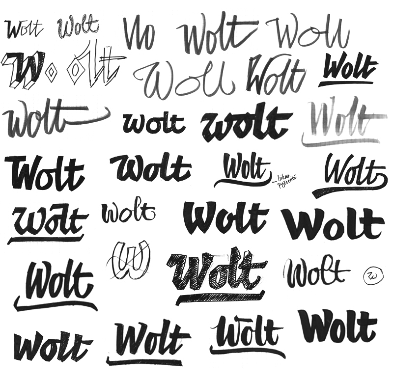
Below are the three versions I chose to show in the first presentation.
The general direction was thought to be right but there was too much cartoon character and strange letter forms.
Number three was chosen as the best on of the bunch and I was asked to continue with it but lose the cartoon vibe and make the letterforms more simple.

Different versions that were developed from sketch number three.

Sketch, think, coffee, sketch, think, coffee, sketch
After the first round of sketches it was proposed that I approach the logo a bit as a signature. I decided to make a completely new, contrasting approach using this angle.

Spread from my sketchbook with brush calligraphy tryouts

I found a direction that I thought suitable from the calligraphy sketches and made vector versions of it.
In the second presentation I showed two main lines of development with two sketches of both. Number one is developed from the best one of the first presentation, number two is the new direction.
This was already getting very close but neither was quite there yet. I was asked to combine the best elements of both directions; the clear letter forms of the first one and the flowing, more organic nature of the second


Final, approved hand drawn sketch. I trusted the guys at Wolt to understand at this point that the clear mistakes of this sketch wouldn't stay in the final version

Tools of the trade
F I N A L
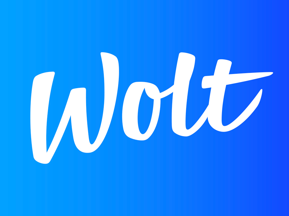
Final version of the logo

Laser cut 3d-version at the Wolt office in Helsinki
Thanks for looking!
You can check out Wolt at
www.woltapp.com
www.woltapp.com
You can follow me at
Portfolio website at


