The Overlooked Purpose of Navigation
Web site owners often try to find one of the key things they should do if they want to make sure their site or app is as easy to use?
Most people answer it as simple as your site or app should be. It’s not “Nothing important should ever be more than two clicks away “or “Speak the user’s language “or “Be consistent “. Some would say it should be “Flat “or “Responsive “Less content more graphics or vice versa.
The answer is “No “
Effortless “Don’t make the user work hard “
It’s the overriding principle- (Steve Kruj’s first law of usability “Don’t make me think!”) the ultimate make or break principle when deciding whether a design works or it doesn’t.

For example, when a user looks at a Web page it should be self-evident. Obvious. Self-descriptive. Self-explanatory.
They (users) should be able to “get it “– what it is and how to use it- without expending any effort thinking about it. As easy to use that your next door neighbor, who has no interest in the subject of your site and who barely knows how to use the Back button, could look at your Home page and say, “ Oh, it’s a____.” Or she’ll say, “Oh, it’s a ____.
Road signs and Breadcrumbs:
You know this from your own experience as a web user. If you get to a site and can’t find what you’re looking for or figure out how the site is organized, you’re not likely to stay long – or come back. So how do you create the proverbial “clear “simple and consistent navigation?

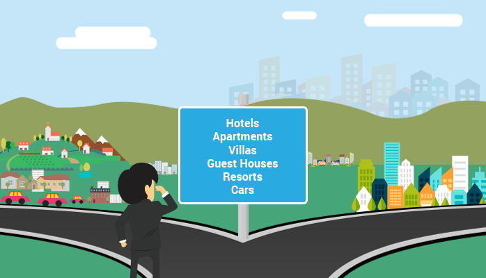
Scene from a city
Picture this: It’s Saturday afternoon and you’re headed for the city to book a Guest House room to accommodate some of your family guests who are visiting you.
As you drive or walkthrough the “Y “intersection or road junction and find a signpost. As soon as you are before it, you stop and start looking at the accommodation names – or types. You expect that the signpost will head you to find which way go to the Guest Houses?. You are looking at sign post and reading names like Hotels, Apartments, Villas, Resorts, and Guest Houses, high up on the board.
“Hummm,” you think, “Guest Houses “or Hotels? Or Resorts and villas”?. It could be either one, but you’ve got to start somewhere you want to head in the direction of Guest Houses.
How frustrating it is when one of the conventions is broken ( When you expect to find an arrow pointing the direction is not there ) as the signpost doesn’t look like a signpost.
Instead of arrows pointing towards Guest Houses direction, what you see is a vertical signpost, no sense of direction, there’s no left and right, no up and down arrow.
It will turn out you on wrong side, you try to look it by yourself, you try to come back at intersection and head to another side.
Not that even if you start looking on you are own, if things don’t pan out there’s a good chance that eventually you’ll end up asking someone for direction anyway.
Web navigation conventions
Physical space like cities and buildings (and even information spaces like books and magazines) has their own navigation system, with conventions that have evolved over time like street signs, page numbers, and chapter titles. The conventions specify (loosely) the appearance and location of the navigation elements so we know what to look for and where to look when we need them.
Putting them in a standard place lets us locate them quickly, with a minimum of effort; standardizing their appearance makes it easy to distinguish them from everything else.

We expect to find street or road signs at street corners or road intersections, we expect to find them by looking up (not down), and we expect them to look like a street signs (horizontal, not vertical).
Web navigation 101
In many ways, you go through the same process when you enter a website.

You decide whether to ask first or browse first.
The difference is that on a Website there’s no one standing around who can tell you where things are. The web equivalent of asking directions is searching- typing a description of what you‘re looking for in a search box and getting back a list of links to places where it might be.
Search Dominant Users:
Some people (Jakob Nielsen calls them “search-dominant users) will almost always look for a search box as soon as they enter a site. (These may be the same people who look for the nearest clerk as soon as they enter a store.)

Link Dominant Users:
Other people (Nielsen’s “link-dominant users) will almost always browse first, searching only when they ve run out of likely links to click or when they have gotten sufficiently frustrated by the site.

For everyone else, the decision whether to start by browsing or searching depends on their current frame of mind, how much of a hurry there, and whether the site appears to have decent browse able navigation.

If you choose to browse, you make your way through a hierarchy, using signs to guide you.
Typically, you‘ll look around on the Home page for a list of the site’s main sections (Like the intersection road signpost for accommodation department signs) and click on the one that seems right.

After another click or two you’ll end up with a list of the kind of things you’re looking for.
Eventually, if you can’t find what you’re looking for, you’ll leave.
This is as true on a Web site as it is at Sears. You’ll leave when you’re convinced they haven’t got it or when you’re just too frustrated keep looking.


