Project Description: The book serves as a promotion encouraging artists and designers to use the Dur-O-Tone line in the French Paper Brand. It is a utilitarian style paper with unique textural qualities sought after for printing single-color and dual-color prints, and this is something I tried to reflect with the quality of the images throughout. Themes of history and timelessness in the type and imagery help drive home the importance of the paper’s relative age and timelessness.
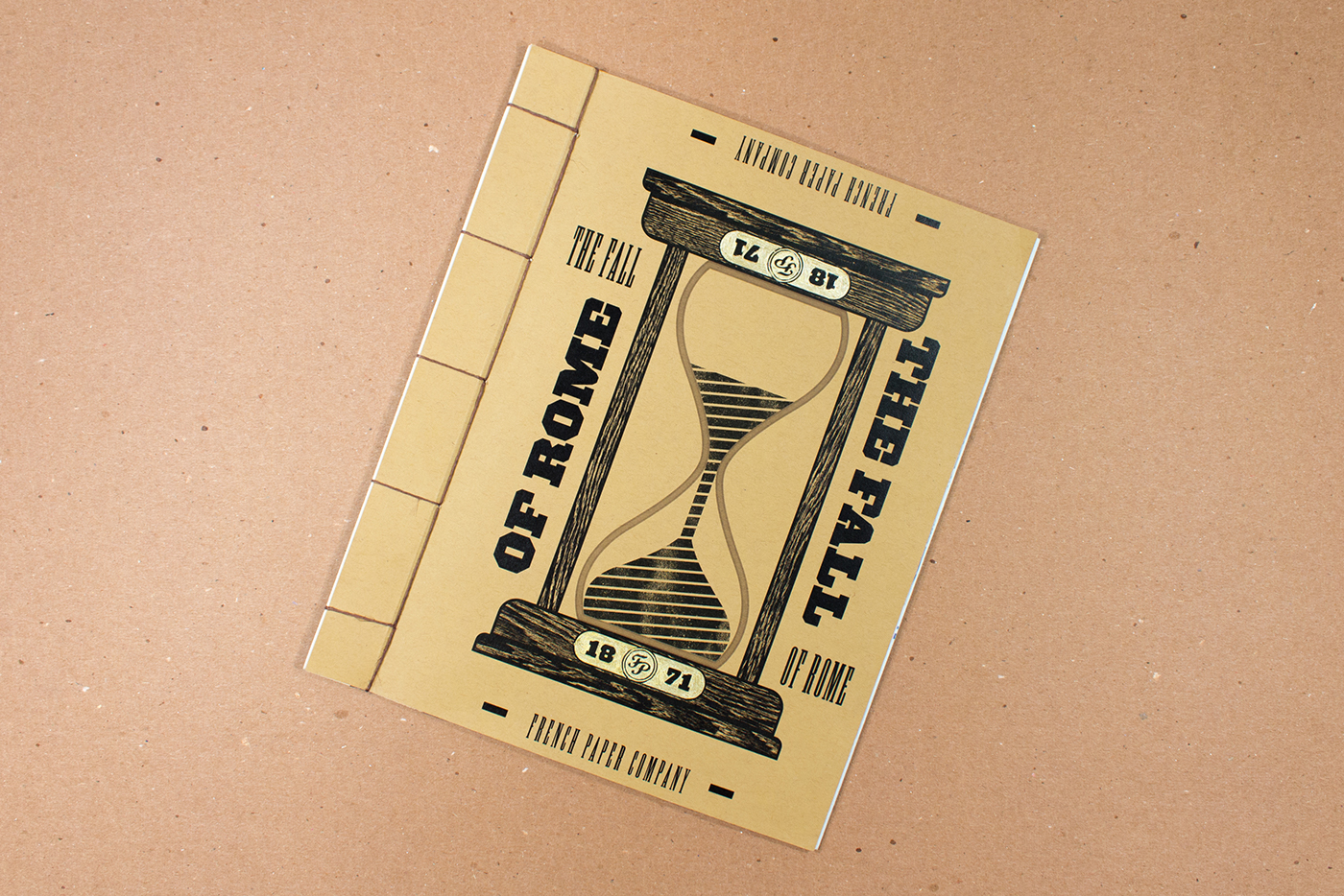
Design Description: It is an exploration of typographic form, conceptual development, and printing and binding techniques. Incorporated into the sample book are different production techniques. A die-cut is incorporated into the 'corruption' spread, a spot UV varnish and foldout into the conflict spread. The hourglass on the cover is a device for communicating the timelessness of the paper’s quality and strength.
Experience Description: The hourglass on the cover is a device for communicating the timelessness of the paper’s quality and strength. It also prompts the user to turn the book to discover the same message regardless of orientation. Throughout the book, the spreads have a variety of typographic orientation to make the spreads readable from all angles to an extent.


