
This was the theater's logo at the time. The quality of the logo was not the issue. The desire for change was part of an examination of the overall brand.

This was what I came up with based on the client's initial direction. He wanted a skewed box to suggest the theater group's unconventional approach to theater. I think it was handsome enough, but I wanted to go further...

I thought that perhaps some of the play-going audience would not be familiar witih the term "Bard" as it applies to William Shakespeare. I thought this was a possibility for the younger audience that the client wanted to attract. And so I added the image of Shakespeare.
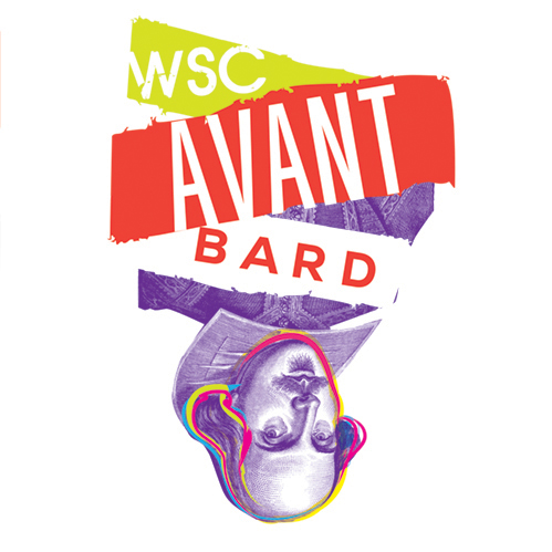
When I took a step back, I thought the other logos were not innovative enough. I wanted the logo so visually say avant garde. And so, I literally flipped the logo so that it was upside down.

With a new approach that focused on saying avant garde as minimally as possible, I ended up here. I was pretty excited. And the client was ecstatic. They were not necessarily concerned with showing Billy Shakespeare's image btw.
While the client liked all of the options, this one really hit the mark for them.

Part of finalizing the logo was making sure that it worked in every application. I was VERY pleased that the red and purple did indeed work light and dark backgrounds. I liked this palette from the very beginning. I find the red and purple combination to be modern with a little extra edge. And in the end, "edge" is what we were trying to achieve through this rebranding.
WSC Avant Bard was having identity issues...
Back when they were known as the Washington Shakespeare Company, WSC Avant Bard competed for name recognition with other Washington DC theaters like The Shakespeare Theatre Company and the Folger Shakespeare Theater. (See, you’re already confused!) To top it off, their home is in Arlington Virginia, not Washington, DC. (Good lord. Stop the madness.)
Changing their name to WSC Avant Bard was the first step. Re-branding was next. They wanted their new image to better reflect their progressive brand of theater. And so, the company’s artistic director and marketing director contracted with my company, Drama Queen Graphics to design their new logo.
Part of the theater company’s mission states: “Provocative theatre can leave us a little askew. Make us feel off kilter. Tip us out of our comfort zone and make us think.”
And that’s what they asked me to capture.
We presented four logos. My personal goal was to capture the essence of this progressive company as simply as possible. And so, while I like all of our logos, I’m particularly proud of what the client ultimately chose. Less IS often more, but it’s way harder to pull off!
We were competing with another designer, so we feel honored that our logo was chosen and thrilled about the company’s final choice. Huzzah!


