Emotions attract. Emotions inspire. Emotions sell. And what is the vessel for emotions? Face. We decided that stationery must carry an emotional charge, it must move and excite. So we created Muzzles. The package works together with its contents to create a funny face that communicates with the customer in the shop and continues to interact with anyone who buys it. It creates a strong emotional bond that you would not want to break. Kids will love it, parents will love it. It’s lots of fun.


Challenge:
To develop a name, a logo and a package for a brandnew trade mark of stationary goods for middle and middle-up customers. The brand is oriented on children and their parents. The specific challenge was to create bright, emotional, memorable and able to modify the commercial space package design for inspire to purchase brand products.
Idea:
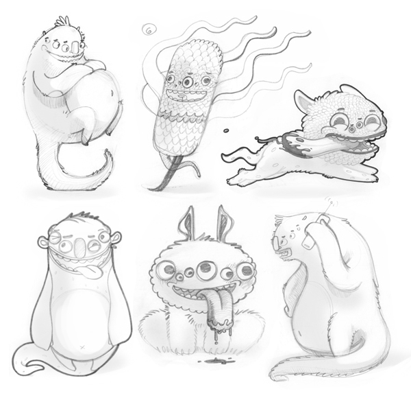
What attracts young and middle age children more than anything else? Characters, heroes — because they can explored and their features discovered, they can be part of different games and stories. That is why the foundation of the brand was based on the idea to create a character for each type of stationery products, in strict accordance to its functional nature.
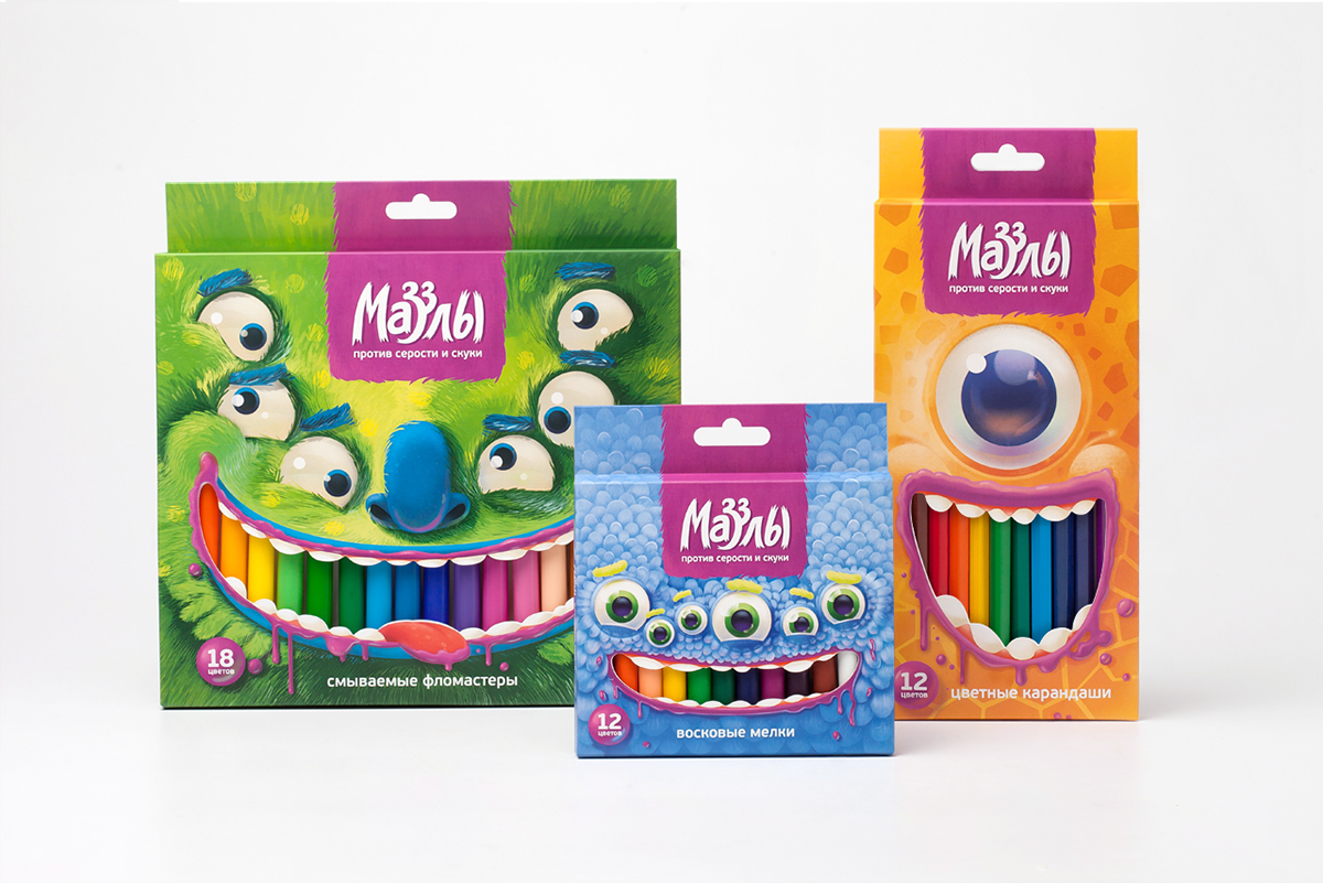
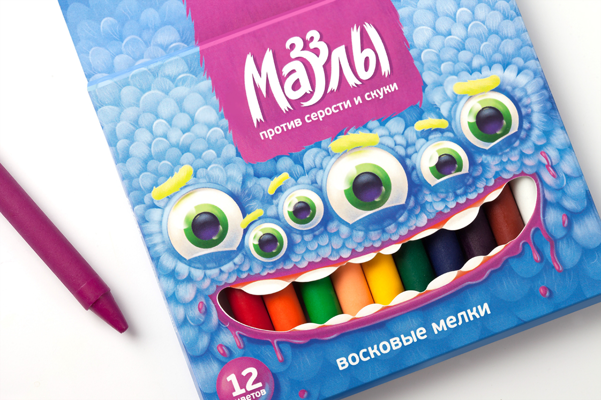
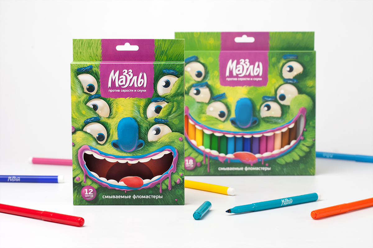
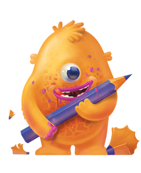
For example, Arnie Sharpener — behind his harmless smile three rows of sharp teeth are hiding, so he can wear away anything that gets in his hands. Its easy to find him by the trail of sawdust, because he lives on the package of colored pencils. Or Grimy Harry, who lives on packaging with washable markers — despite its fearsome appearance he loves to hug. He will never miss the opportunity to squeeze you into his mighty paws and leave a few pounds of blue-green wool on you. And all of them together are Muzzles, oddballs from the wonderful world of colors. Living on a shelf or on a table, sometimes they can be found in the most unexpected places, because Muzzles love to play hide and seek.
For example, Arnie Sharpener — behind his harmless smile three rows of sharp teeth are hiding, so he can wear away anything that gets in his hands. Its easy to find him by the trail of sawdust, because he lives on the package of colored pencils. Or Grimy Harry, who lives on packaging with washable markers — despite its fearsome appearance he loves to hug. He will never miss the opportunity to squeeze you into his mighty paws and leave a few pounds of blue-green wool on you. And all of them together are Muzzles, oddballs from the wonderful world of colors. Living on a shelf or on a table, sometimes they can be found in the most unexpected places, because Muzzles love to play hide and seek.
Solution:
The name comes from the English word «muzzle», which is consonant for Russian buyer perception to verb «smear» (draw) — so, the name emphasizes its belonging to the stationary goods. Brand slogan — «Against the dullness and boredom!» shows that «Muzzles» can «color» not only the picture, but also the lives of their young consumers.
Brand logo is a font solution performed in a deliberately casual manner, as if someone had «smeared» paint. Packaging design is built on the use of «face» of a character as the most important carrier of emotions and is in the form of illustration.
Brand logo is a font solution performed in a deliberately casual manner, as if someone had «smeared» paint. Packaging design is built on the use of «face» of a character as the most important carrier of emotions and is in the form of illustration.
Results:
The new trademark «Muzzles» is designed to organize shelf space in retail outlets in a new way, to attract attention and interact with customers. The package works together with its contents to create a funny face that communicates with the customer in the shop and continues to interact with anyone who buys it. It creates a strong emotional bond that you would not want to break. Kids will love it, parents will love it. It’s lots of fun.
Client:
«Smart People» OJSC
Team:
Creative director: Artem Shutov
Art-director, designer: Daria Medvedeva
Illustrator: Sergey Ermakov
Copywriters: Olga Obvintseva, Daria Khlyapova, Daria Medvedeva


