


ABOUT
A Zoo and Botanical Garden located at Byculla, 'Mumbai Zoo' is the only wildlife & animal park in Mumbai. It was laid out in 1861 and is one of the oldest zoos in India. Managed by the Municipal Corporation of Greater Mumbai, it spans over 52 acres and is a green lung in the heart of the city.
Mumbai Zoo is unique to other zoos in the country because of its British Heritage. A number of structures like the Clock Tower, Main Gate, and the Bhau Daji Lad Museum in the grounds are built in a Greco-Roman style. The zoo is rich in tree cover and has trees canopying over every square inch of space!
Mumbai Zoo is unique to other zoos in the country because of its British Heritage. A number of structures like the Clock Tower, Main Gate, and the Bhau Daji Lad Museum in the grounds are built in a Greco-Roman style. The zoo is rich in tree cover and has trees canopying over every square inch of space!
THE BRAND
As of today, the Zoo has no brand language. It does not communicate with its consumers at any touchpoint, and uses its old name as its only selling point. In this Wayfinding & Signage project, I am also going to give this awesome entity a new brand identity. Mumbai Zoo must be an Energetic & Fun brand, that caters to a Diverse audience- ranging from children to adults, national and international. My aim for this project was to develop a look fit for this great metropolitan city, while also referencing the zoo's historical value.
This project was completed in my 3rd year of college. A big hug to Angad Bharaj who created the 3D models. All photographs were taken in Mumbai Zoo.
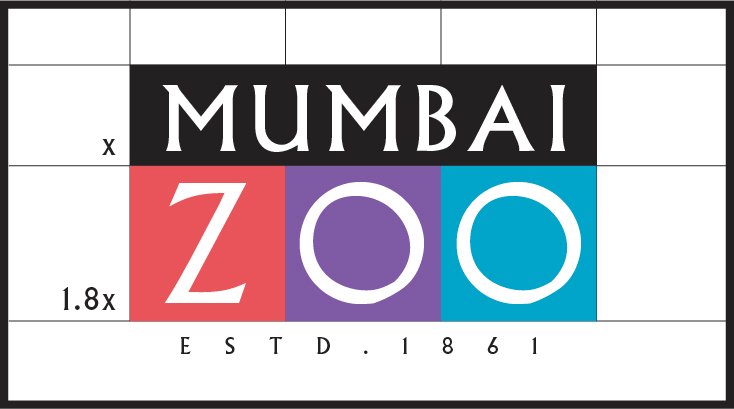
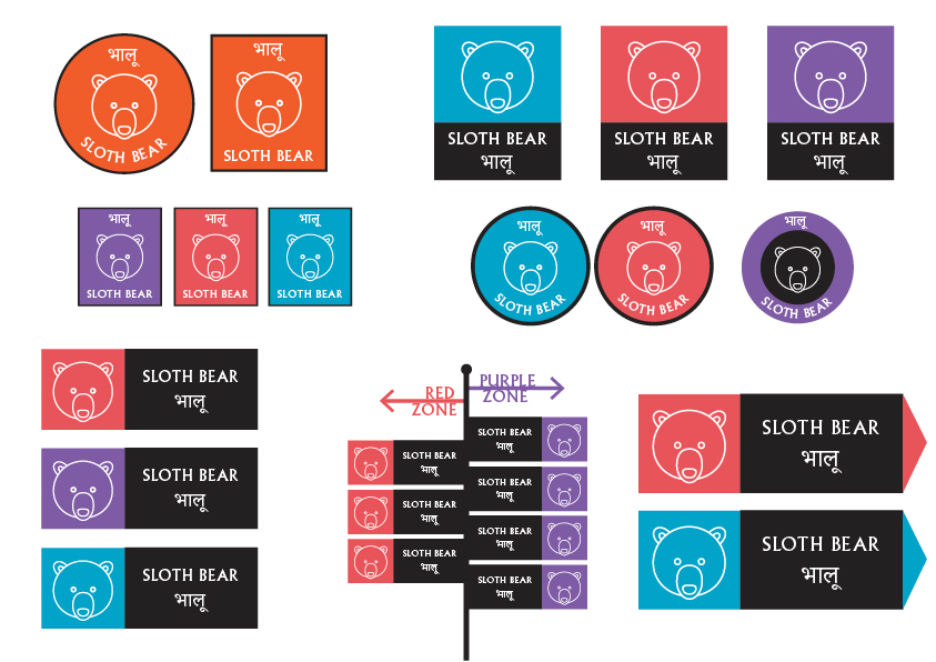
LOGO/ NAVIGATION
Walking around in the Zoo grounds can be quite a task due to the tall trees that obstruct vision.
To ease navigation within the zoo, I divided the space into 3 Zones by convenience. The logo was created after a series of form explorations, using the three zone colours along with 'Albertus MT' characters.
To ease navigation within the zoo, I divided the space into 3 Zones by convenience. The logo was created after a series of form explorations, using the three zone colours along with 'Albertus MT' characters.
COLOUR PALETTE
I studied all combinations of colors that contrast each other, while standing out against the green environment in the zoo. Coral Red, Maya Blue & Iris Purple worked perfectly- also providing the energy required.
I studied all combinations of colors that contrast each other, while standing out against the green environment in the zoo. Coral Red, Maya Blue & Iris Purple worked perfectly- also providing the energy required.
All 3 colors look great when used with White icons or text. This maintains great Synergy between different elements in the zoo.

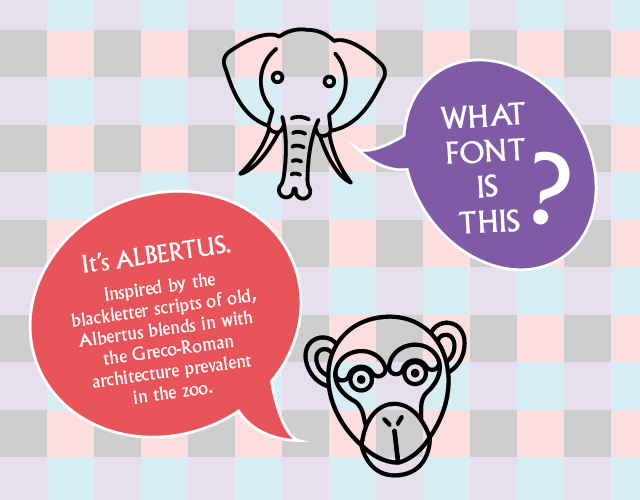
TYPOGRAPHY
Typography is the area that I used to retain the Historic value of the Zoo.
Typography is the area that I used to retain the Historic value of the Zoo.
The zoo was established in 1861, during the British rule in India. Influences of this heritage are found all over the Zoo. I chose Albertus MT, an old British typeface- with its straight stems and sharp edges, reminiscent of the classical lettering used by the English royalty throughout much of the 19th century. Its uniqueness & playfulness are a win-win for the zoo!
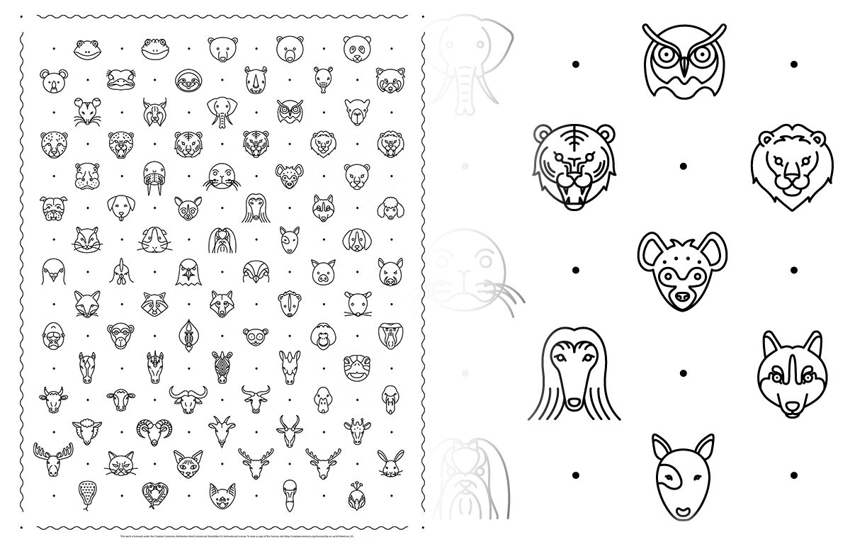
ICONS
People come to the Zoo to see animals with their own eyes. Hence, it serves no purpose to have photographs of the animals in the signage and information systems.
Taking this into consideration, I studied lots of Animal Icons made by Icon designers- & found this set by New York designer Tae S. Yang to be most appropriate to my brand’s visual language. Besides, the icons look great when used with the font Albertus!
Do view his amazing project HERE
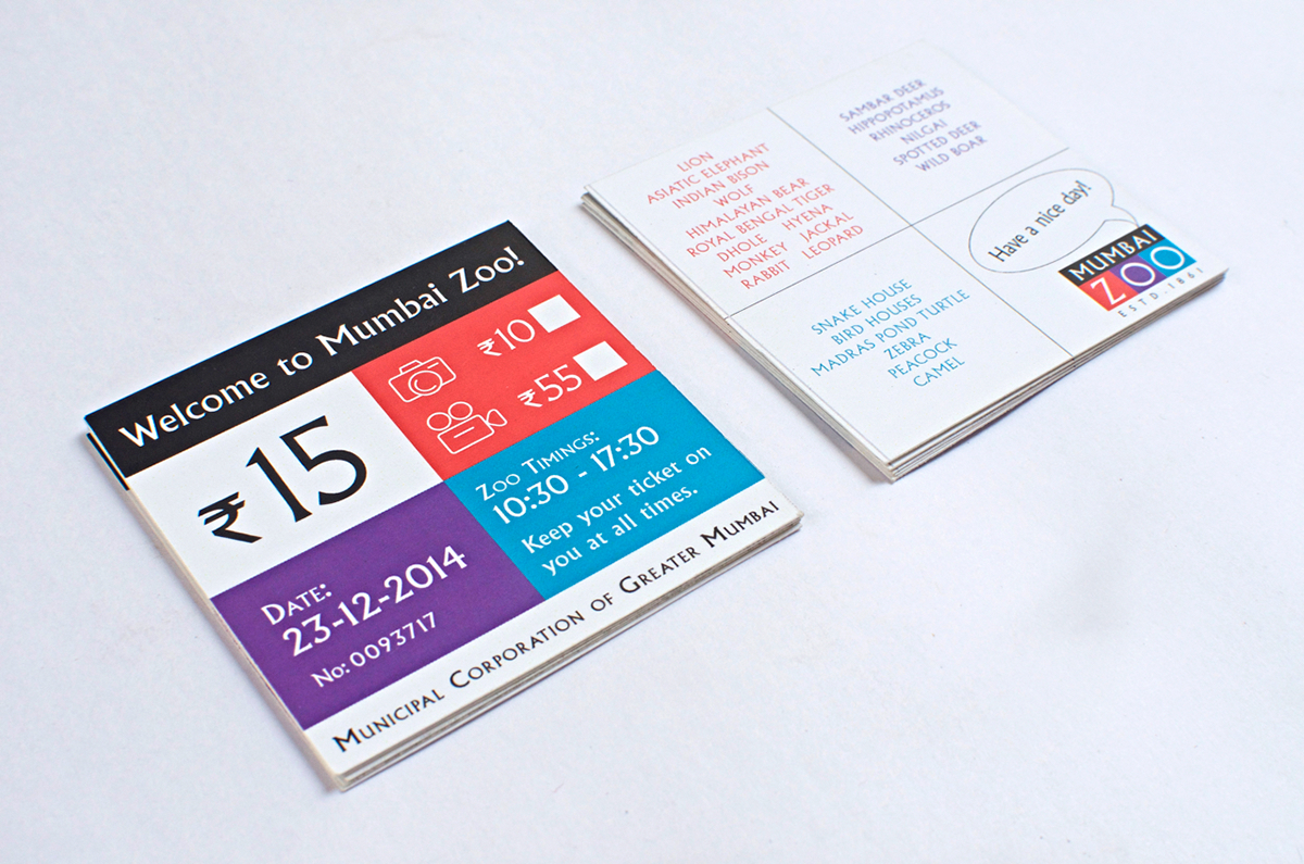
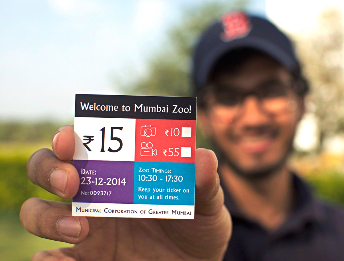
THE TICKET
While designing the ticket, I gave primary importance to the experience that a user has with it. It's only 6x6cm in size, with clear divisions for different kinds of information.
On the reverse side, is a guide that shows you the zone in which you'd find the animals you would like to see!
The Zoo wishes you a Nice Day before you enter :)
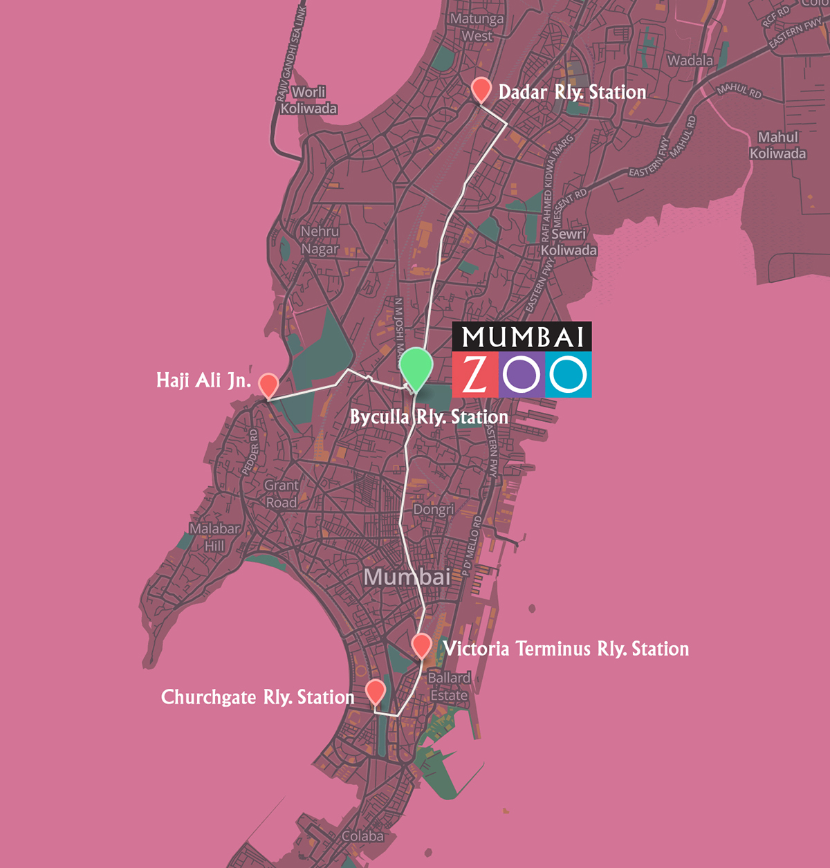
GET TO THE ZOO
A guide map I made to help people get to the Zoo as easily as possible within Mumbai.
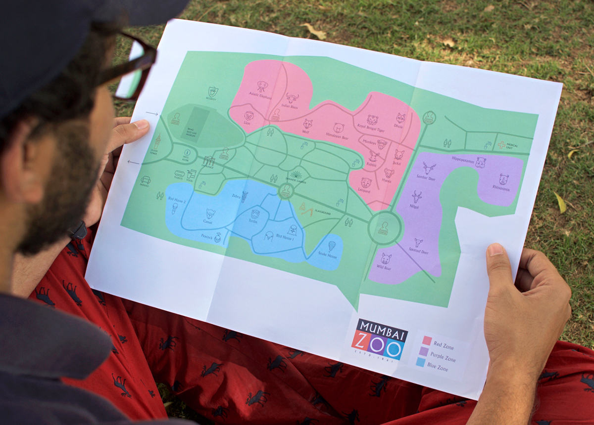
ZOO MAP
The map clearly shows the 3 zones within the zoo. It's Bright & Easy to Use, and saves the trouble of reading from a key/legend unlike most zoo maps!

DIRECTIONAL SIGNAGE
The Directional signs are created referencing the brand identity, incorporating a square-based form. While it has a Fun aesthetic, it is effortless to use.
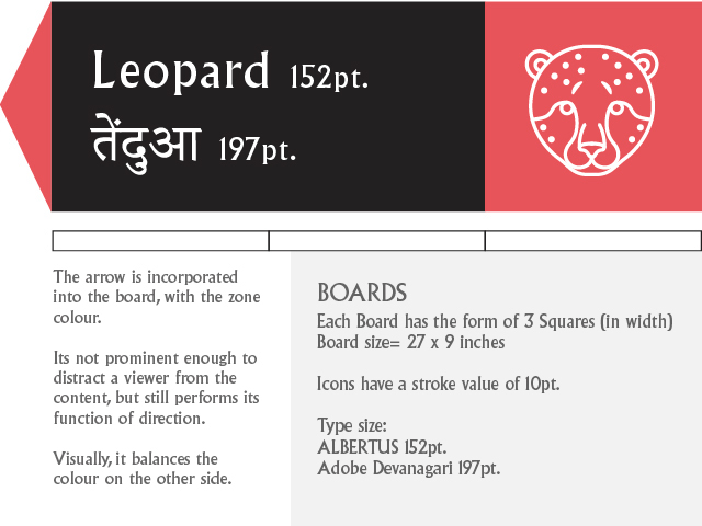

Proportion of the signboard to people of different heights^

ORIENTATIONAL SIGN
The band running along the pathway will be painted in the zone colour so one has an impeccable sense of location.
The boards are printed on 10mm Acrylic sheets
The boards are printed on 10mm Acrylic sheets
The rod is anodized steel
The coloured portions are slightly raised.
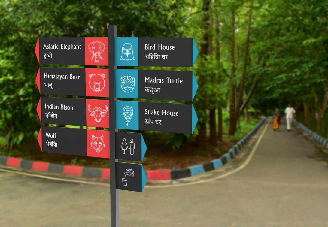
INFORMATION SIGNAGE
The animal information boards have an icon as a pictogram, fast facts on the right & longer bio's of the species if one desires to know a little more.
The black background in these boards is different from the white ones used for the regulatory messages ahead, so a viewer can easily identify the kind of sign he's looking at. The fast facts are highlighted in the zone colour, clearly reminding you where you are within the zoo.


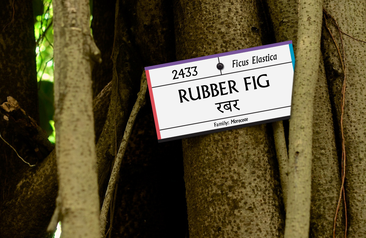
Signage for the plant species in this botanical garden.
REGULATORY MESSAGES
The Regulatory signs have been designed in an interactive manner, where the animals tell visitors What they should avoid in the zoo & Why they should avoid it.
The Regulatory signs have been designed in an interactive manner, where the animals tell visitors What they should avoid in the zoo & Why they should avoid it.
I wrote the copy in a friendly/humourous tone, starkly contrasting the administrative messages prevalent today. Through incorporation of the brand's colours- one knows that this is an Official message. The headline in each one is set in a larger type size so the main message comes across at first sight.
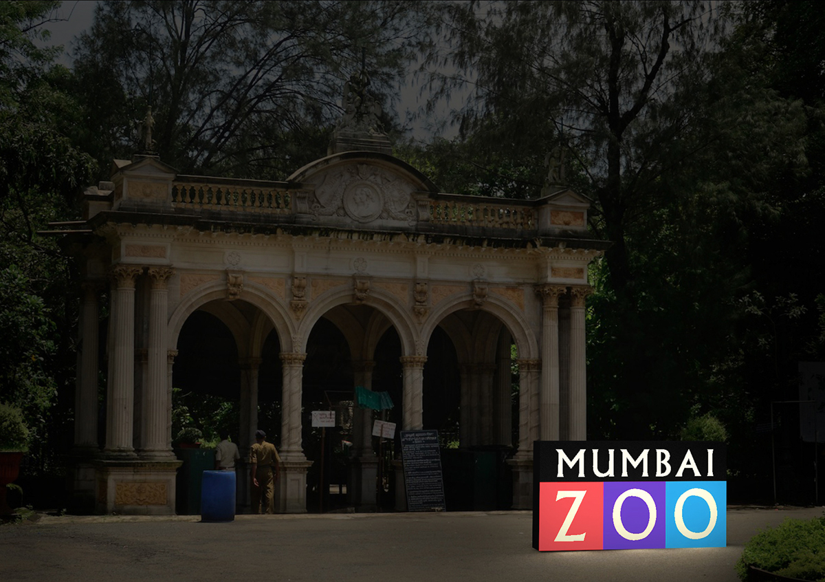
A logo installation to be placed outside the gate, which is illuminated once its dark^
OFFICIAL FAN SHIRT

PRINT AD.
An imperial size print advert to be placed at kiosks/ bus stops etc. all over Mumbai.


