

Sound of Cancer - No Vampires in Gilroy
Album art cover design
Album art cover design
So when Alexx Calise and Dennis Morehouse of Sound of Cancer approached me to design their bands album art, I jumped at the chance. Individually I've respected both of these musicians for years and now they have a duo writing project that is absolutely stellar. They started sending me sample tracks to give me an idea of what the album would sound like. For me I could hear a clear inspiration of bands like Pink Floyd but without all the layering. The production was complex but not busy, and it had a darkness about it that was mysterious but not creepy or eerie.
Initially I had a few ideas that I quickly roughed together after some sketches and sent them over to the group. Downloaded a few comp images from Shutterstock just to flesh out my ideas and to share a direction with them.

There was something about the music that really had me loving this idea of something childlike, vintage, and classic. A victorian feel. I always found these type of illustrations a little strange. Their stare, etc, were just a little eerie and intense for me so this was the inception of the design path.
This inspired the band to go on a shopping spree and start looking for assets we could use to design the album art with. They sent me a package of antique porcelain dolls to photograph, but unfortunately the majority were smashed so bad they didn't work. Some were broken in beautiful ways, but the missing faces, the shattered hands, etc, definitely created more of a horror vibe than I wanted in the design.
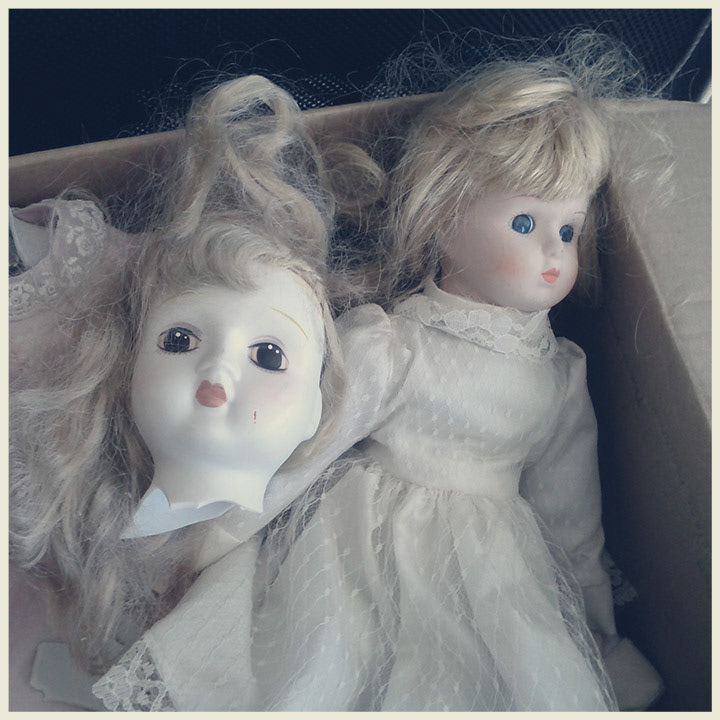
The weird antique dolls the band bought for me to potentially use in the album design.
So, this left me thinking for a bit. I did sketches, looked at images in local antique shops and the more I listened to the music the more I felt a disconnect between the parts and the music. I started realizing there was an interesting eerie factor to antique imagery but at the same time the music had a modern swing to it, with good energy. I needed to find a composition that played both sides of this focus.

The pram, this became the cornerstone for everything.
I remembered that my wife and I had this vintage styled pram that I really liked. It had the vintage/antique quality I wanted without being so gothic or victorian to feel like I was depicting something from Bram Stoker's Dracula. So I had the right icon image to base the whole design around, but I needed to place it somewhere. Well that positive energy of the music that is so uniquely blended with the dark tones and production felt like I needed to mirror that. So I thought I would start getting the pram outside to take pics of it. Blue skies, fluffly blue clouds, all of it. The positive nature of just being outdoors, which initself can be a dangerous place at times, but it's not always. I kept having that re-occuring thought.

So off into the 400+ acre fields not far from my house in Central Texas I went. I never, ever, get to work with my dad. For years I was gone from home while learning my trade and so we never collaborated on anything. My brothers all worked with my dad at his shipyard when I was a kid. My sister had worked in his office, but I am the only child to have never worked with him. He now lives not too far from us so decided to take advantage of this project and asked if he would come help me with a photoshoot. Strange to think, I was basically hiring my dad for the day to work as crew. I was lying in the grass, ants all around, I had my 200mm f2.8 lens on my Nikon and I'm giving direction to my dad to move things around and position them properly for my composition. This was my favorite part of the project just because it meant so much to me doing that with him. And, he got to see how I work.
So the idea was starting to gain legs, I was seeing in my head the whole scene and shooting with negative space in mind for the things I was going to composite in. I had a relationship that I was going to depict between these two contrasting parts. This relationship of darkness and light, threat and safety, etc. They paired off each other in a way that opened itself up to many metaphors. I started doodling some more...

This led to this quick doodle in photoshop just to get my idea solidified. The icon of the pram representing the baby, safety, nurturing and the threat being this predator bird. I didn't want to use something as vulgar as a vulture, and I felt like crows and ravens were too cliché. So I started exploring bird options.

I finally arrived at the idea of using an owl. It was a hunter, strong, yet more sophisticated and less obvious than say a crow or even a hawk. This felt like a really solid idea, so I moved forward with compositing it into the scene.
So here comes the hard part right, I've found what I think is the perfect cornerstone iconic image with the pram, and I have this "great" idea of using the owl. I think I'm on to the solution. But it still felt too obvious to me, and their music is anything but obvious. It's very dynamic, there's almost a Pink Floyd quality to the little complexities. I was on to something, but it didn't have that abstract component. I decided to do some prints and sketch all over them. I still had nothing. Usually when I get stuck like this I start pulling out all my favorite books and just sit on the floor flipping through pages. If that doesn't work, I'll go get in the car, or on my motorbike, and just ride around hoping to see something that strikes me. Luckily it did, I was flipping through my art books and I came across one of my favorite artists, Salvador Dali. He has a painting inspired by the concept of a Flight of a Bumblebee. It depicts a pomegranite turning into a fish, into a tiger, into a gun, etc... I took two inspirations from the piece, one I was being too literal to scale and the surrealism work of Dali played with proportion in beautiful ways. And, I had considered the bird simply because I had taken the picture in this big open field. So I switched, and I started exploring flying insects. Much more unsettling, not has iconic to horror and goth like ravens, crows, etc were, and I could be more story-centric this way. It started to feel more like a nursery rhyme to me visually. I was beginning to get happy.

Wasps were a bit too grotesque and other flying insects didn't have that potential threat feeling about them, so I settled on a bumblebee. It looked cute in a way, but there was still a sense for potentially being stung. Watch how any one person reacts around and a bee and you'll notice even the most comfortable person still keeps their eye on them. There is a respect element there that I could tap into.
Once I had my insect, I started exploring with the other story components. Much about the band is misunderstood. Even their name, people think it's some connection with Cancer the disease when it's more a relation of the astrological period Cancer, the crab. The title of the album, "No Vampires in Gilroy" is an interesting story about this town south of Silicon Valley. It's a little bit sleepy and country like for a free way town heading south out of Silicon Valley. So there's lots of smoke and mirrors going on. The last thing for me was to depict and connect the relationship of those two parts I mentioned earlier. So I decided to add a baby's arm to the image, coming out of the pram and the bee would have this string around it similar to a balloon. There were lots of analogies for this, but simply put, I like the curiousity it creates. Was the bee kept by the baby, is the bee attacking the baby, who is in control?

Here you can start seeing it all come together.Again I tweaked the scale of the baby's arm for dramatic effect. If this was real, that kid would be HUGE. But, I started feeling an ease in how it related me back to Dali's works and his disproportionate collages of characters.
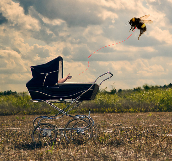
Here you can see the illustrated baby's arm with the leash on the bee. I also made it look like the baby's fingers are covered in paint. You can make of that whatever you'd like...
After all this I found the crop that I liked and added our logo and title. I purposely worked not in the format of a CD cover because I tend to become obsessed with the grid and spacing within that square format. So this time around I just made a big piece of art, and then was going to make it fit and work within that frame. I actually found this much more freeing, and it's definitely an approach I'd take again in the future. It sort of felt like old skateboard magazines looked when I was a kid. The layouts were popping out of the frame, crops were very unique and unspecific. It felt not templatized, which is something I'm always a fan of.
Final Version

So here's the final version. The band were happy with it and it was a great experience to get so immersed in their project to develop the design for this. Doing mostly corporate work I rarely get to push wider conceptual imagery and thinking. Thanks for checking it out and if you want to hear the music relating to this, check it out at http://soundofcancer.com/fr_home.cfm


