The Hallmarks of UX Design:
Designers- especially designers who have ever worked in print - love subtle visual distinctions. In print, for instance, you can use a hairline rule to indicate one kind of heading and a half-point rule to indicate another, and people may actually notice the difference. (More important, judges in design competitions will notice the difference.) And things like hairline rules and tiny, low- contrast type are hallmarks of sophisticated user experience design.
Busy Moms move fast:
Unfortunately, people using the Web (Our users, our customers, our lovers) are moving so fast – and screen resolution is so low compared to print – that they almost always miss subtle visual distinctions. Web users rarely “get “subtle visual cues.
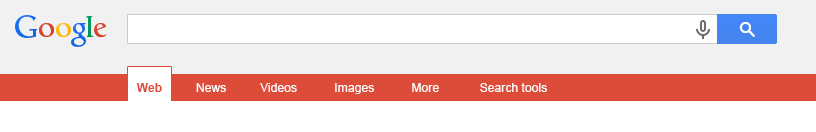
Some mature sites don’t even manage that if they actually wanted people to notice and use the excellent navigation system they’d built, the visual cues that let your users know it was there needed to be less subtle. Here’s an example from Google site what they have built.

On the navigation bar on the left, what you think is the one thing Google has decided their visitors absolutely need to notice? I am guessing you knew it is the one orange underline. I am not sure if no one has trouble spotting that difference. How many of us notice that?
What you and your designer need to understand is that this doesn’t mean it to be ugly. But if they actually wanted people to notice and use the excellent navigation system they’d built, the visual cues that would let you know it was there needed to be less subtle. Here’s a version, I designed to show what I mean.
If you want people to use something you’ve built, they have to notice it first. I think it’s always possible to maintain visual appeal – and even sophisticated design – and still divert people’s attention to where it needs to be.
Here’s another example, from a site working at Booking.com.

Landing through parachute in Jungle :
Whenever a user lands on an interior page of their site, there isn’t any visual indication on the site navigation system to let the user notice at what page he is on now. Even if you switch in between pages – one to another, the tabs on navigation bar stay same. There are hardly any visual distinctions even subtle of an active and inactive tab.
There’s no question that nowadays most of us live in Google. Almost everything I do starts form Google search. Many (or most) of the people who come to your site don’t enter via your Home page anymore. They search for something in Google and go directly to some lower – level page in your site with no idea of where they are. Its kind a like dropped down in the forest by a parasite or air balloon.
If it’s not exactly what they are looking for, very often the next thing they’ll do is to look around- look for the navigation so they can bob up to the surface and get their bearings.
With no signposts active, the users may lose the impact of the tabs in crucial first few seconds. So the inner page tab needs to be active to “indicate “the user a visual cues. Here’s what I mean with my version of their navigation.

Show empathy for your customers:
If you love your users – and of course your goal is to make them awesome in what they do – and you think that it’s important to help them out, you need to provide them visual indications with distinctions in a forest where there’s nobody else around them to guide. You need to make the page tab active on your navigation – or it should look different than other tabs around it. Make it stand out more than you probably think you do – and almost certainly more than your visual designer would like.
" If you care your users, they will trust on your site "

