Simplicity is the absence of luxury, pretentiousness and ornamentation;
it is naturalness, the state or quality of being ordinary but enjoyable.
Simplicity is to declutter.
The act of decluttering, of eliminating the unnecessary leaves behind beauty, purity and clarity.
Simplicity is knowing to be contented and happy with the minimal and the bare essentials of life.
Juubun, in Japanese, means 'Enough'.
This is to say that all you need are the most bare, most simple things to make you happy.
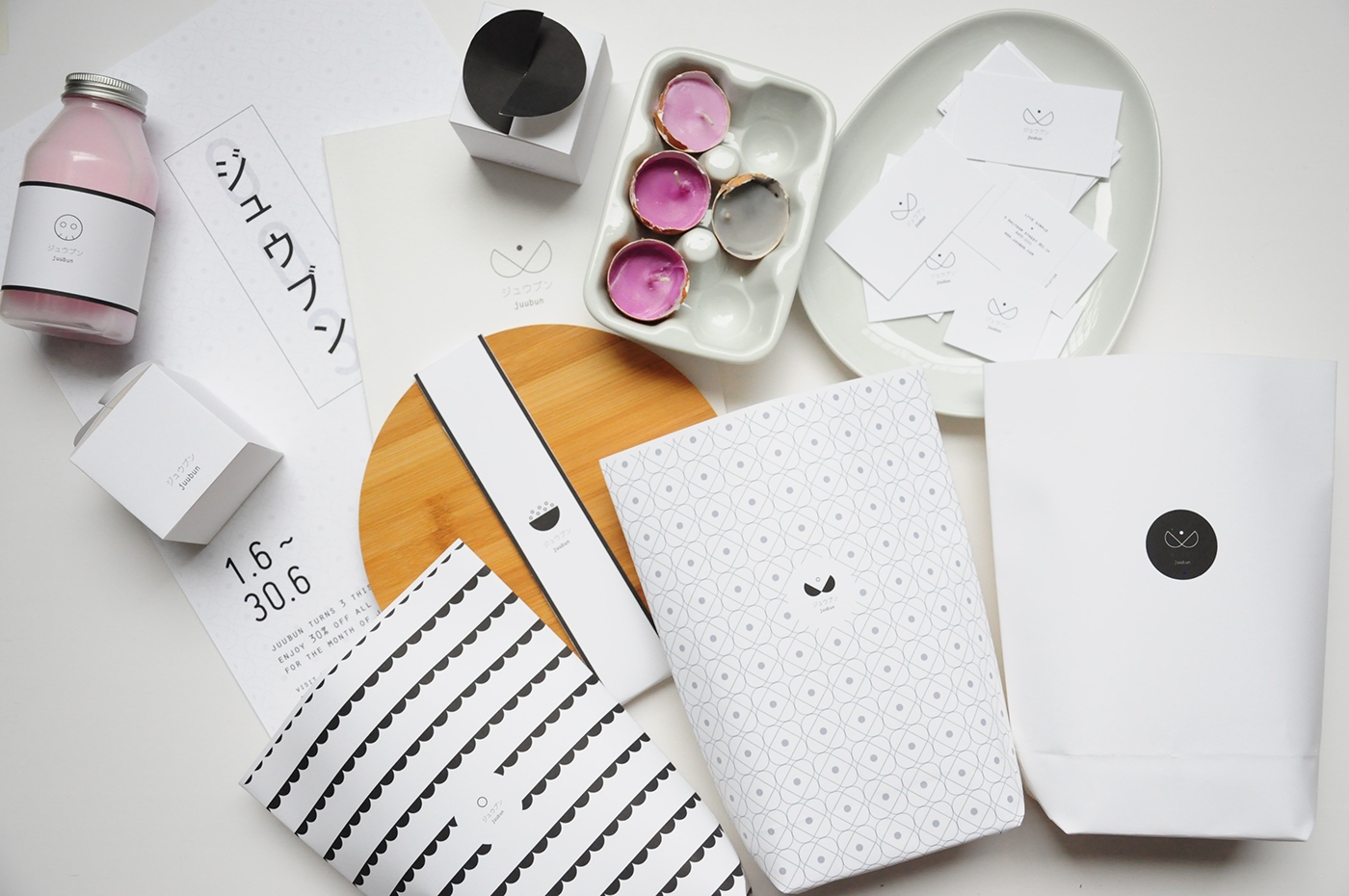
Juubun is a concept store that sells the essence of Simplicity through egg-related products. Eggs symbolise the birth of life, the purity and the innocence of the beginning
of existence. It is the embodiment of simplicity and the bare and decluttered form.
At Juubun, simplicity is found in the mundane and the uncomplicated,
happiness and contentment is easy.

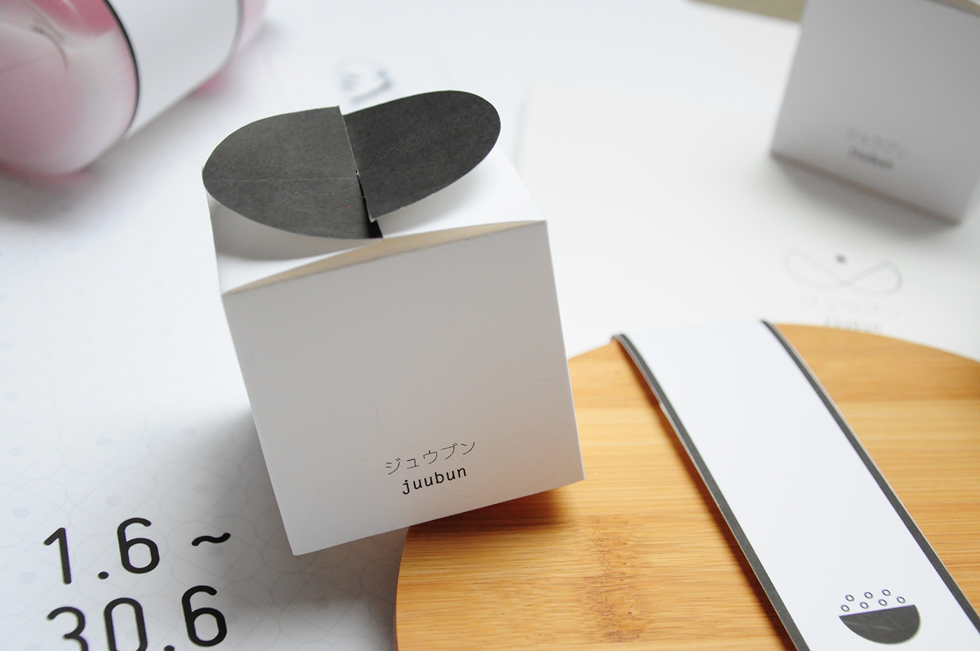
The logo symbolises the decluttering of 'eggshells' and being reborn as a simpler, uncomplicated form.
It is about abandoning the unimportant to be free, and to emerge from and away from the complexity.
The black dot symbolises the essence of what is really important.
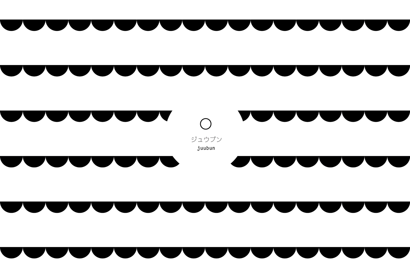
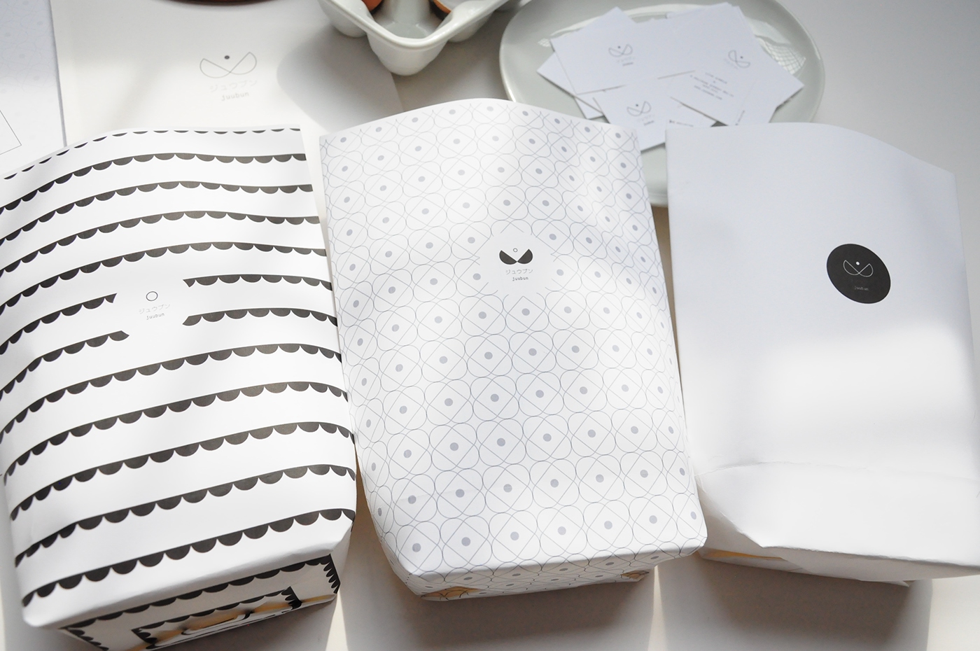
Pattern print for shopping bags


The logo is dynamic and its form can be broken down and recreate sub-logos
for the products in the store to emphasise on each concept product.
Here are two examples of the logo transformed to their sub-logos.
The one on the left is for the egg facial mask, which represents the idea of doing away with cosmetics and being natural and bare-faced. On the right, the logo has been transformed into a bowl of rice, the staple food,
and a symbol of simplicity and homeliness.


Below is a promotional poster for the store's promotion event


The namecard echos the concept of the logo by being perforated on both ends to allow the receiver of the card to 'declutter' the namecard by tearing away the ends that are not important, only leaving the middle which has the company information.

On the giftbox, the logo and concept is represented in the form of opening the box. The two black semi-circles from the logo is transformed into a physical form and function as the flaps for the opening.