This was the Robinsons Squash'd brief from the Starpacks Design Awards competition.
The brief was to redesign the graphics and packing of the drink to make it more attractive, as the current packaging and graphics are 'boring' and packaging is referred to as looking like 'marmite'.
I began to redesign the shape of the bottles and i went down the route of a teardrop/water droplet shape to enforce the whole idea behind the product. It is to get consumers to drink more water, however with a mix of flavours to 'liven it up' a little.
The colours symbolise the 3 flavours availble in the drinks to make it easy and obvious to grab off the shelf at a glace of which flavour you want to purchase.
The packaging has the same mechanism as the current retail package - a flip top lid and a squeezy bottle to get every last drop, which can fit easily in a bag.
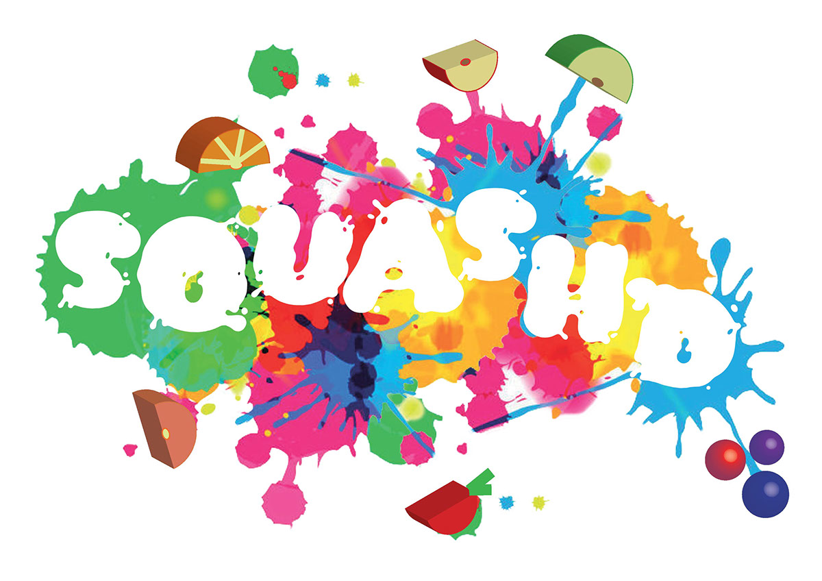
I chose to make the logo a lot more lively and give it a fun brand indentity which shows what the drink is about. The colours reinforce this idea and the representation of the fruit splattered and squashed reinforces the name entirely with fruit scattered around to show the contents available.