Mike Abbink is the designer of several internationally recognized typefaces, including most recently FF Kievit Slab and FF Milo Slab, FontFont (2013, 2014); and Brando, Bold Monday (2014). In 2014 Mike teamed up with designers Paul van der Laan and Pieter van Rosmalen of Bold Monday to create serif and sans additions to the GE corporate typeface family Inspira. Both Brando and the GE Inspira have recently won awards in the 61st Annual TDC Type Competition. Mike is also Senior Creative Director at the Museum of Modern Art in New York, and has a broad typography background from personal, in-house, and design agency work including MetaDesign in San Francisco, Apple, Wolff Olins on two coasts, and Saffron Consultants.
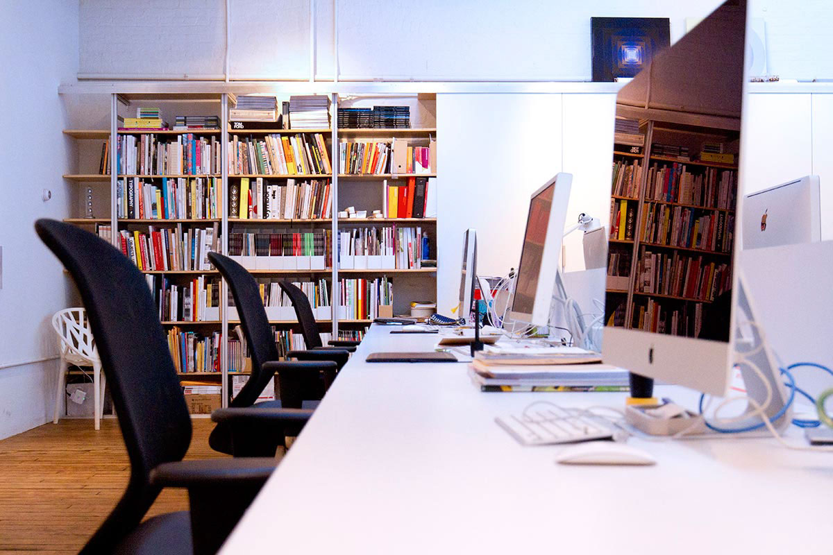
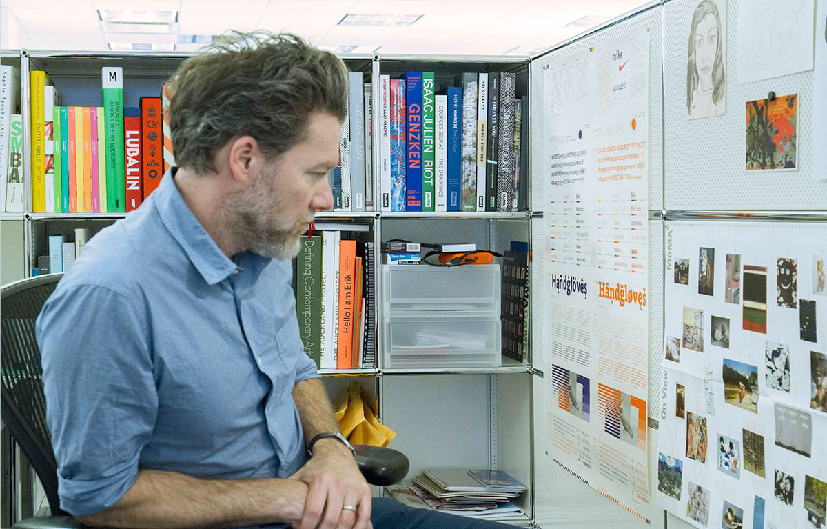
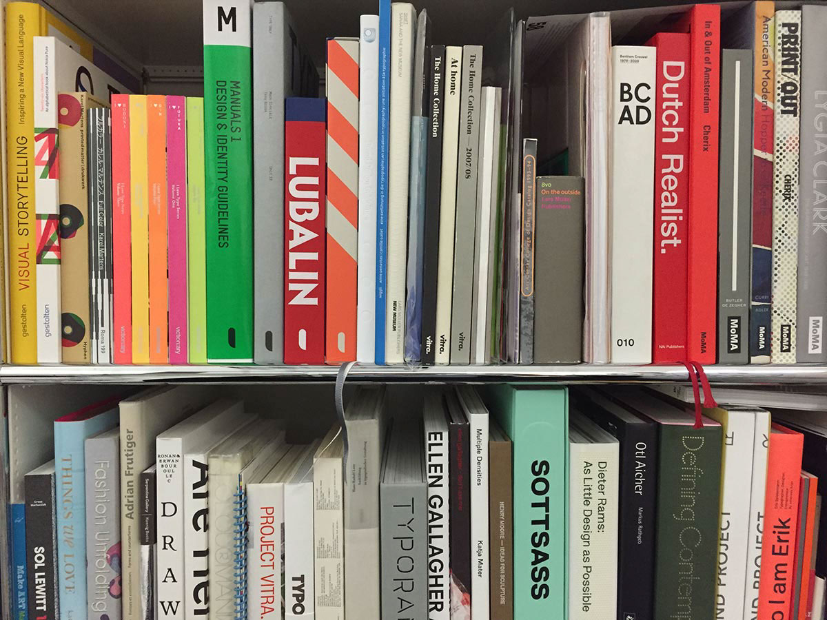
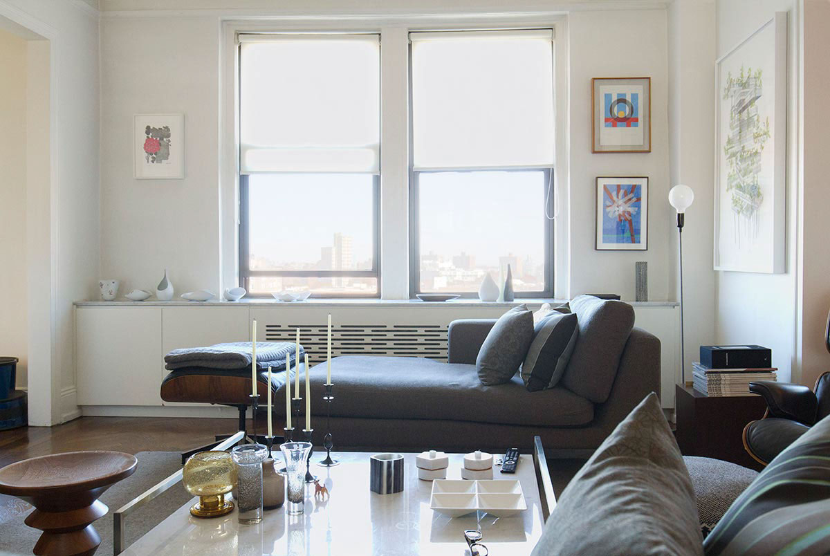
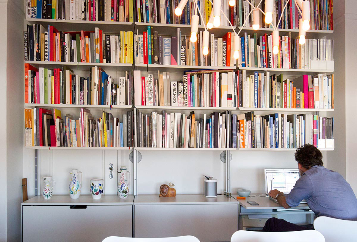
FontFont caught up with Mike at his home in Brooklyn. We toured his neighborhood, studio space, and dropped in to the city to see his office at MoMA.

What have you been drawing lately and what projects are you in the middle of?
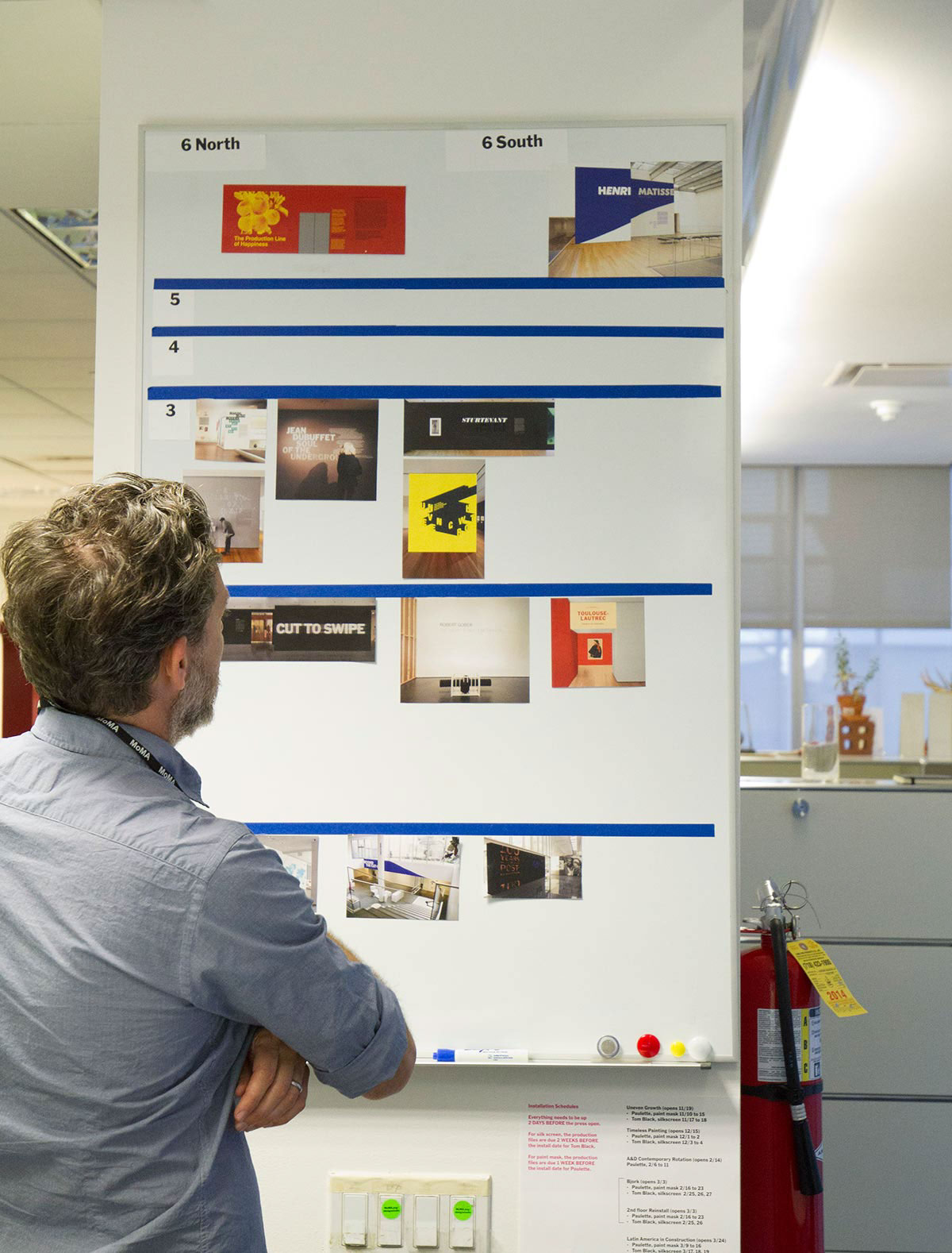
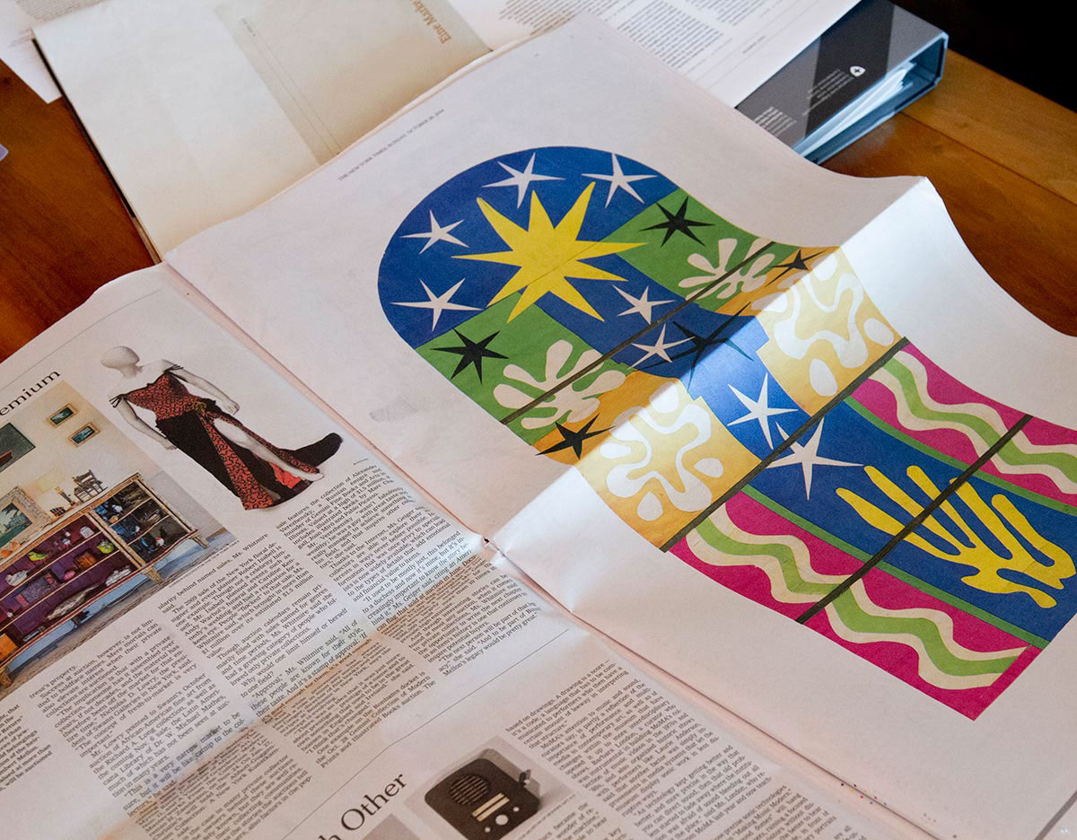
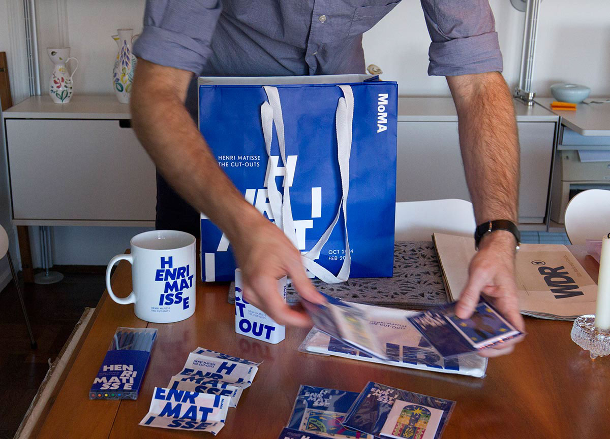
I can show you work that was just finished for the Henri Matisse exhibit that my design team worked on in the MoMA design studio. It’s a Futura inspired black weight with roman, italic and reverse italic. I designed it to work well with the bespoke typeface (Henry) created for the Matisse catalog and designed by the Fraser Muggeridge studio in London. We developed this identity to be used as the Matisse exhibition title wall and products in the MoMA Design Store. We also ended up redoing the street-facing store windows using the Matisse identity typeface. I’m also very pleased by the way our print advertising has turned out. One that stood out for me was a full page ad in the New York Times, showing a single artwork and just small caption set in 7 point type. No tag line, call to action, exhibition info, address… just the image of Matisse’s Nuit de Noël. I have not seen that approach with any museum adverts which was quite refreshing and bold.
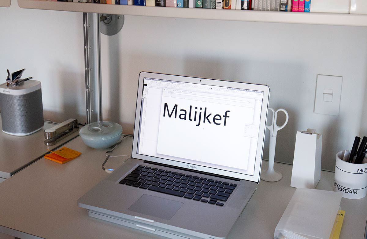
I’ve also been working on Brando Sans and what will ultimately become
I’ve also been working on Brando Sans and what will ultimately become
FF Kievit Serif; right now we’re currently getting the weights within the family fine tuned so it mixes well together with the sans and slab versions. I’ve been working on FF Kievit my whole career with the goal of building a cohesive family which includes a sans, slab and serif. The Serif and Slab versions have been done in collaboration with Paul van der Laan.
I see you’re working in Fontlab here; Is that your editor of choice at the moment?
Yeah. I’ve got RoboFont and I’m learning it, but all my current projects are in Fontlab and it’s the one I’m most comfortable in. When I’ve got some time, I like to learn in RoboFont, but if I’ve just got a couple of hours and want to jam I go with what I know. Erik Spiekermann has mentioned Glyphs to me recently so that is on my list to learn as well.
Since you’ve lived and worked in both, how would you describe the difference in design culture between San Francisco and New York?
San Francisco is a great place to work as a designer, and it’s got connections to tech culture which is obviously pushing everything toward digital media and new ways of interacting with design and technology. But I’d say New York has a certain kind of gravitas that’s hard to beat based on the number of influential and legendary designers like Paul Rand, Milton Glaser, Vignelli, Chermayeff & Geismar, Paula Scher and Michael Beirut (just to name a few).
What’s the story behind FF Kievit? Where does it get its name? How do you say it?
It’s ‘key-veet.’ It’s a Dutch word. My parents are Dutch, and I spent summers visiting my relatives there in the Netherlands as a kid. FF Kievit was my first release. I started it when I was a student in Leah Hoffmitz’s digital font design class at Art Center in California. I was looking closely at designs like Frutiger that introduced humanist elements to a sans model and the skeletal structure of great oldstyle designs like Garamond. I wanted FF Kievit to land somewhere in the middle with the modernist flesh and the bone structure and proportions of a serif. I tried to make something with a natural personality, but that’s cooler in tone, not too expressive. The name Kievit is a Dutch name for a little bird that nests on the beaches there, it’s called a plover or Lapwing here in the states. There was a Dutch tradition to present the first found kievit egg of the year to the Queen, who took it and pronounced the official beginning of Spring. So in a small way, this first typeface is my little offering of something new. It also happens to be my mom’s maiden name so I’ve always had a connection to the name and the bird!
It seems like nearly every independent type designer these days has his or her own foundry label. Is yours next?
Maybe in 4–5 years, but for now I like things as they are because I still like my career as a graphic designer as well. Collaborating with designers who operate their own successful foundries gives me an idea of how much work goes into the marketing and technical and business ends. I’d rather focus on design and continue to collaborate with FontFont and my friends Paul van der Laan and Pieter van Rosmalen at Bold Monday. We have a great relationship and have worked on multiple bespoke typeface projects together as well as some personal type development.
More At Home With and At Work With episodes:


