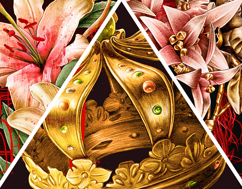

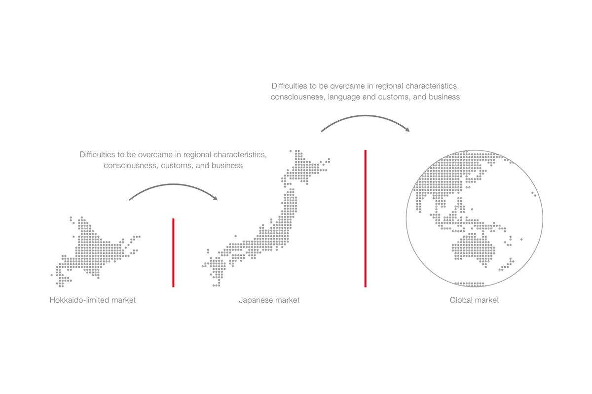
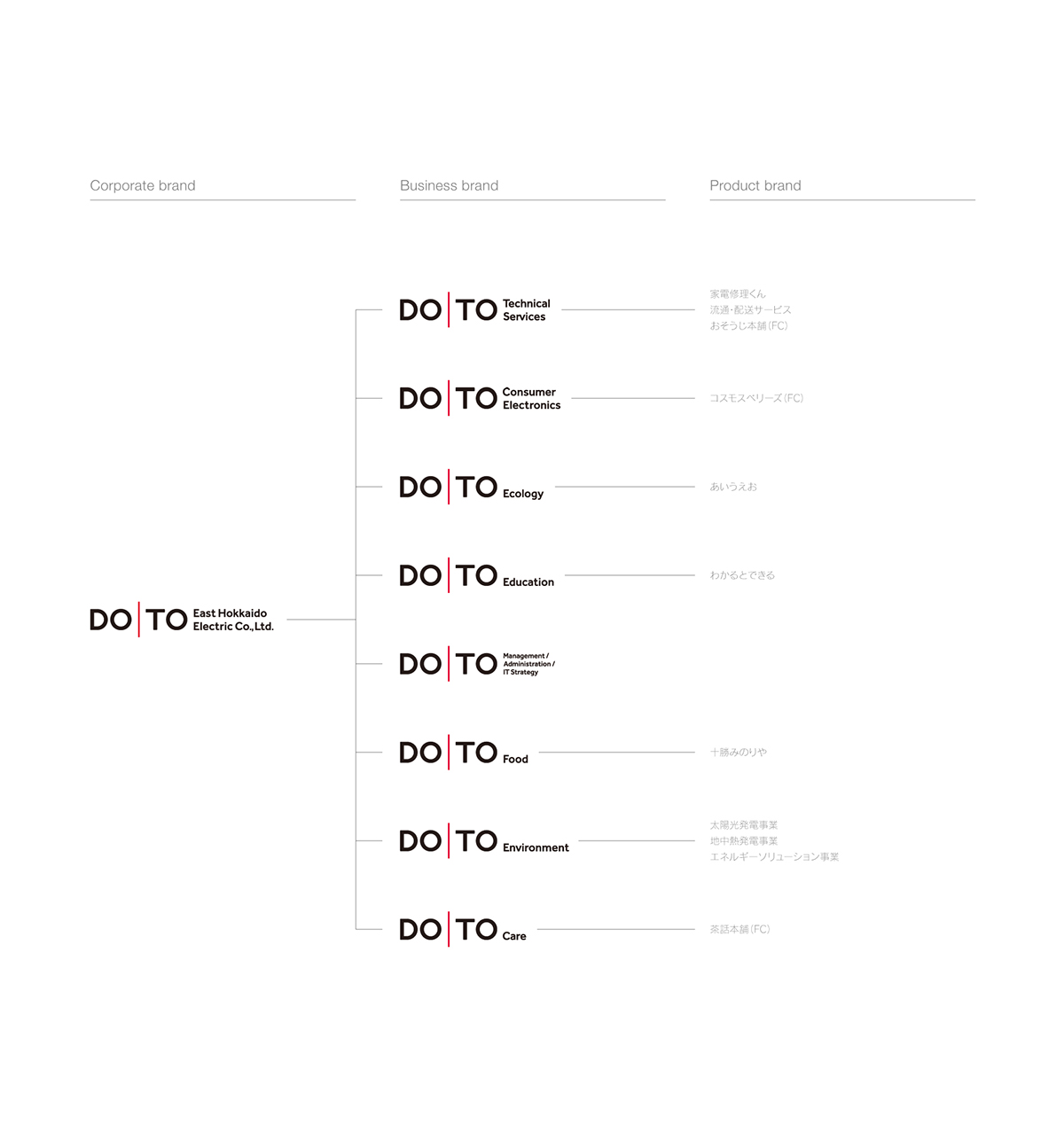
DOTO (East Hokkaido Electric Co.,Ltd.) who was born in Obihiro, Hokkaido and had 50th anniversary of the foundation challange the aim to advance not only into a limited market in Hokkaido, but also all over Japan and the global market in the environmental energy business which will be a key in future.
They will face a lot of difficulties that they will always have to overcome from now on. On that occasion, they will have to reform the regional characteristics, habits, ways of business, and consciousness that was accepted only in the limited market, and they will also need to change themselves in a flexible thinking. This radical change in consciousness is the essence of challange, and it is what they should always keep in mind. Future DOTO will head for the next new 50 years with this new logo in order to become DOTO of Japan and the world from DOTO in Hokkaido.


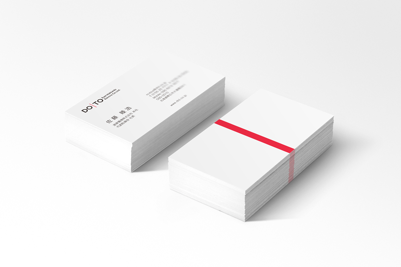
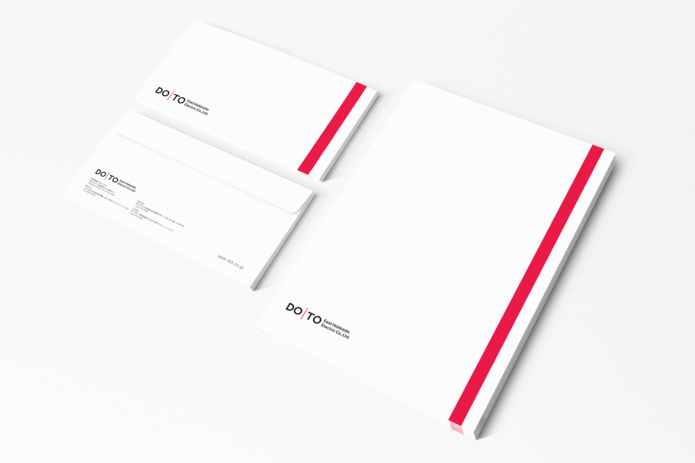
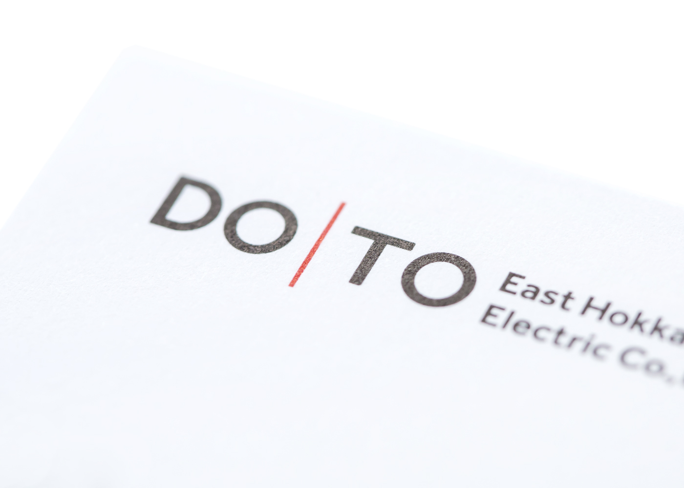
Red line:
A symbol of this radical change in consciousness is the red line, which is the difficulties to be overcame, in the center of the new logo. This exists for them to put their radical change in consciousness in the center of their heart all the time. This is because everything starts from the state of heart in their center. Therefore, the red line exists in the center of the logo. Red of the red line is the color which represents a passion and energy to challange, and it is also the color of Japanese soul aming at going into the world from Hokkaido.
A symbol of this radical change in consciousness is the red line, which is the difficulties to be overcame, in the center of the new logo. This exists for them to put their radical change in consciousness in the center of their heart all the time. This is because everything starts from the state of heart in their center. Therefore, the red line exists in the center of the logo. Red of the red line is the color which represents a passion and energy to challange, and it is also the color of Japanese soul aming at going into the world from Hokkaido.
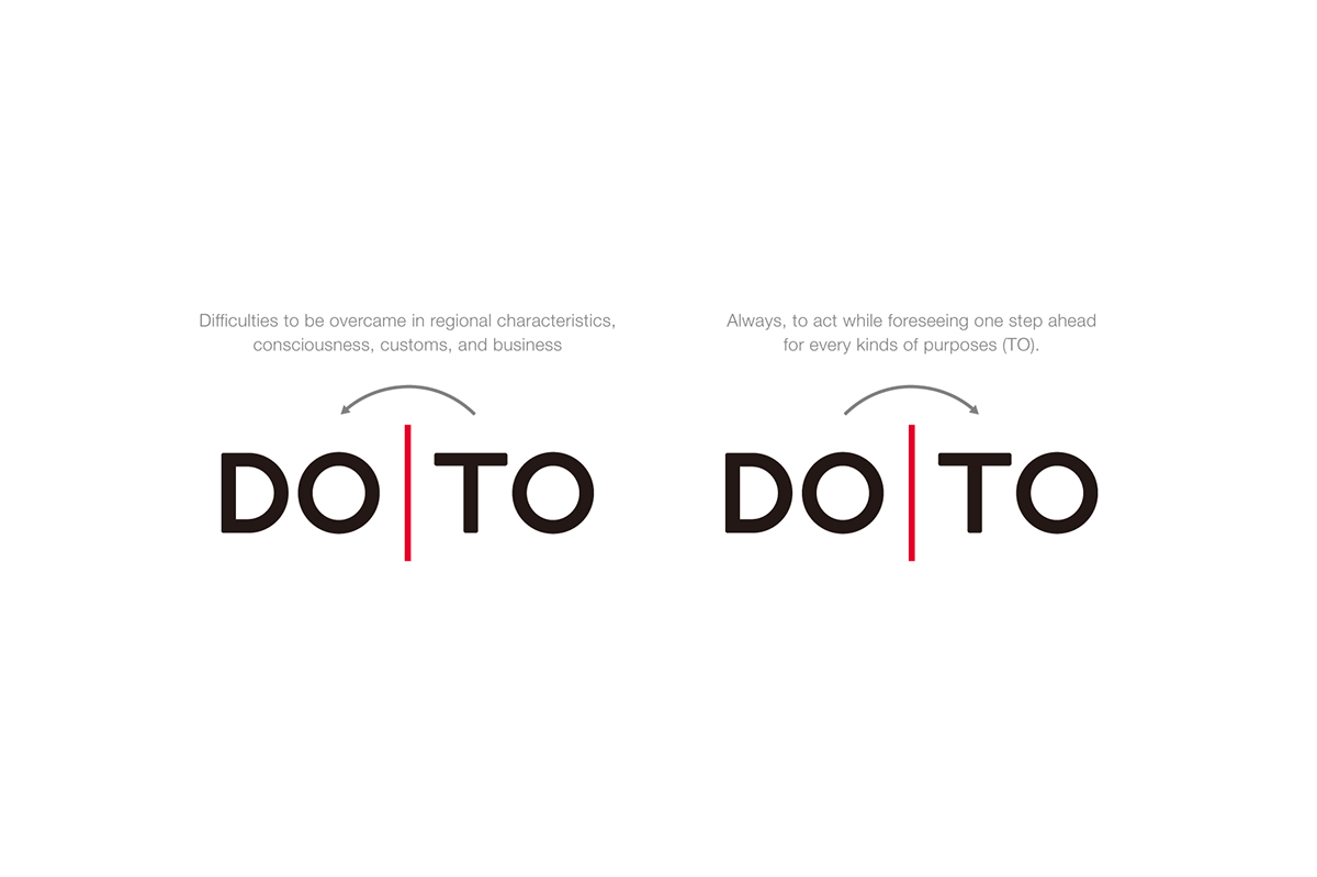
Always, to act in advance, while wearing of customer's happiness (DO).
Always, to act while foreseeing one step ahead for every kind of purposes (TO).
These actions are the difficulties itself that they have, and they are one of the simple preparations to be required from new customers in the new market. Overcoming these difficulties will lead them to the achievement of the next big goal. Daily consciousness is their advance and it will become a small successful experience. Accumulated successful experience impresses the consciousness, such as "We can do it if we try" in their heart, and it will be a foundation of their radical change in consciousness. By accumulating a small successful experience everyday, every week, and every year, a larger consciousness will be born. And then, this fulfills a big change of the company which is an aggregate of people.


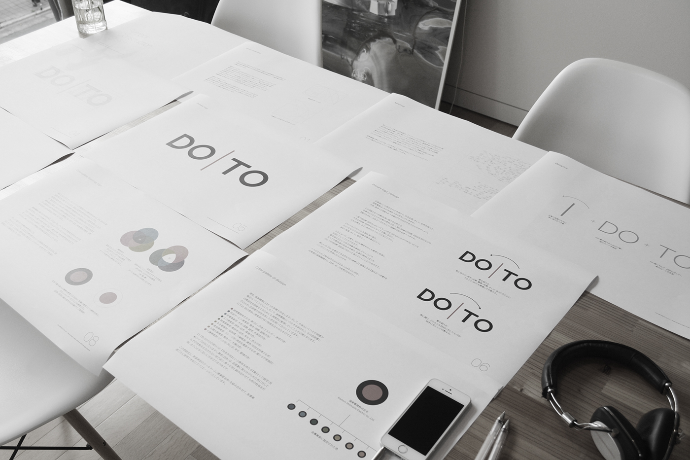


Color scheme:
A new force is produced by putting their individual force together. Black and White which is produced by an additive color mixture and the subtractive color mixture symbolizes their force. Red of the red line is the color that represents the passion and energy to challenge and is also the color of Japanese soul aiming at going into the world from Hokkaido.
A new force is produced by putting their individual force together. Black and White which is produced by an additive color mixture and the subtractive color mixture symbolizes their force. Red of the red line is the color that represents the passion and energy to challenge and is also the color of Japanese soul aiming at going into the world from Hokkaido.


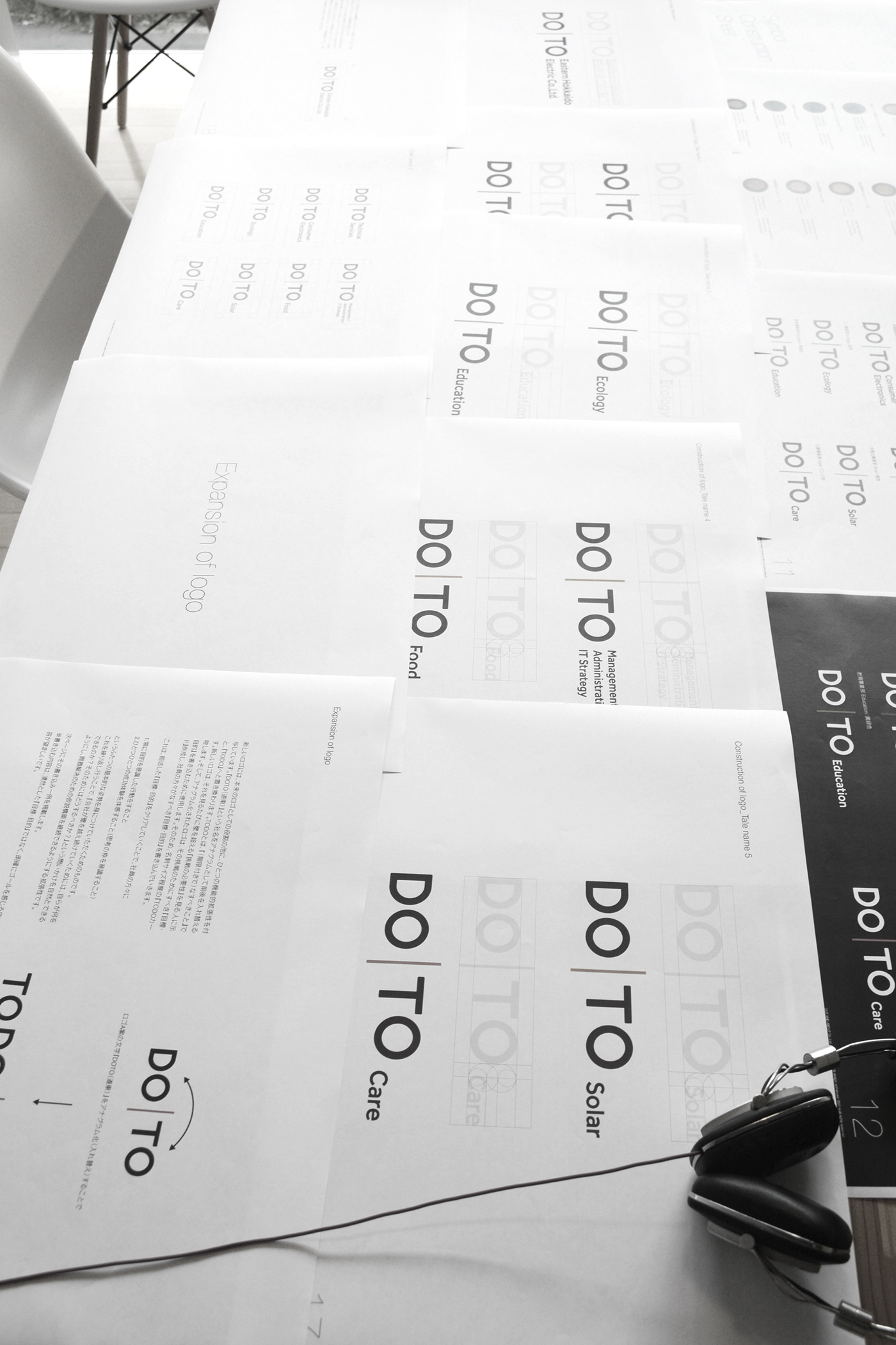
Expansion of logo:
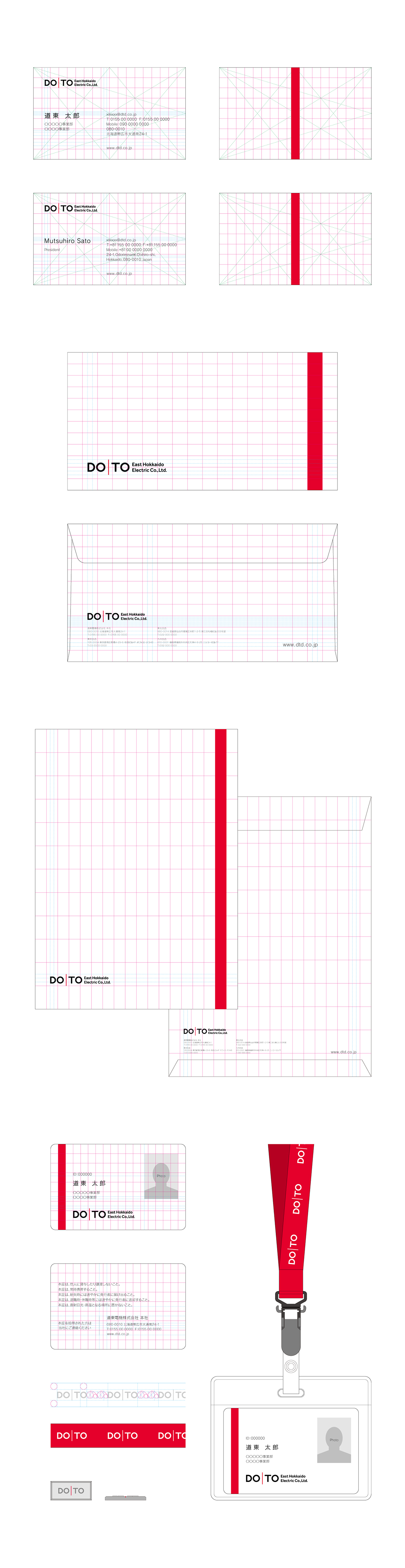
By replacing the order of DOTO, it will be TO DO, things should be done with a time limit. They fill in the challange that they should do on the day between two red lines, and they fill in a new challenge after achiving it. This is a TO DO card that they can always carry what to challange for a radical change in consciousness.
By replacing the order of DOTO, it will be TO DO, things should be done with a time limit. They fill in the challange that they should do on the day between two red lines, and they fill in a new challenge after achiving it. This is a TO DO card that they can always carry what to challange for a radical change in consciousness.

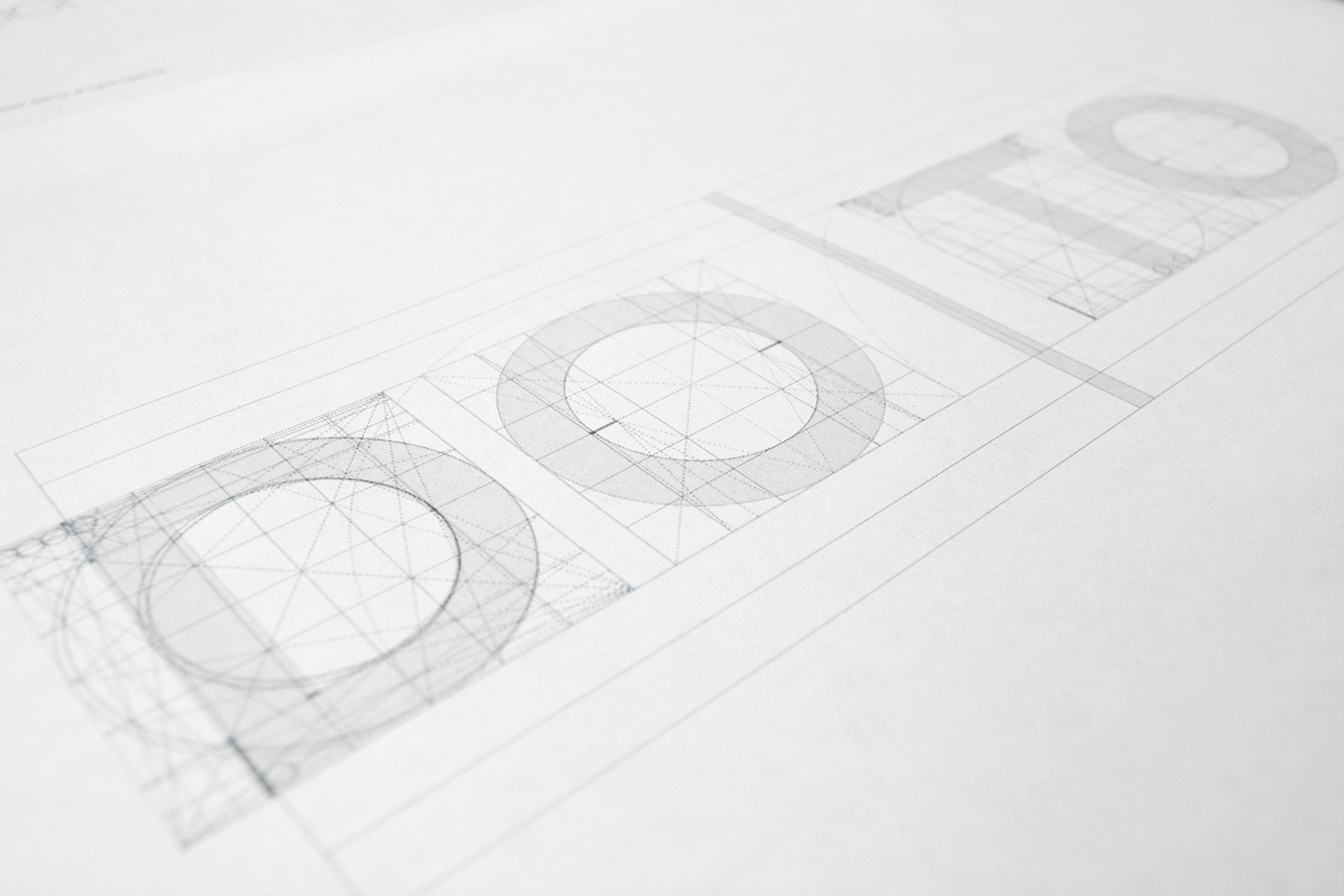
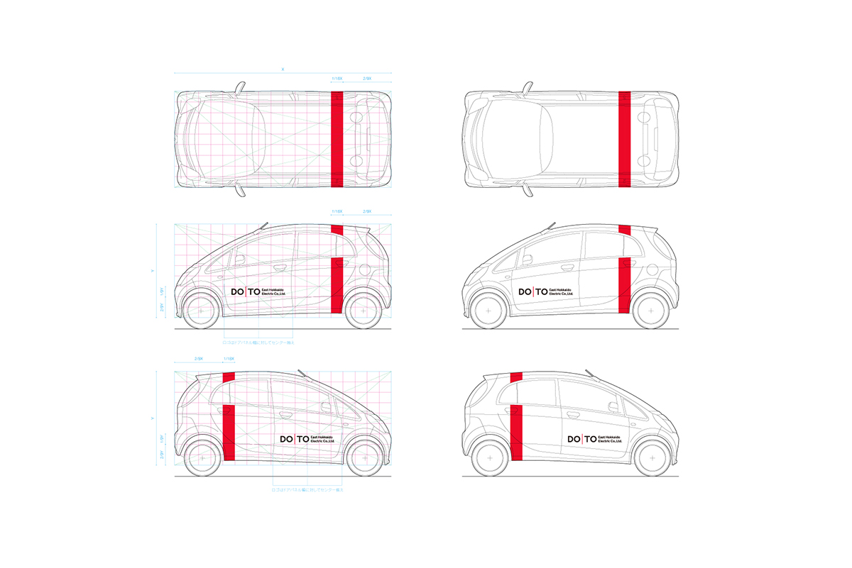
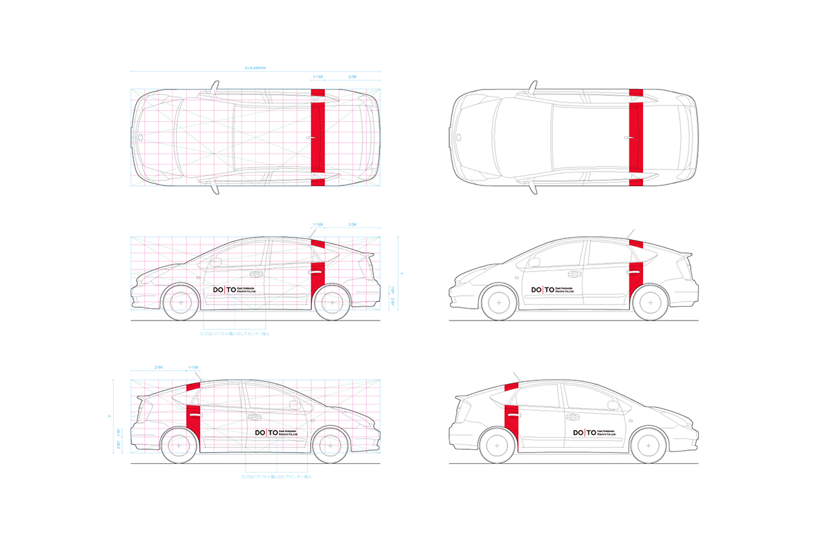
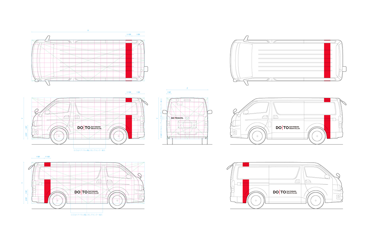
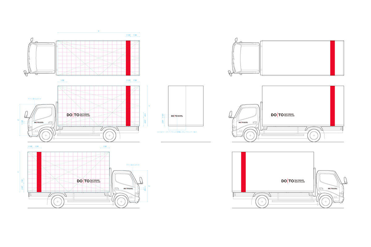
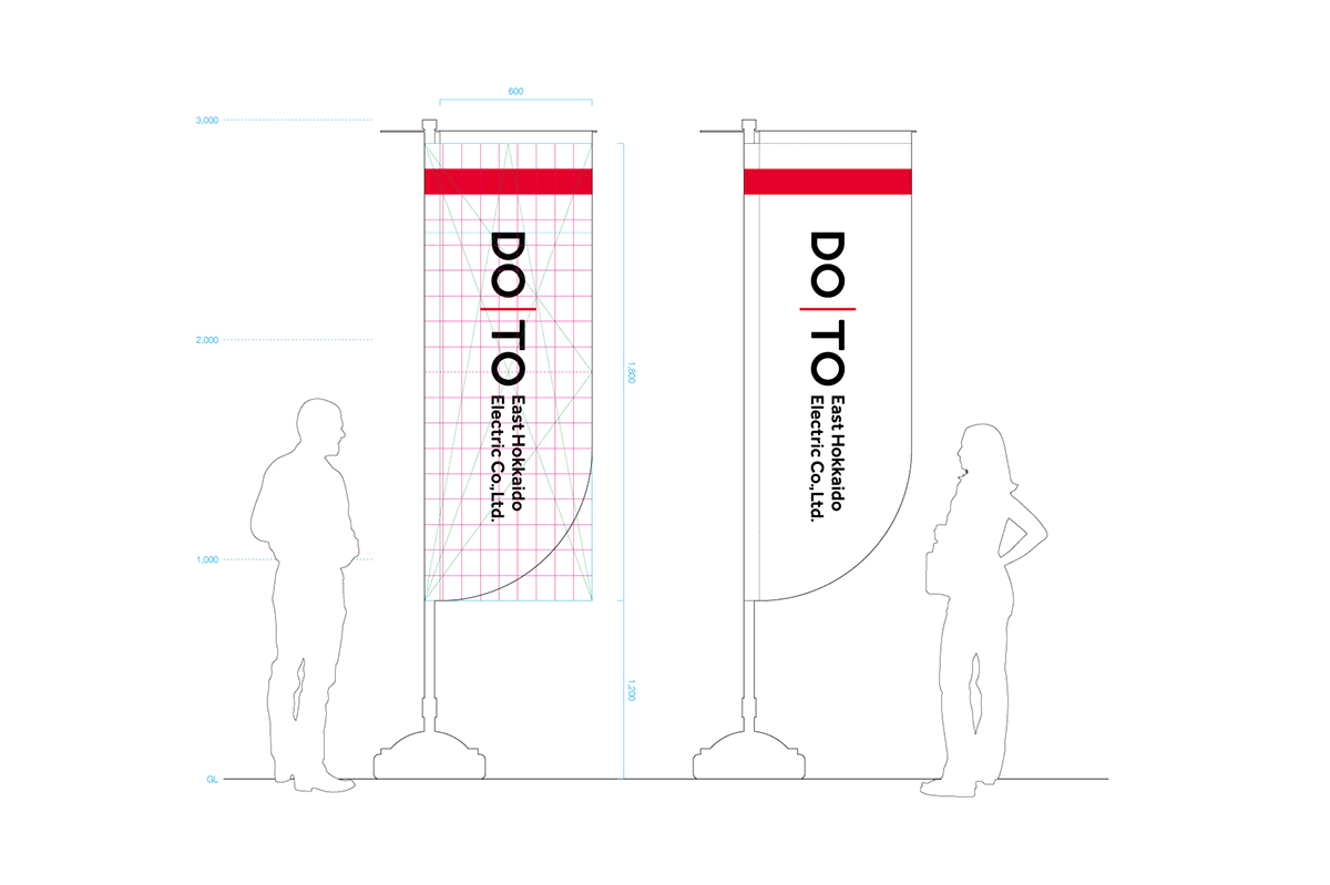
18-9 grid modular for brand identity collateral:
All tools are controlled by 18-9 grid modular. This makes a relationship between the logo and red line common in al tools, and it was set in order to maximize its effect. Also, everyone aims to be able to produce this relationship easily. A grid transforms according to various medias, and it derives a logo and red line that will be the most suitable size fo the medias.
All tools are controlled by 18-9 grid modular. This makes a relationship between the logo and red line common in al tools, and it was set in order to maximize its effect. Also, everyone aims to be able to produce this relationship easily. A grid transforms according to various medias, and it derives a logo and red line that will be the most suitable size fo the medias.


Client: DOTO East Hokkaido Electric Co., Ltd.
Agency: OUT AND ABOUT Co., Ltd.
Range of work: Identity construction, VI guideline, Brand (Business card, Envelope, Staff card and holder,
Agency: OUT AND ABOUT Co., Ltd.
Range of work: Identity construction, VI guideline, Brand (Business card, Envelope, Staff card and holder,
Company badge, Company flag, Banner, Car vinyl), Office building appearance (WIP), Web, and more.
2015~ Hokkaido, Japan
2015~ Hokkaido, Japan