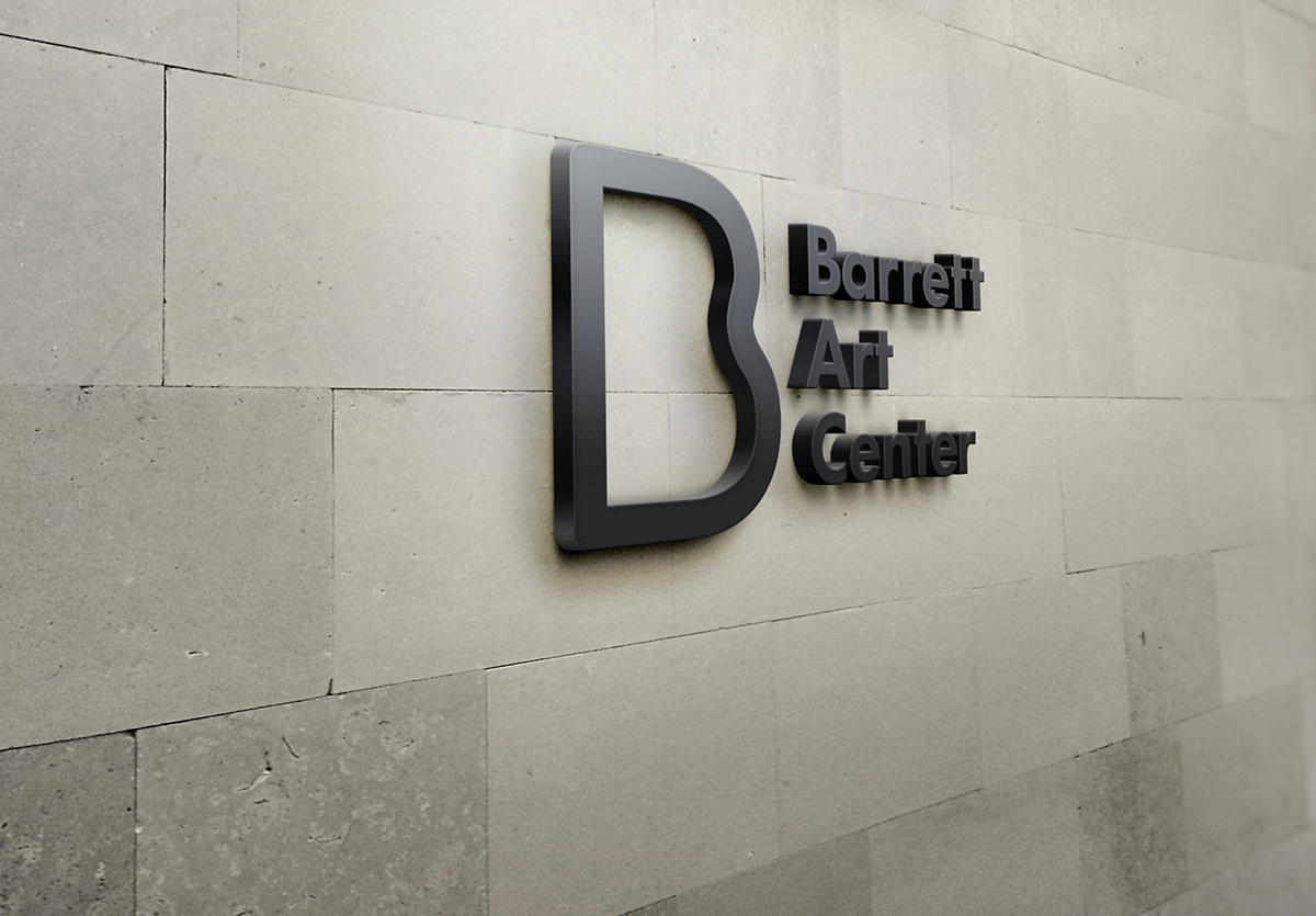
The Barrett Art Center
This is an identity for the Barrett Art Center, a non profit art organization in Poughkeepsie, New York. They are approaching their 80 year anniversary, which gave them some popularity in the news. I thought, hey let's make them a logo because their current one was really foul.
Logo Process
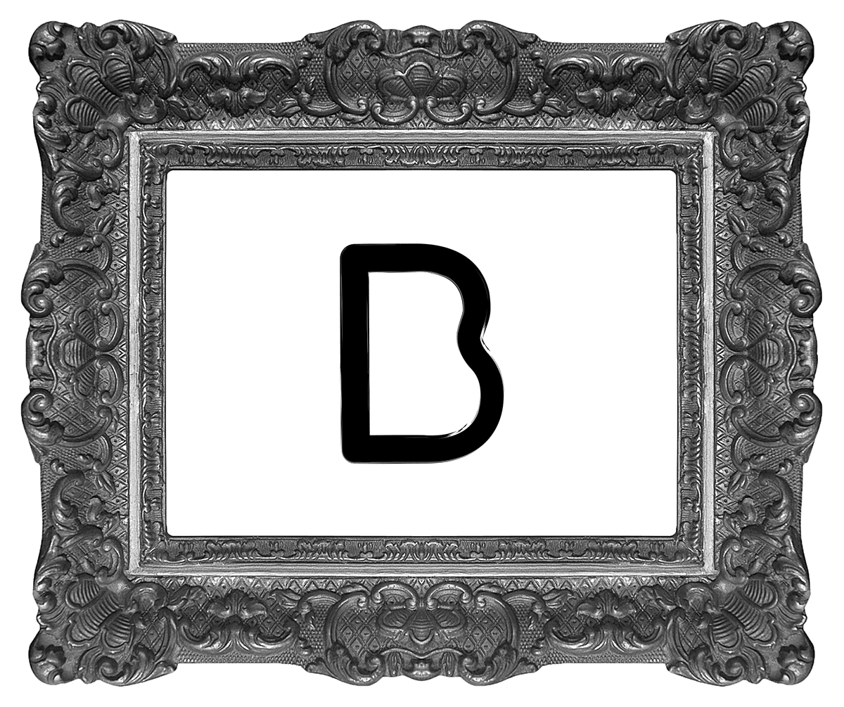
Unfortuantely, I can't find my scribbles for the process. I did some research on the art center and it's competitors and found that Barret's competition was littered with handrawn logos that were done in the early 2000's, even from the neighboring Universities. So, I wanted something elegant and modern, just like the work they produce. From this I decided I wanted a single B to be the main logo of the facility and tack on the full name alongside of it. With Adobe Illustrator I duplicated around 40 B's and found Futura Bold to be to my liking, mainly because of the curves created when you filled the interior of the B (also because the proportions of the bottom half matched the top very well.)
So I had my B and I knew I wanted to fill in the interior with some samples of the art they might have for events, wonderfully simple to create. They also teach art to whomever wishes, and the B could be a great medium to start with, and eventually end with some artwork within the B itself.
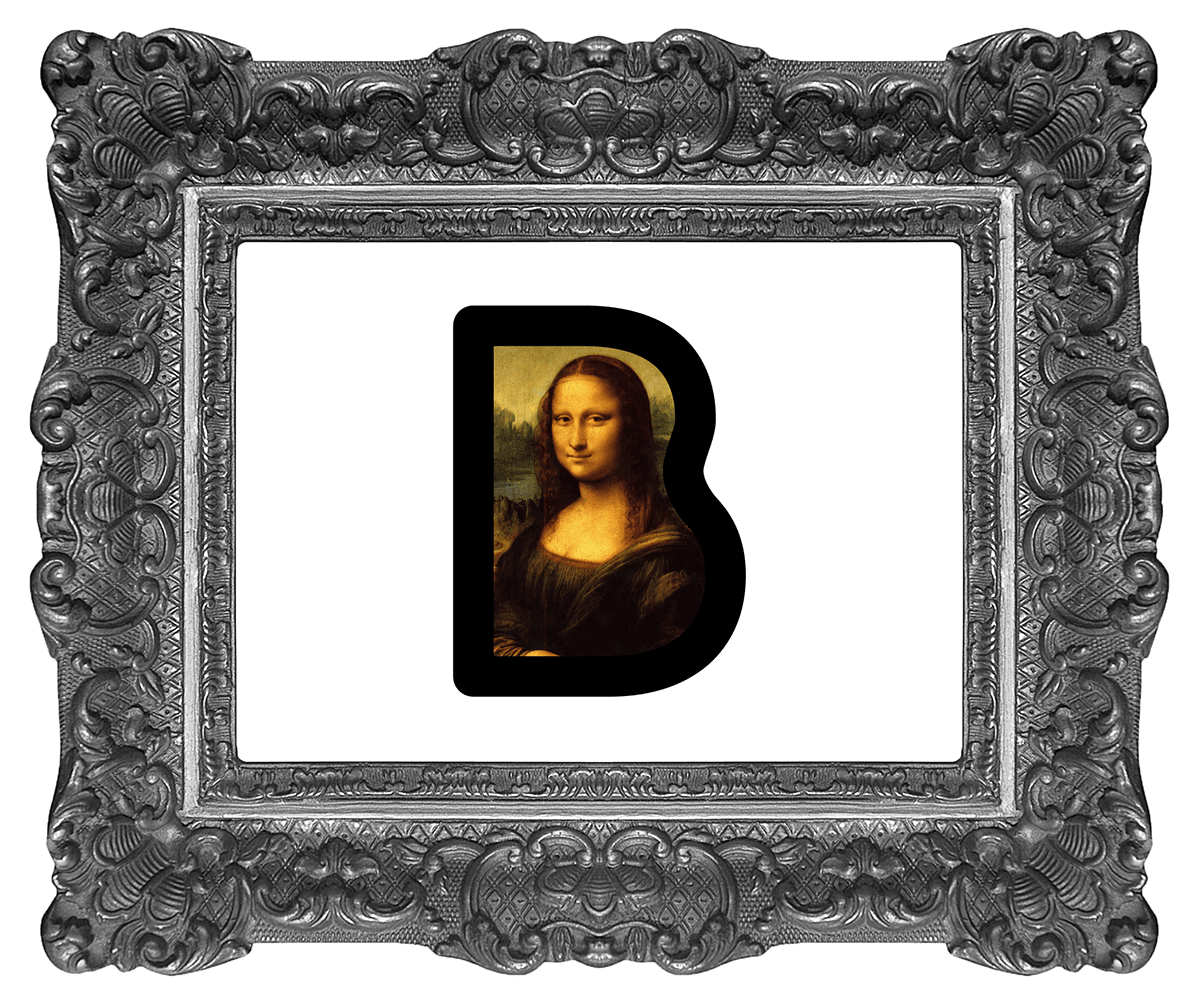
Like so.
The Man
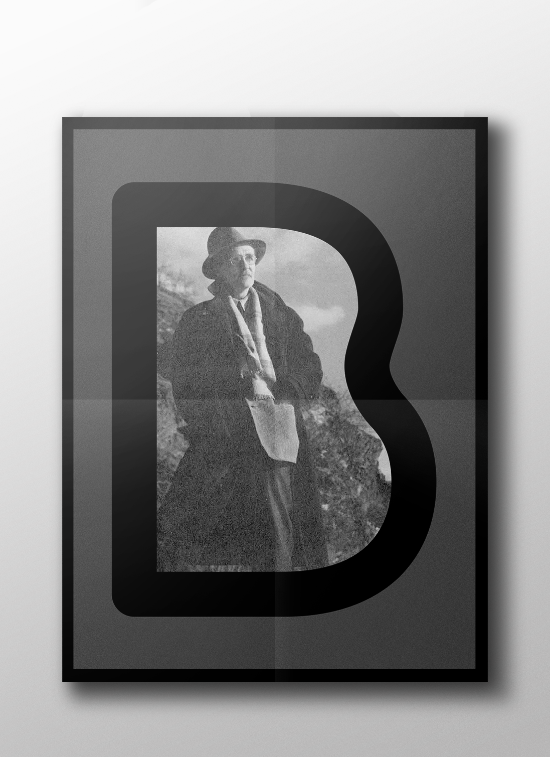
This is Mr. Barrett, the man who the art center is named after. He wanted to bring an artistic hub to the Hudson Valley and the Barrett Art Center hopes to continue tradition. I wouldn't consider him renown as an artist (I don't even think his art was very good), but he was an extrodinary socialite and many people loved him. He was able to bring a lot of people together to celebrate the arts, the logo is intended to serve the same intention, but actually showcase the art at the same.
Color
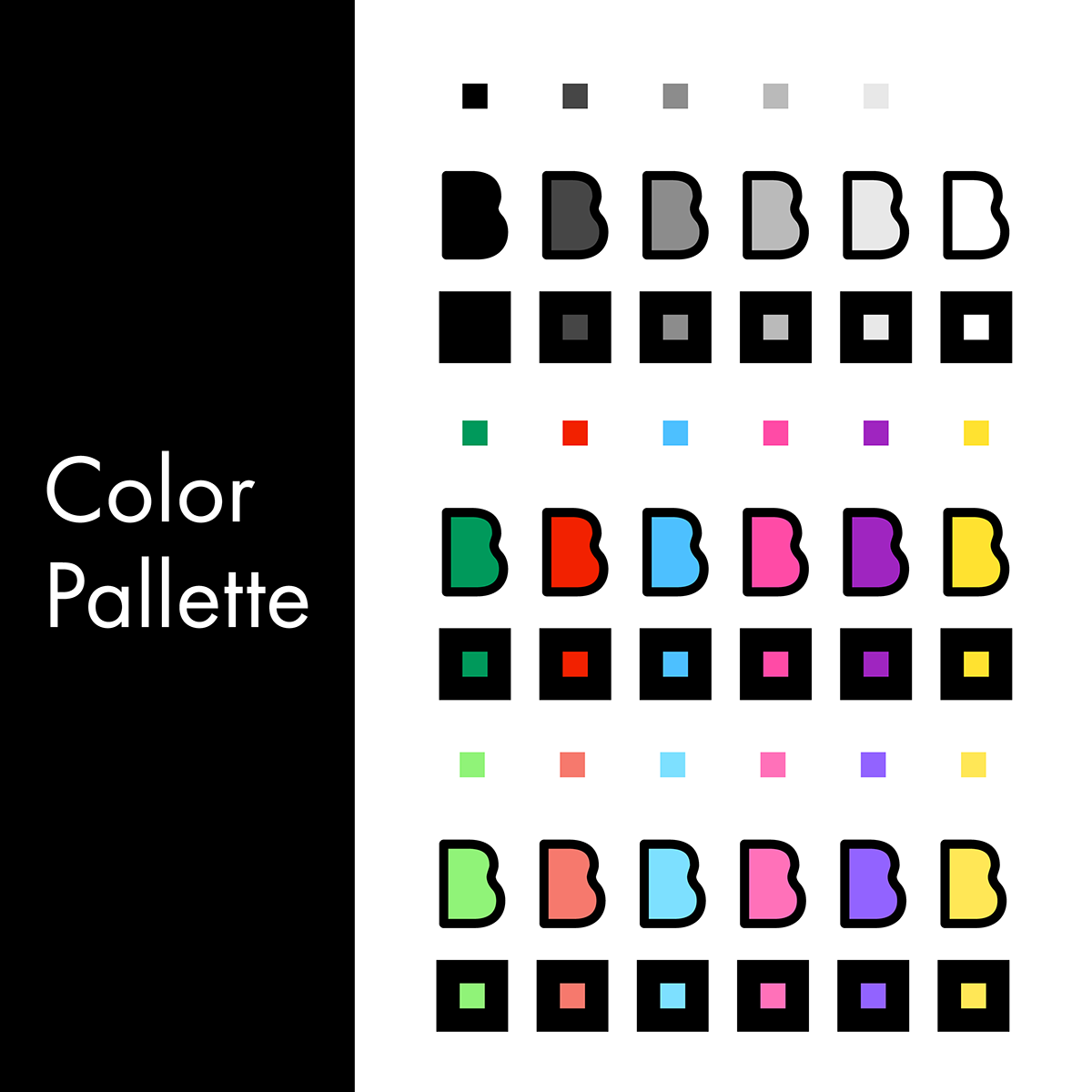
Even though the main design is intended for Black and White, I have included some colors that they could use. My thoughts were centered around the seasons and months, giving a color for each specific month that they could use the color. It's not sacrosanct, but it's a good medium and provided some nice colors. The brighter hues are intended for the Spring and Summer, while the faded out colors are intended for the Fall and Winter months. Alongside this, I added some monochrome color variations as well.
Branding
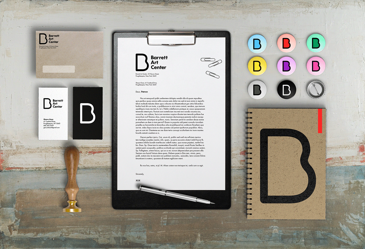
We have already decided that this logo will set them apart from the rest of their competitors. Alongside the logo I also included some materials with the logo placed on it. Business cards, letters, journals, stationary & letters, alongside with pins for events. The application can extend to artistic utensils as well.
Web
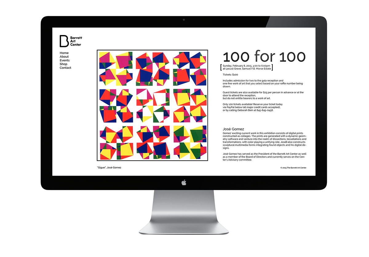
I also found some trouble with their web design. They already have a web designer, but like so many in the area, they aren't advancing their craft and so it appears stale. There are typography issues, the javascript disallows right clicking to prevent photo theft (when you can just open the source tab to download the pictures), the color is unappealing, and the logo & text of the header is rasterized greatly.
I'm a simple man and I made a simple mock of a website design. The landing page will be editable, pics and text, so they can update it with current events they want known or just to serve as a 'blog.'
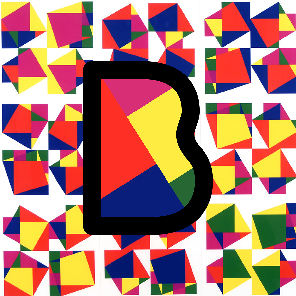
The background is artwork from one of the artists being showcased at the event. I simply made a vector renditioning of one of them and placed it within the B. Presto!
