
After users logging in, they land on the Call List page. On this page, users are able to view the prioritized call list according to different prioritized criteria, which will be featured in the calendar page. Within the call list, it includes the clients’ names, telephone numbers and tags, which demonstrates the clients’ information. The information in the tags could include the stocks, which clients are holding, his investment styles such as active or conservative and what the clients are interested in such as their interested industry and interested countries and their hobbies. By clicking each tag, all clients with the same tag will come out automatically. With the tag system, all information about the clients can be gathered together and thus it gives a brief description about the clients so that users can better analyse their clients. There is also a call button for the users to call the clients directly and a comment button, which is next to the call button. By clicking the comment button, the comment will be automatically added to the information centre, which is top white cross button at the top. In the centre of the page, there is a search box which enables users to search everything in the system including tags, client’s names, stock information and etc. This call list functionality will be advantageous to all personas who have a common frustration which is cannot call as many clients as they want and do not which client to call. By this call list, they can select the clients they prefer to call according to different news or events, which will be introduced later. In this page, users’ main goal is to call the client, so obviously users can understand the green button is to call the clients and it is visible and it can be clicked to achieve the action. Lastly, if users click the call button, the calling page will be appeared which shows clients’ name and calling time so users know they have achieved their action.

The second page is the Market page, which shows up-to-date market information, and aims at helping users make decisions about which clients to call. The blue background of the “market” label at the top highlights the current location in the website. Below the navigation bar, the information centre and search box are kept consistent with all other pages in the system. On the right hand side of the page, the “World Market” box shows prices of certain stocks and indexes and their line graphs and the “Watch List” allows users to set their favourite stock to follow. On the left of the page, there is news feed bar, which allow users to subscribe to particular news sources. These sources could be a website such as Bloomberg or a company in the “Watch List” such as Apple, or it could allow users to follow certain news’ updates. At the middle, it shows news headlines coming from subscribed sources. Followed by the headlines, there are tags showing stocks related in the news giving a quick way for users to view the event and make decisions. However, the question is how can users make decisions about which client to call based on these events. In order to address these questions, we designed the tick button, which is in the right of the headline bar. If users are interested in certain news and want to call clients based on this event, by clicking these buttons, the headlines will automatically display on the Calendar page. For example, if “Credit Suisse Global Investment Returns Yearbook” shows that the price of Apple is rising next year and the users want to call clients with Apple stock, what users need to do is clicking the green button. This page is extremely productive and helpful for the role of Martin because it helps him to identify the relationship between events and trading stocks. And this page also covers the requirements of Charlotte and Benjamin since it is helping them which client to call each day. By designing the buttons as green ticking button, it is easier for users to identify its function because both green and the sign of ticking mean passing through something. But further instruction should be available for users to learn this function. Moreover, users get appropriate feedback, as the headlines will be displayer on the Calendar page instantly.

Therefore, on the Calendar page, the news headlines, which are chosen previously will be displayed on the right hand side of the page. In each news bar, it shows the stock code, current prices, headlines showing the related news and a red button for syncing the call list order of the Call List page according to the current prioritised criteria. For example, if the prioritised criterion is “Revenues”, the top three clients who have the highest revenues will be showed and if the users want to apply this order to the call list, they need to click the red button within the stock bar. After clicking the red button, the criteria will be updated in the information centre, which can be opened by clicking the big red button at the top. Therefore, after opening the information centre, users can see their comments on the clients, their notes during the work and the prioritised criteria, which are everything users want to remember during their work. By designing this page, we see events in the Market page as triggers and this function as assistants of users to make recommendations. Throughout this process, it is similar to the workflow of sales person and analysts in Credit Suisse and this integration of events, trade data and revenues fully addresses Martin’s frustration. However, it seldom covers Benjamin’s requirement on this page. On the left hand side of the page, every user can see their events happening today and different colours represents different types of events. For example, blue means meeting and green means the announcement of company reports. In addition, users can add comments about the event under their titles. By complying with design guideline of the whole system, the white cross and red button is used to add something to the information centre so users will easier learn the working mechanism of this system. Also, the Call List page will be updated at the same time so users can get feedback of their correct actions.

The last page is the Client Information page, which shows all the information about clients. The information includes personal information such as names, date of births, address, telephone number and financial information such as most frequent traded stocks and tag information including interested fields, investment styles and hobbies. By clicking the tags, all clients with the same tag will come out. Also, the users can add some comments about the clients and play the recording with the clients. In “Most Frequent Traded Stock” table, the “Research Rating” column is especially designed for the role of Benjamin because one of his frustrations is that it is hard to find out who’s getting his research and who is taking up his recommendations. With the “Research Rating”, clients’ preference for the research and the extent of usefulness of the research can be showed through a percentage rating.
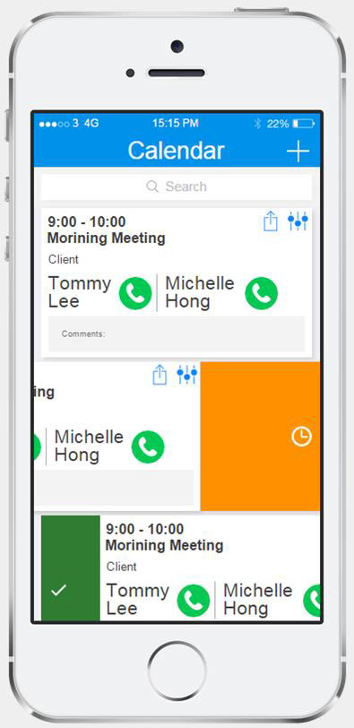
The mobile version of system only includes the Calendar function from the full version because we think that the scenario users use the system changes while it is on mobile device. Therefore, we only focus on the Calendar function to provide a more focused application for users. On this page, users can do with their schedules by swiping to left or right. To be specific, if users want to deal with the event later or enable the application to remind them in the future, they can swipe to left and set the time of reminder and add notes about the event. On contrast, if users don't want to deal with an event anymore, they swipe to right to archive them.

