


This is the digital version of what was originally a letterpress poster. The primary difference between the digial and analogue versions is the location information.
(You can find the analogue version in the letterpress folder.)

This was the promotional style for the Purim party of a different year which emphasised the fun formal style of the evening.
The posters involved the same visual design.

For the Jewish holiday which focuses on learning there was a quiz style game.

This was the result of the first total redesign of the Ahavath Beth Israel syngagogue newsletter.
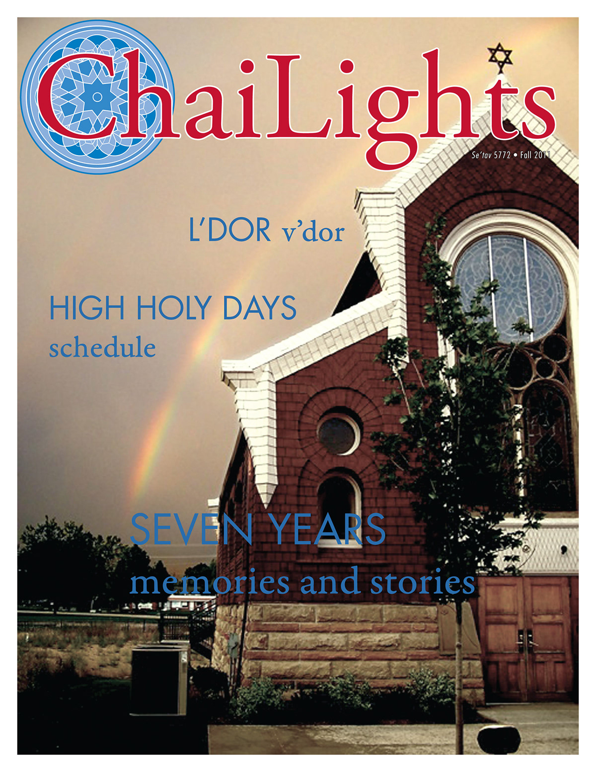
This was the result of the second newsletter redesign following the creation of a new logo and branding. The first time the newsletter was ever in colour.
The logo which I designed is featured in the non-profit logo folder.

This was the one and only attempt to consider a new name for the newsletter and featured a modification to the above styled newsletter.
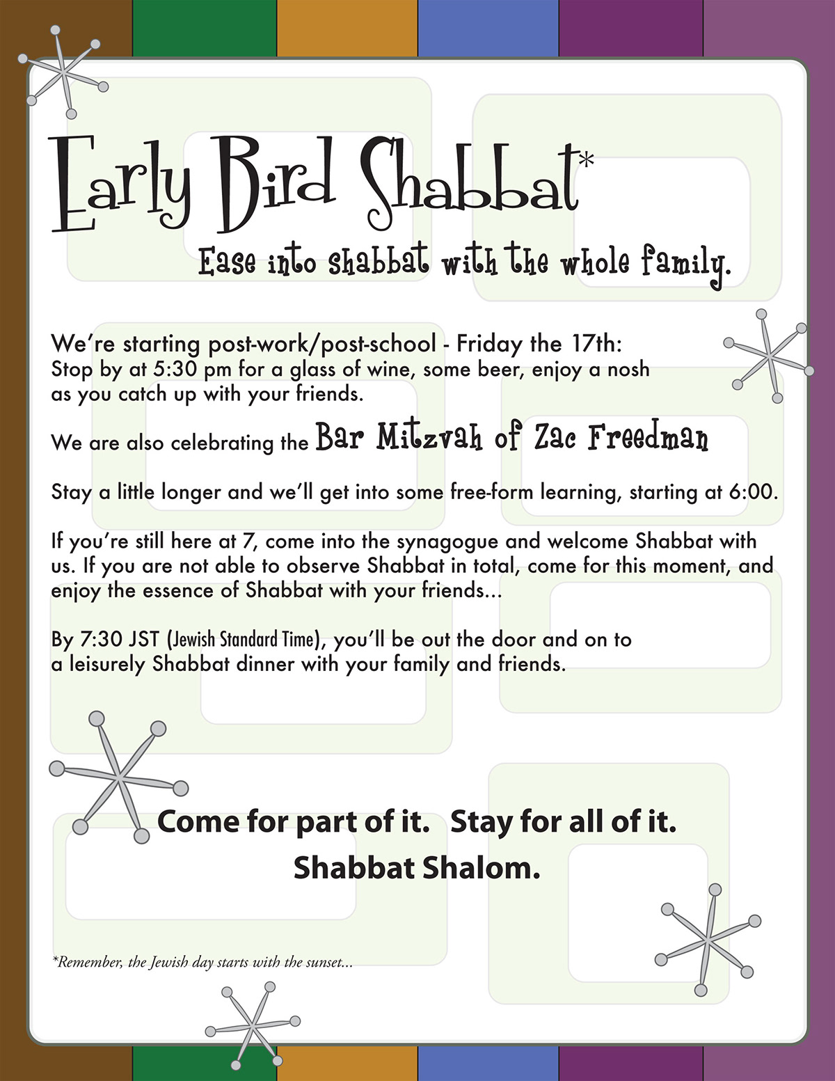
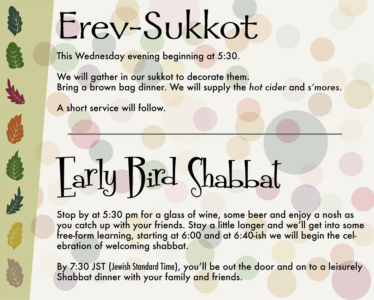
Early Bird Shabbat is an ongoing initiative by Congregation Ahavath Beth Israel. For its first year I designed the monthly promotional materials for the eblast.

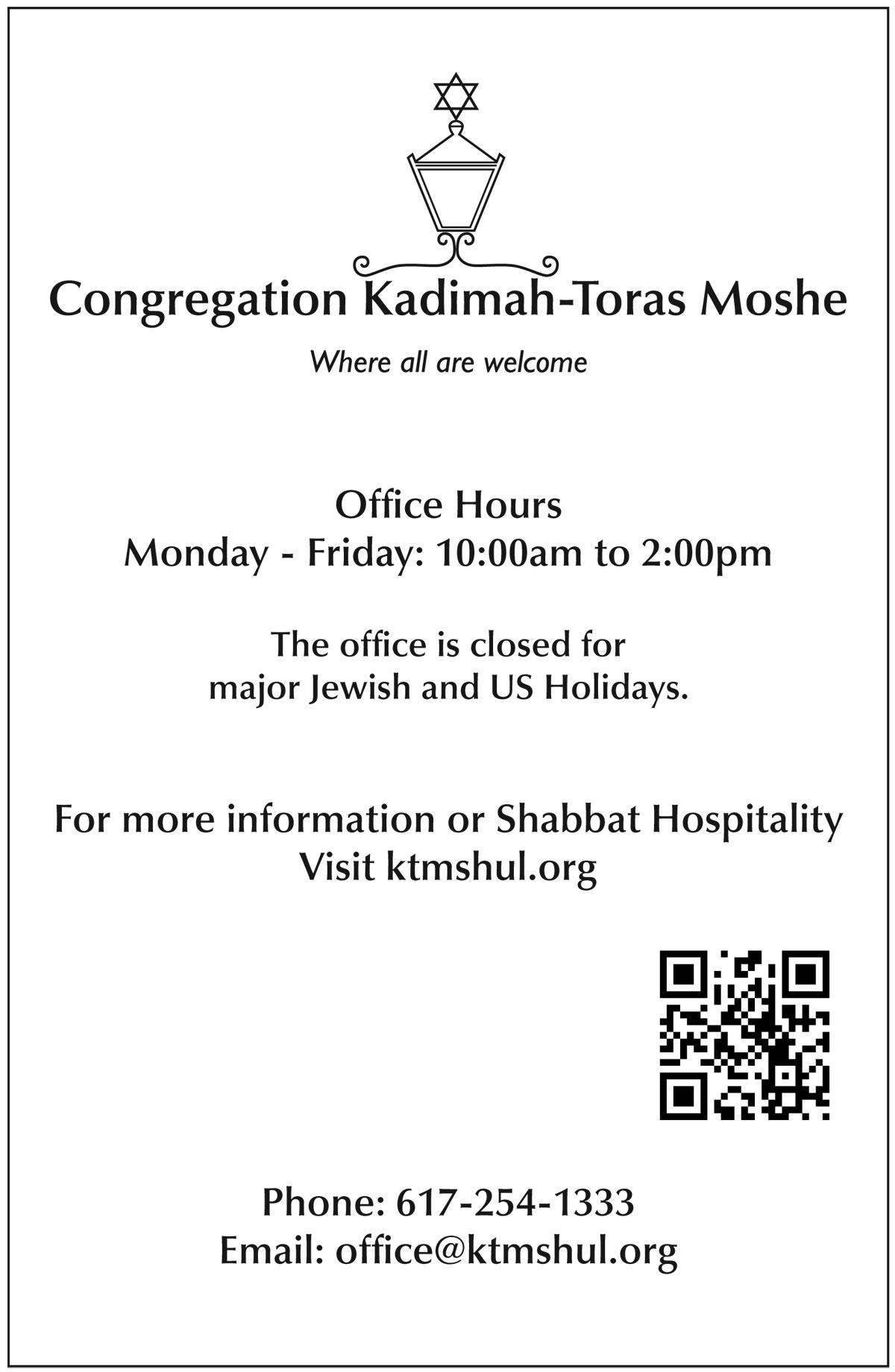
A simple and straightforward design for informational signage which included a direct link to the website through the QRC.


