A great coop for a couple of good friends for the new adventure they've decided to start: making they own beer.
They ask me to work on the "Il Malt Mostoso" logo and then on the beer labels (done with the great coop of our friend Luca Cislaghi that has done bottle drawings).
LOGO DESIGN
For logo design there was only a couple of request:
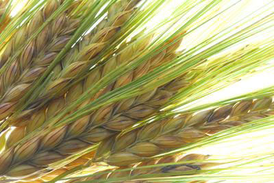
Element one: the presence of malt
Element two: the Duomo of Milano in order to identify the city

The basic idea (that was used also in the beer names) was to play with worlds.
In fact Malmosto (a typical Milano dialet expression that means "surly") could be modified in Malt Mostoso (of course "Malt" is malt and "Mostoso" is clearly referred to the "Wort", the liquid extracted from the mashing process during the brewing of beer).
We have decided to make a round logo, perfect for glasses, labels and others stuff so with few little mods on the "M" there appears a kind of ear of malt. For the Duomo the best way was to make it with few and simple lines in order to make it visible in any size.


LABELS DESIGN
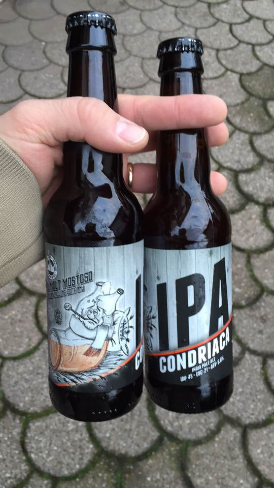
About first type of beer, it's an IPA and this time the word we have used to play was "hypochondriac" in italian "ipocondriaco" so with a little change first kind of beer was named "IPA condriaca".
One of goals was to find a funny subject and what better than a beer bottle themed with the name?
So for the IPA condriac the bottle was themed by Luca Cislaghi with a tipical flu set :) with also a surly earl of malt in the right side.

Facebook page teaser covers


Beer glass


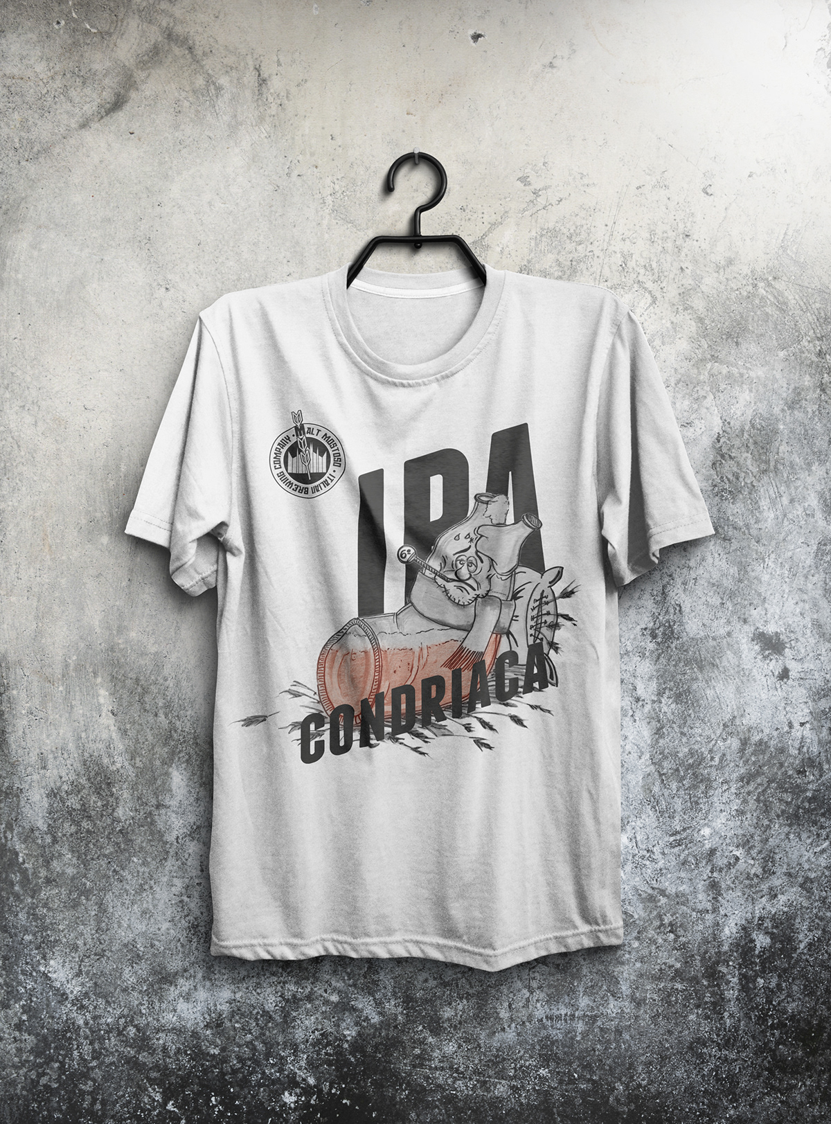
T-Shirt for supporters
IPA Condriaca bottles ready for beer!

And here we are!