FF Tundra
Designed by Ludwig Übele
Designed by Ludwig Übele
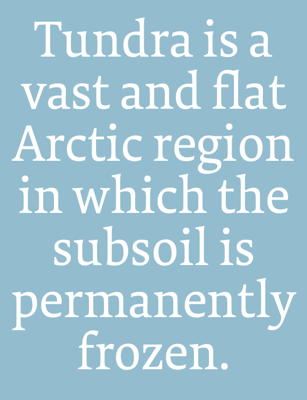
FF Tundra is a narrow running typeface with warm, curvaceous letterforms. To avoid a fence-effect caused by the narrowness, Tundra emphasizes the horizontal line with strong serifs and flat shoulders. The bold and open terminals help also to guide the eye along the line and therefore ease the reading. Tundra contains a big set of characters and comes in six weights from Extralight to Bold.


In the first sketches Tundra had asymmetrical serifs to accent the reading direction. Somehow it looked cropped, especially for the capitals.

Some characteristics of Tundra: moderate contrast between thick and thin parts, flat and strong serifs, diagonal stress, open and heavy terminals, flat and strong shoulders.

The lighter a typeface the more linear its stroke. The Extra Light weight has much less contrast between thick and thin than the Bold. The thin parts of the Extra Light and Regular are almost equal.
Read more about the making of the typeface on I love typography.
Buy FF Tundra at FontFont.
