
THE GOAL WAS TO REDESIGN THE STORE, INDICATING
THE COMPANY SERVICES. WAS ALSO INTENDED TO PRESENT
THE SPECIFIC AREA WHERE IT ACTS IN A MODERN AND EDGE CUTTING WAY.
Our client wants to renovate the store to attract more people. He wants it to have a modern perspective, taking into account current trends and the company’s future. Since the beginning, the idea is to have some information about the Mediterranean diet.
Creative Lemons intervention allowed Trincas to have more visibility. This way it attracted more customers to experience the kitchen that restaurant offers.
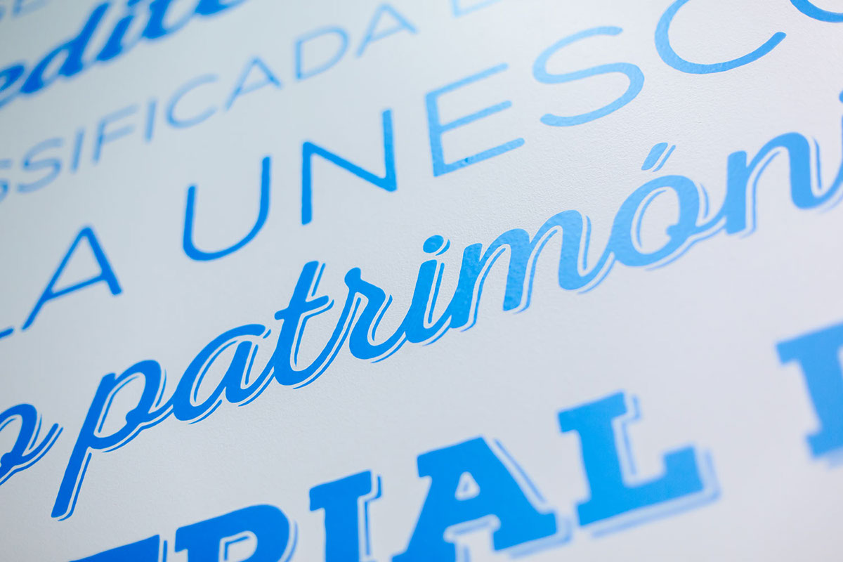
To give the client more confidence, we decided to try the blue and neutrals tones. These tones kept the consistency between the store and the environment. With cleaner and pleasant air. Using the previous logo and with this new touches, customers associate Trincas and the new “face-lift”.
The menus were thought to be clear and immediate. Some of them are on television screens showing the dynamism of the icons and other elements. We photographed all Trincas dishes as well as the decorative pictures in frames. The uniforms, walls, paper bases for trays, were developed to let the client comfortable and attracted to this new look.


MEDITERRANIAN WALL


FIXED & TV MENU


BOARD BASES


—
Creative Lemons © 2014
Client: Trincas
Braga, Portugal
Store Design


