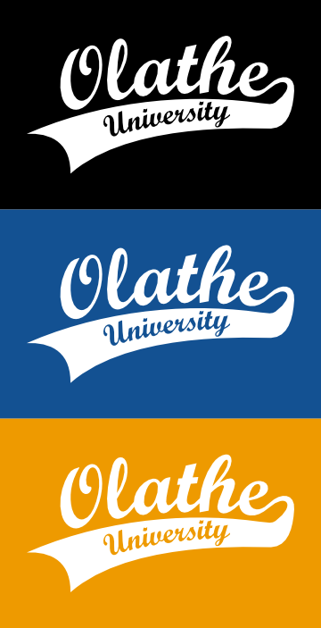
When the City of Olathe implemented a new in-house training program, they dubbed the new initiative, "Olathe University." Part of the rollout of the new program was a contest, in which employees were asked to design a logo.
From the start, I envisioned a sports-themed logo--something you might see on a uniform.

I started with a Windows system font called Script MT Bold. I used Inkscape to place the city name on a curved path, and rounded-off flat areas on the ascenders of the lower case letters.

A single-color version of the final product. Other versions are demonstrated below.

Versions of the logo using the official city logo colors.
Another single-color version.

Two-color versions of the logo, using the official city logo colors. The first of these examples was used on t-shirts that were distributed to all city employees.

