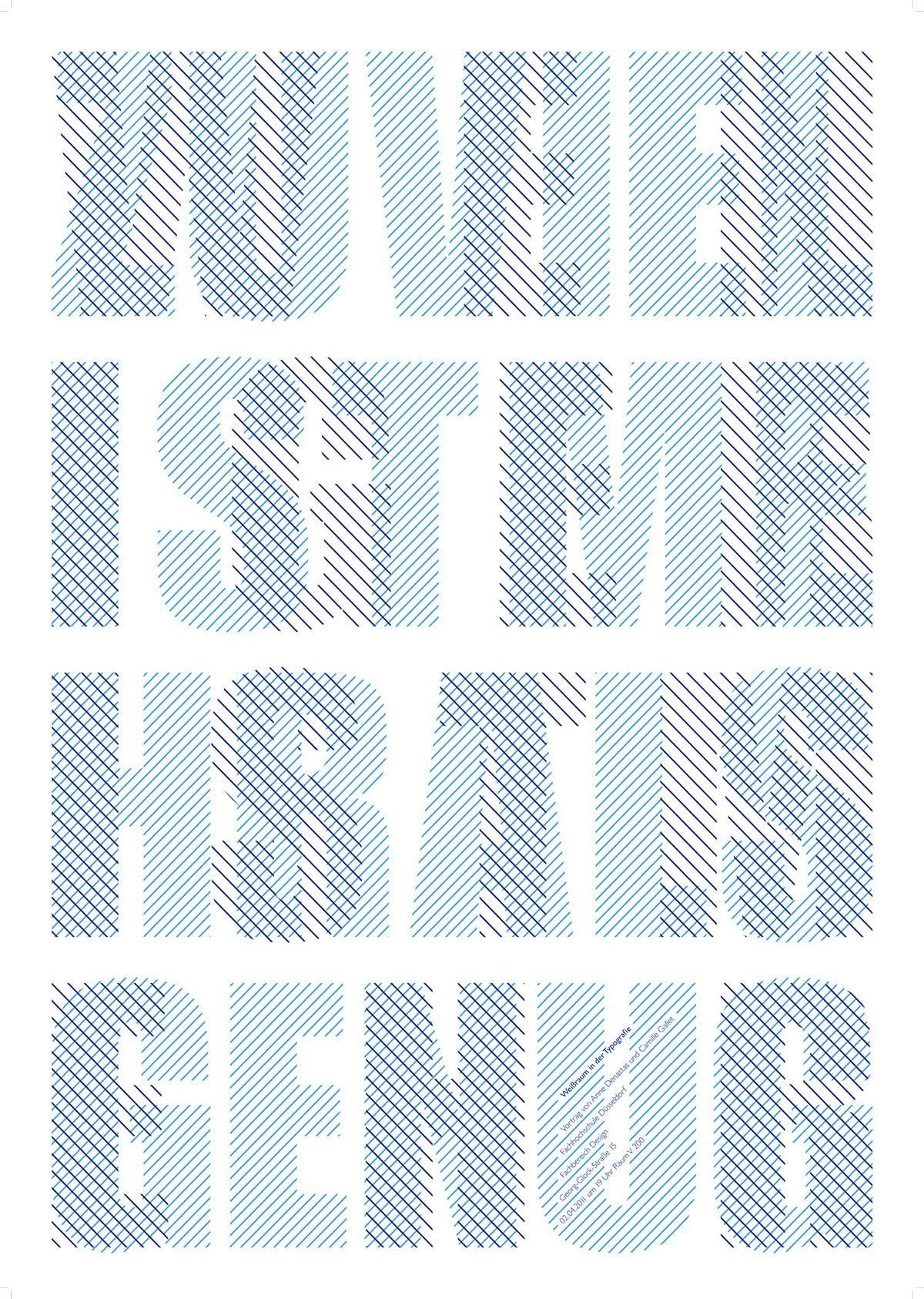
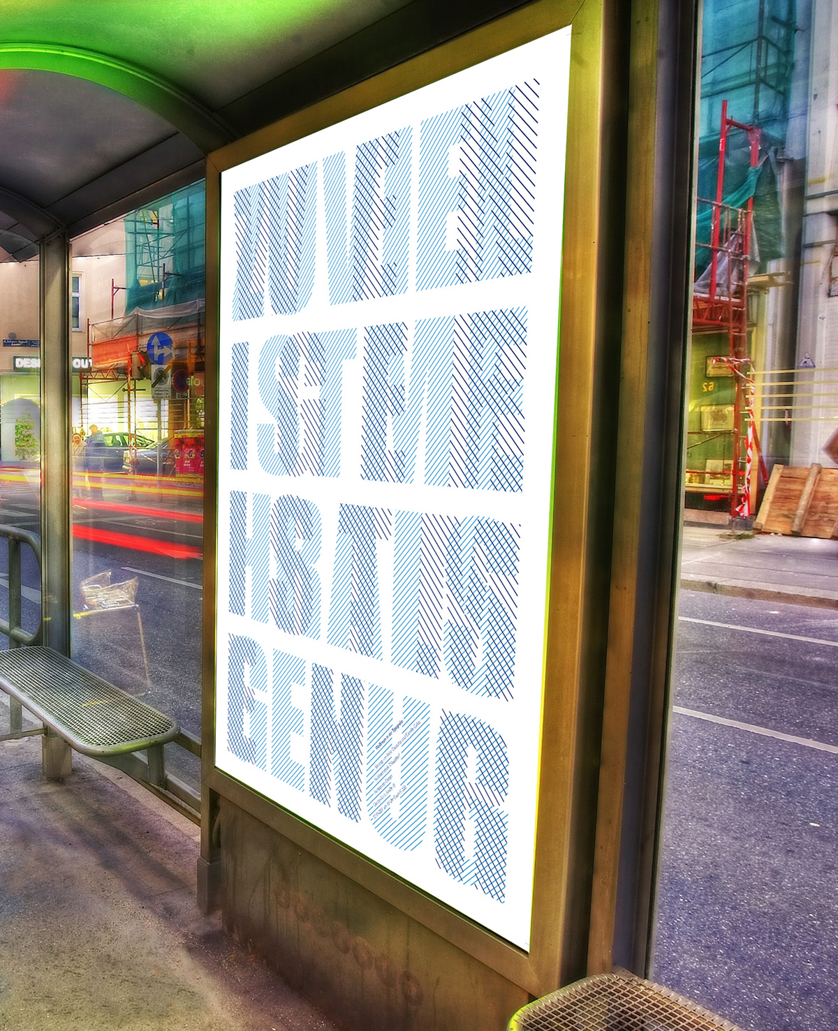
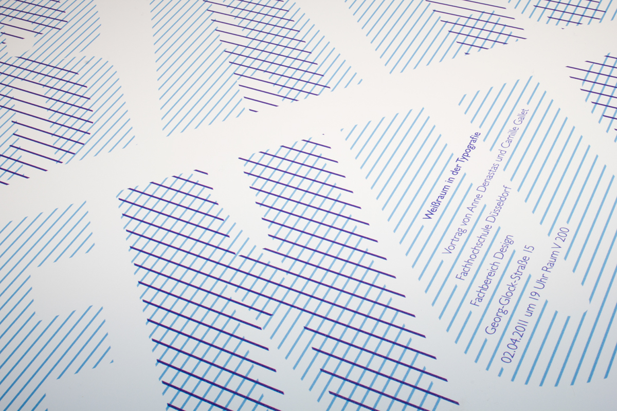
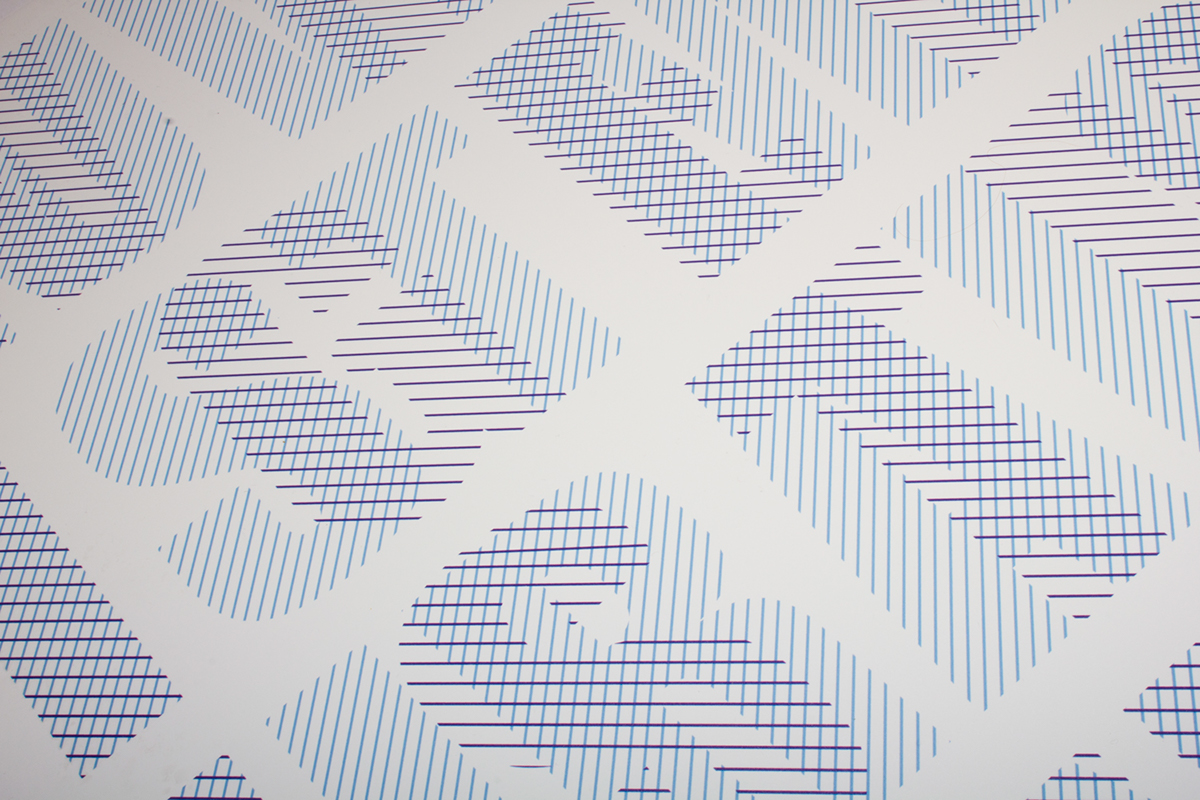
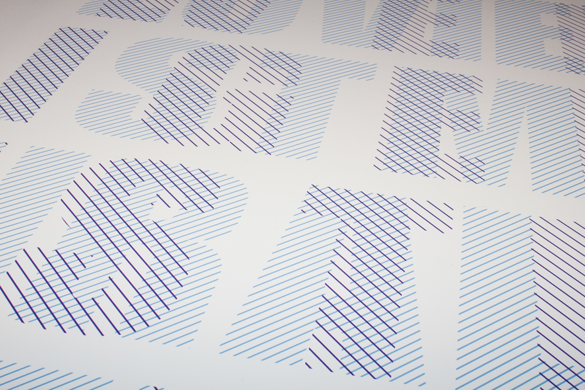
The white space in typography
A poster for a dissertation at university
A poster for a dissertation at university
I created this poster for a dissertation taking place at university. The dissertation itself was about the use of white space in typography. For that reason i decided to create as much white space as possible. To highlight that i chose two different messages. In the background the text says "Too much is more than enough" and in the foreground it says"less is more".