


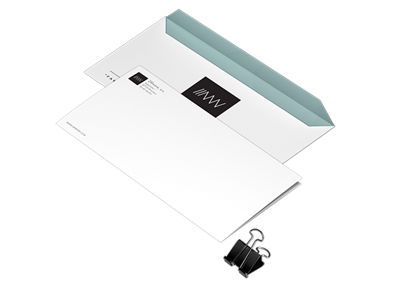
2Mware rebranding is based on simple vector graphic, where each line represent individual element of name. In mutual fade-over they create basic identification of 2Mware corporate identity - logo. We shifted logotype from color and shape icon combination with typography into unique and characteristic geometric structure. Its simplicity complements brand visual based on low-poly illustrations.


Thanks for watching from Provocation bureau


