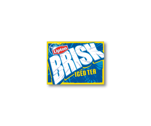
Brisk Iced Tea Word Mark
Iced Tea, Nice Tea
I think all of the Brisk Iced Tea logos have been ugly. There, I said it. It kind of looks like an old person trying to appeal to a younger generation through the power of outdated snowboarding graphics from the 80s. I'm sure many of you would agree.
Brisk has tried to correct its image, hiring agencies such as Safari Sundays which "resulted in a 57% volume increase in 1 year and double digit growth over the next 4 consecutive years making Lipton Brisk a $1 Billion dollar brand."
I can't argue with numbers like that, but I still think the logo isn't very attractive.
Now, I love Iced Tea and I was sad to see a product so beloved to be adorned with a messy wordmark.
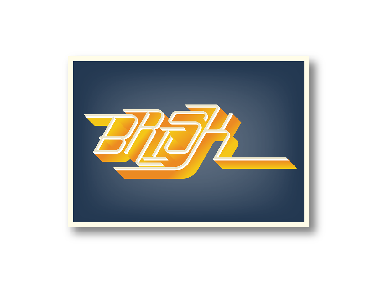
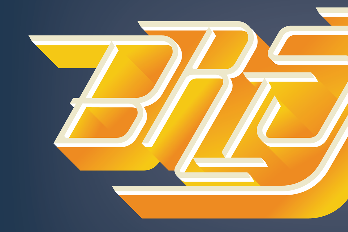
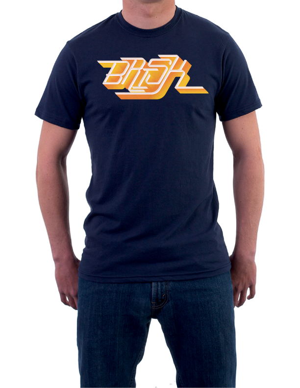
So, I spent some time working on a new one.
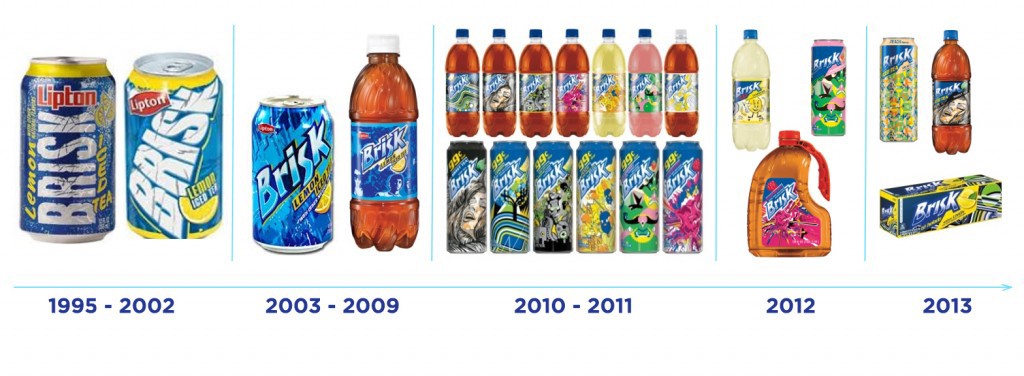
Brisk Iced Tea is property of LinPepCo. I do not own the respective images.
Timeline from:http://blankyouverymuch.com/blog/2013/06/the-evolution-of-the-brisk-iced-tea-can/