

Type Factory Brief: This brief was based around a fictional typography museum called 'The Type Factory'. The requirements were to design the museums identity and promotional material including a booklet and posters. I created a logo from an assymetrical box and futura typeface, of which some of the letters linked and I aimed to give the identity a ‘Bauhaus’ feel to it by using geometric lines and grids.


The ‘Type Factory’ accordion fold book has 18 pages printed onto 9 sections. The book was designed to stand up as to create a shape and not lie flat and as it is accordion fold, the book can completeley unfold to create one long box shape.


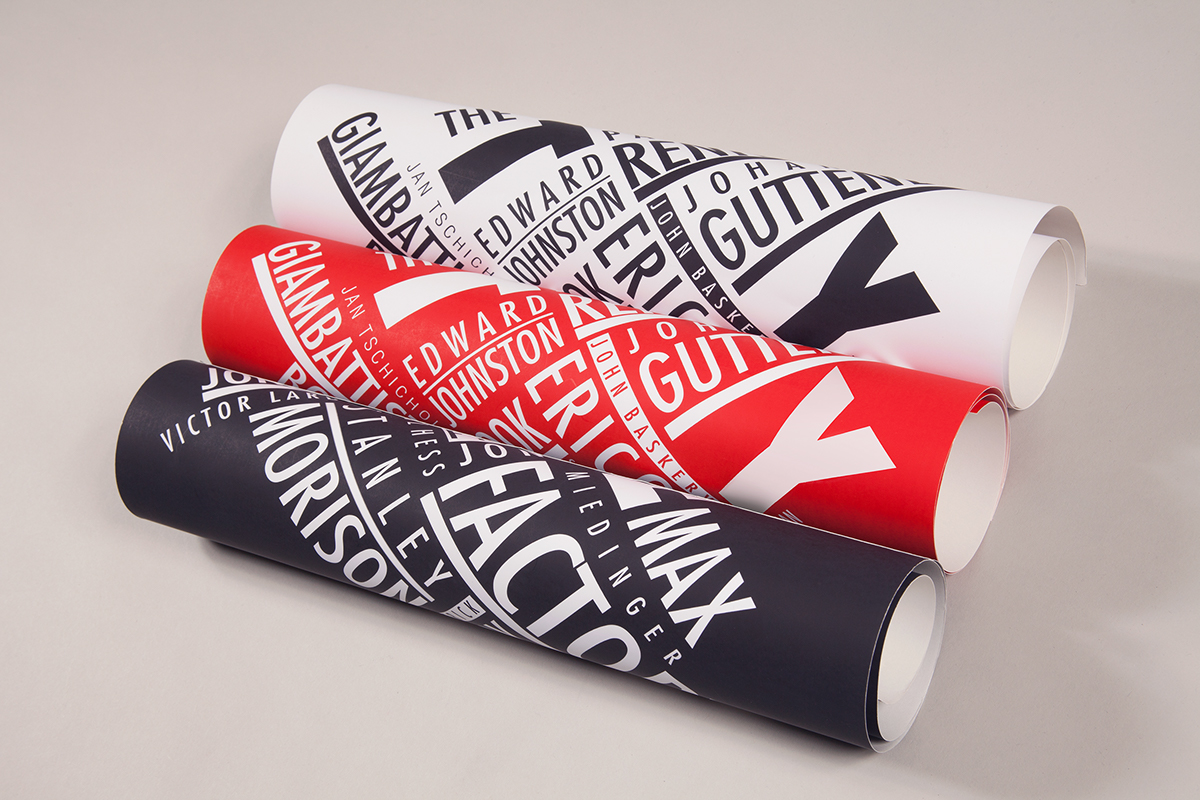
I produced a set of 3 A2 posters for the museum based on Paula Scher's 'Best Of Jazz' poster.


As part of the promotional material, I created a piece of direct mail that would be sent out to museum members. The words ‘The Type Factory’ were cut out of magnetic strip to form small fridge magnets and were sealed in a small bag with a label that matches the promotional posters.

_
Photography by Alex Hurst and Rachel Brooks.
