HC Connect is the internal website at Kentucky Housing. When I came onboard, it was in the middle of an overhaul. The back-end work had commenced but we were still trying to get the front end looking good. They had comissioned a logo from my predecessor who had given them the following (through rigorous R&D with staff and managment).

Using the prompts given to me: show connectedness, be modern, use KHC's corporate logo, must be square, and use of old arrow was devisive (have one version with motif but shy away from); I created a set of four logos to go from.
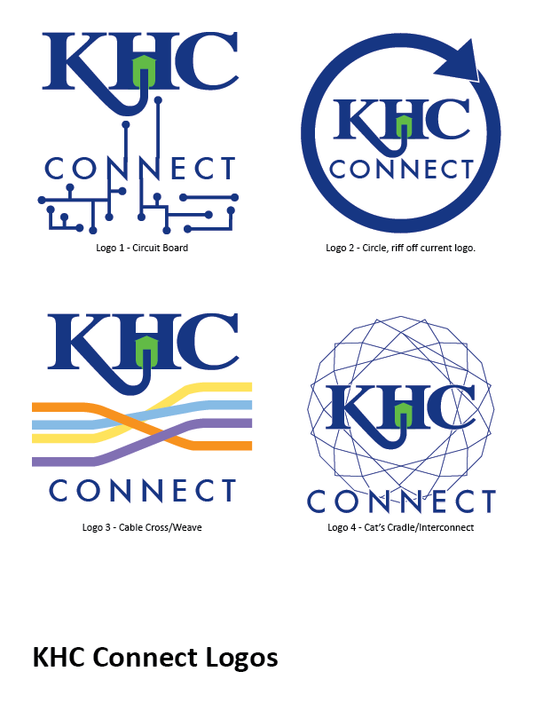
I had two logos that were favorites. I made more derivations from those. Expanding and bringing in our complementary colors.
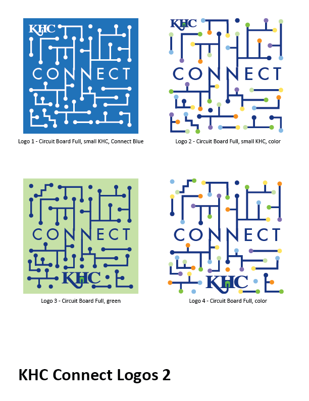
Multiple "Circuit Board" logos. Expanding on the original concept.

Expanding the two logos, "Weave" and Interconnect.

Finally, six of the most liked logos were picked and put at web size for a panel to discuss.
From there, the fourth logo, the blue "Interconnect" matched the KHC Connect look the most and was more versatile for the future.


