

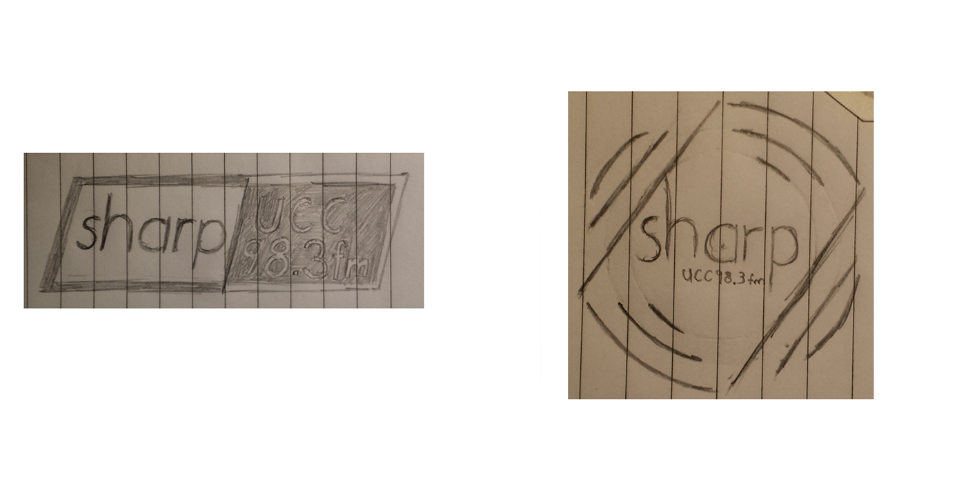
Here I have 2 of about 10 initial sketches that I sent to the client. These were the two they liked the most and wanted to develope further.
I based the right hand one off the old vinyl records. The radio show plays mostly indie and alternative music and I felt this was a node to old times.
The left hand side was based of the literal name "sharp". The font used was Century Gothic italic, and I tried to create some contrast with the various black and white themes.
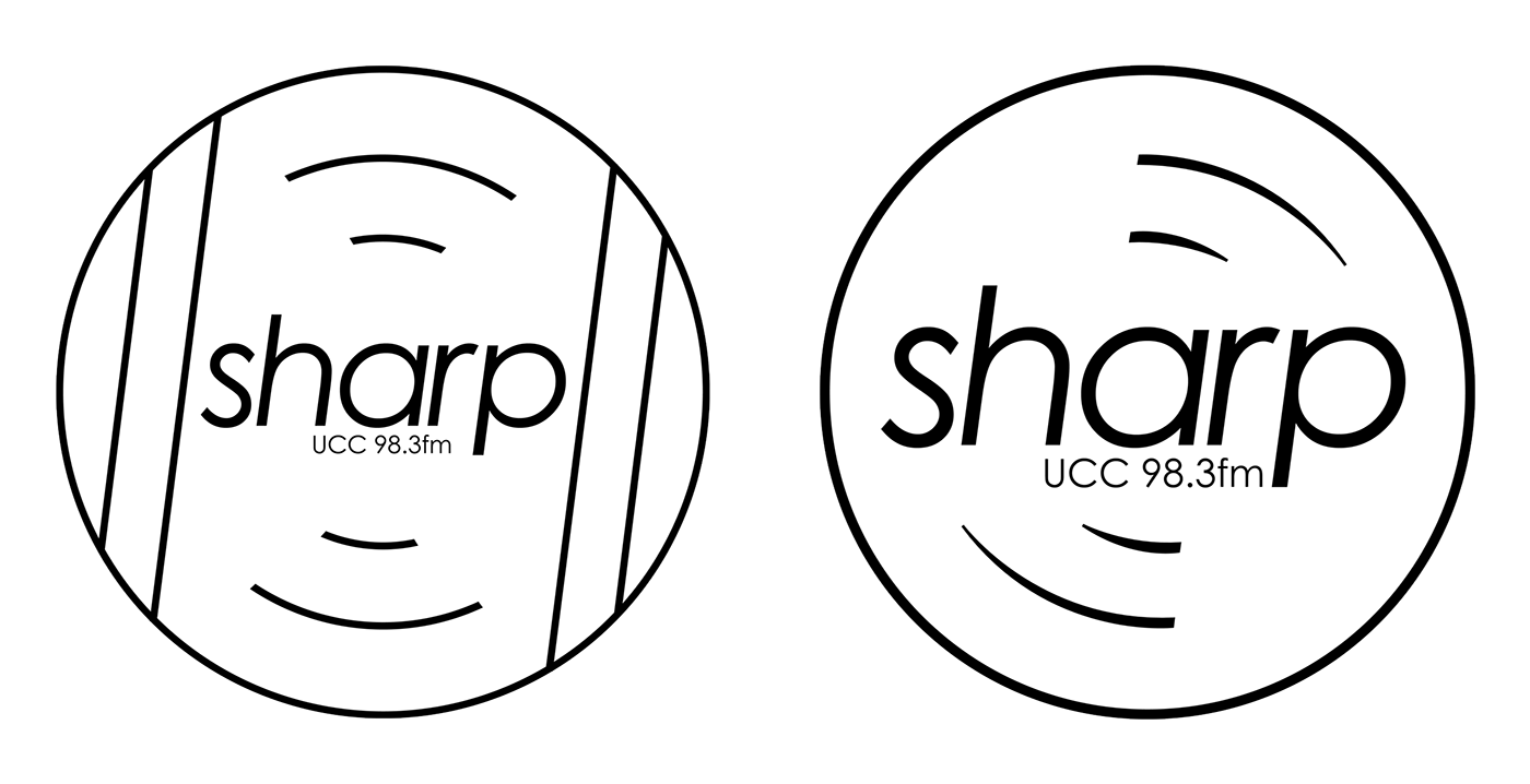
2 of the 3 final versions the client could choose from. In the end these were left to the side.
For the posters I went straight into photoshop laying various pieces around and seeing what layouts I could come up with. The one on the left was the final and I have a larger version below for you to see. The one on the right was dismissed.


