(This document describes the page content, along with my design choices and decisions made along the way. For an interactive view of the final mockup, check out the InVision project.)
Making It Pretty
For the next iteration of my prototype, I shifted my focus to the visual side, adding another level of fidelity to the mockups. For this, I took my wireframes to Sketch and began the layer of gloss.
Starting from the top of the application's schema, I began this last iteration with the log in screen.
Log In
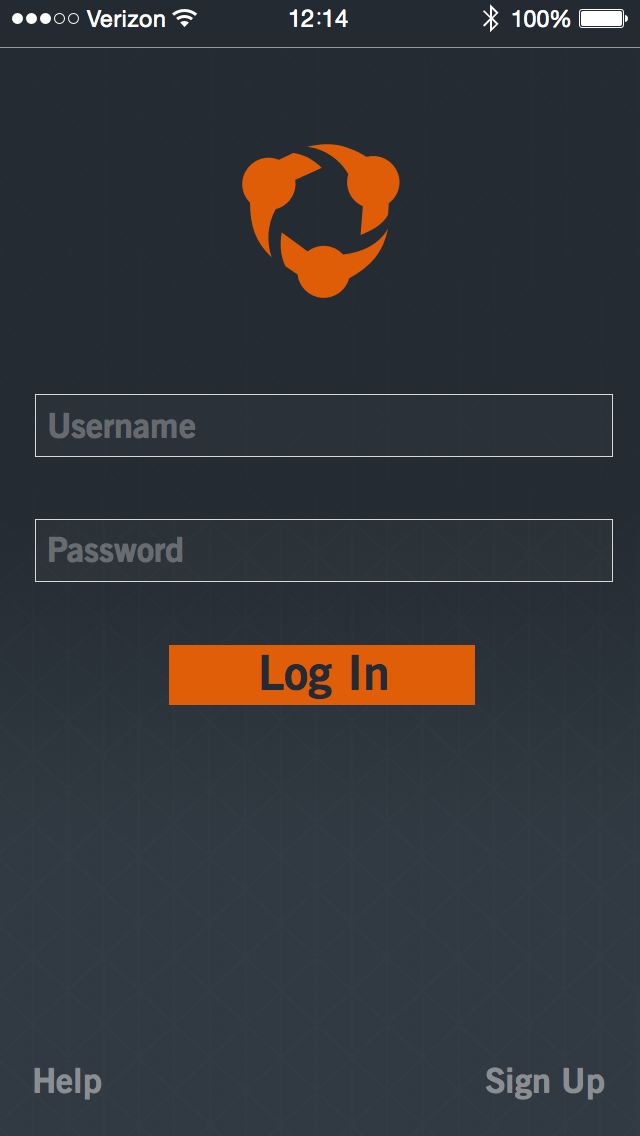
Not much changed here from the wireframing stage to the final mockup. Initially, I intended to include some sort of volleyball-themed background for this screen; however, in the name of a minimalistic approach along with my "card" paradigm, I decided against this. Instead, a subtle gradient lives behind the content of the log in page, with a very light triangular texture applied.
Landing

The landing page serves as a "Home Base" for the application, and serves to highlight recent or important data. The top of the view shows a title and a logo for the current team being accessed. Demonstrated below that is the most recently played game for the team. Clicking this simple score card will link you to that game's entry on the Games page. Other team notifications also appear on this interface. For example, when a team stat record is broken, an update shows up on the home page feed. Clicking this takes you to the related player's individual stats on the Roster.
The bottom of the page gives lower-level navigation to the main three Information pages. These links are also available in the sidebar menu. I included this redundancy to create ease-of-access for users coming from this page, as well as to maintain a consistent navigation structure with the nearly-ubiquitous sidebar links.
The bottom of the page gives lower-level navigation to the main three Information pages. These links are also available in the sidebar menu. I included this redundancy to create ease-of-access for users coming from this page, as well as to maintain a consistent navigation structure with the nearly-ubiquitous sidebar links.
Sidebar Menu

The sidebar, or "hamburger", menu lives to the left of all "main" pages- i.e., those on the Information level, as well as the home page.
As it exists off to the side of the main content and feels somewhat "underneath" the page, the sidebar menu is styled similarly to the high-level log in page, sharing a similar background gradient and texture. The current page is highlighted by brighter, heavier text, along with a slight back-lighting. The other links take you to the various other Information-level pages.
Notice that the iOS status bar is shaded differently here. As the top of the gradient background is nearly the same color as the status bar is regularly in-app, I changed the shade for the sidebar view. This also avoids any transparency issues in iOS 7 or 8.
Stats
The Season Stats page contains a lot of content - as such, I split it into three "scrolled" views here.


Volleyball has a hodgepodge of statistics to keep track of - keeping this in mind, instead of inundating users with a wealth of information, I split the main portions of the season statistics into two different locations - individual season statistics are nested under each player's entry on the Roster, and all other team statistics live here. This is a pretty big assumption, but because I based this off of data I recieved from my interview process, I feel confident in my choice and this would be a major focus of mine in a testing phase.
Major categories of team stats are listed individually on separate cards, with the statistics themselves contained within a traditional chart layout, again, a call-back to pen-and-paper stats that many coaches are familiar with.
Roster


The Roster page shows all players on the volleyball team, organized according to jersey number. Separate cards hold individual players, and from the default view, give some basic information on the athletes such as name, class, position, number, and a profile image. By tapping on a player card, it is expanded out to show that player's individual season statistics. This data is organized very similarly to the Season Stats page, and acts as an extension of that information. If needed, this individual stats chart can be scrollable, and tapping anywhere outside of it will collapse the player card back down to its standard size.
Games

Providing the links to the main fuctionality of the application, the Games page serves as a portal to the Interaction layer. Each game in a particular season is represented as an individual card, titled with a number and the date. Prominently featured on the game card is the match score. Below that is a chart containing each match's score breakdown by team. The bottom edge of the card contains "switcher" tabs, allowing users to view the game's video clips, as well as the game statistics.
I included the iOS page control indicator dots here, signifying the game card's location in relation to the others in the season. Edges of other game cards are shown on either side of the current game card, giving a visual hint of more content existing just off screen. A swipe left or right (that is, depending on context) will move the focus to another game card.
Game Video


Hudl has a heavy focus on video - with good reason - so the Game Video page is arguably one of the most important in the whole application. It takes some inspiration from other mobile video players, like YouTube's interface for their Android application. In a landscape view, the video itself is featured at the top of the page, with standard iOS controls below it, centered vertically on the page. Along with these controls, clip data, like the playlist and clip name, are contained together on a card. The bottom maintains the tab switcher, similarly to the game card.
The video page is contained within its game's card, along with the game's statistics, and exists on the left half of the card. As such, tapping the Stats tab or swiping the left brings up the Game Stats page, which takes up the right half of the card.
Game Stats


The final view in the prototype is the Game Stats page. This screen presents statistics spectific to a particular game, and similar to the Game Video page, lives inside of a game card from the Games page, albeit on the right half. Following from this, I designed the page with the features of the Game Video and Season Stats pages in mind, maintaining consistency across the application. The tab selector appears at the bottom of this screen as well, making it possible to navigate to the corresponding video for the game entry by tapping or swiping. Neither the Game Stats nor the Game Video pages contain a method of accessing the sidebar, as they live inside of a game card. In order to access this main navigation method, the user must return to the Information layer, since these two pages exist below that, on the Interaction layer. A "back" button is provided in the upper left to allow for this.
Included as content on the page itself is another match score breakdown, reiterating information from the containing game card. Additionally, a team total section for the match is shown, with individuals leaders displayed in each category. Finally, a "Top Player" is selected based off of total kills, aces, and blocks performed in the game.
Final Thoughts
I had an incredible learning experience as a result of this project. I was able to interact with real-world users and create a solution for these people. I was able to employ my design skills to disseminate data and ideas from their input and ultimately create a prototype product that addresses many of their points of interest. Additionally, this project exposed me to a wealth of visual design- including workflows, techniques, and software that I previously had very little exposure to.
Ultimately, much like any designed thing, this project is just an iteration: there's always something that could be improved upon. I would love to further iterate upon this base, and I look forward to continuing my journey of design.

