


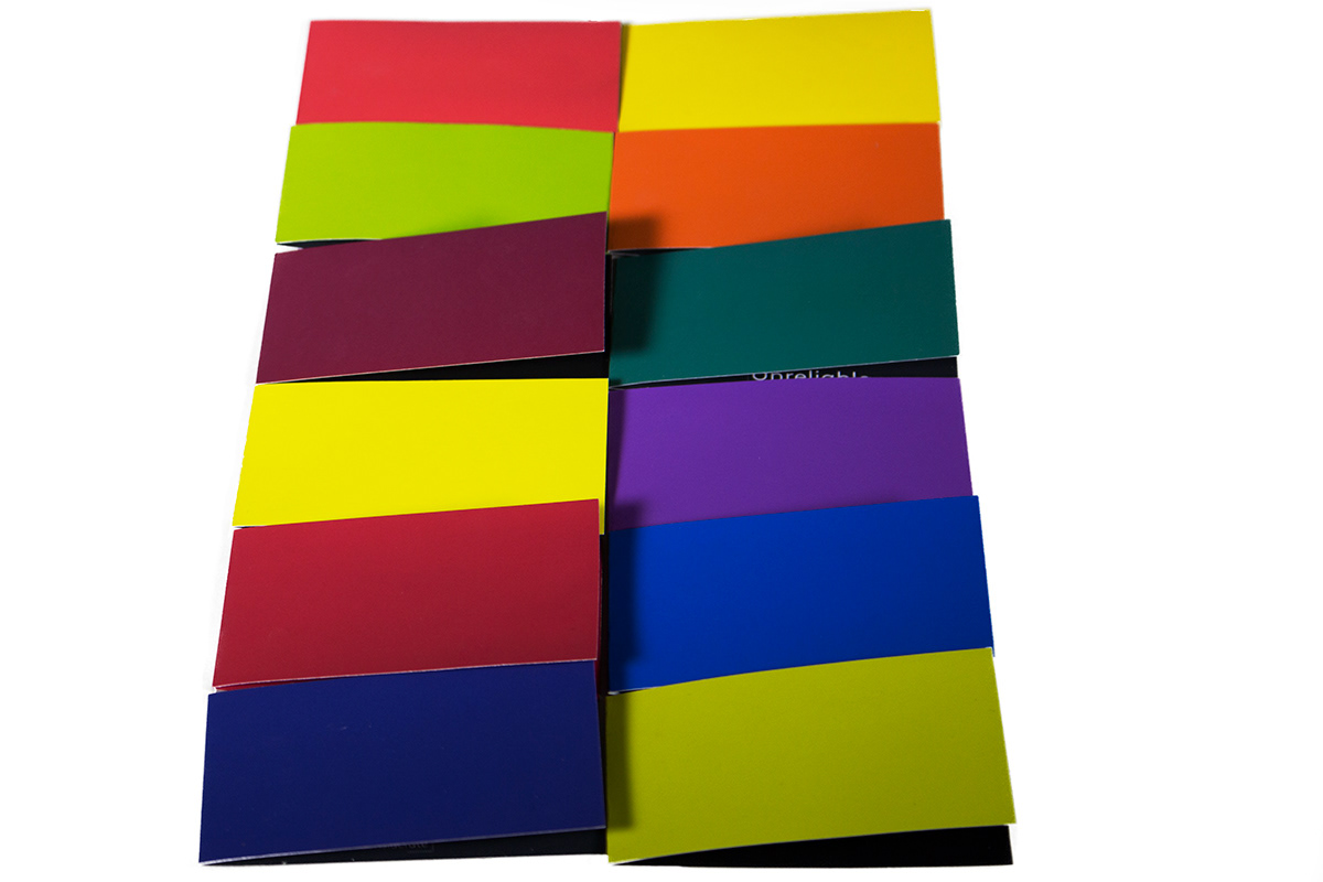
The personality of a brand is highly determined by its colour. Each brand has specific emotive elements used to attract its consumers, and colour emphasises those elements. For example yellow is most often perceived as warm and red is most often perceived
as bold.
Through the exploration of duality and the help of the colour wheel, it can be understood that colour can create positive and negative impacts on brands. The white displays the positive usage of colour and the black displays the negative usage of colour for another brand similar to that of the positive. This helps the viewer appreciate the originality of a brand and how the use of colour can be aesthetically appropriate on just that specific brand and not on another.
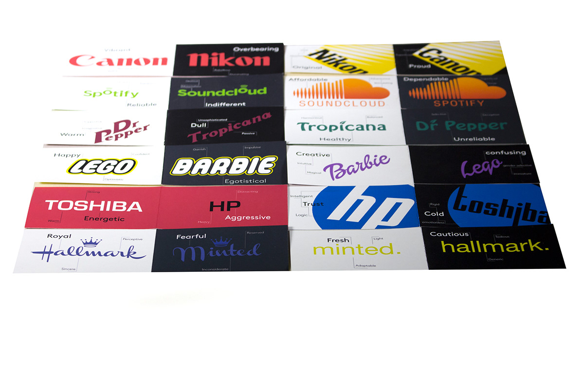


Epson printed paper sized to business cards.
Please note that each original brand image and font belongs to them. They
were used and modified to aid an assignment for Aki Nurosi's Colour Theory class.


