
New Logo
The New Logo
We still use “Hi” word as a logo to keep the originality of the company to keep the originality. We change it into square to make it look more bold and more represent technology. For the colours we combined green and blue, become turquoise. Blue represents trust between HiMAX and their clients and growth of green because HiMAX is the new brands. So, turquoise represents open communication and clarity of thought.


We focused on developing brand identity and advertising. Hereby, we would like to propose our service to construct a new visual identity for HiMAX. As a new brand growing in the market, our team thought it’s substantial to give fresh, distinctive, and bold impression to consumers. In order to achieve that, we would like to revamp HiMAX official website and designing your company’s advertisement. This campaign would benefit the brand to stands-out from their competitors, and hopefully convince the audience of their products.


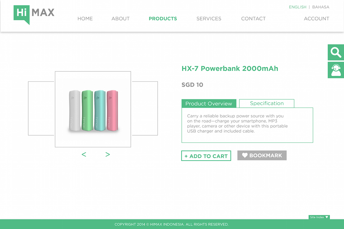

Scrolled horizontally on screen. If you click "full specification" button,
the specification page will appear vertically, or under the page.

"Full Specification" page


