

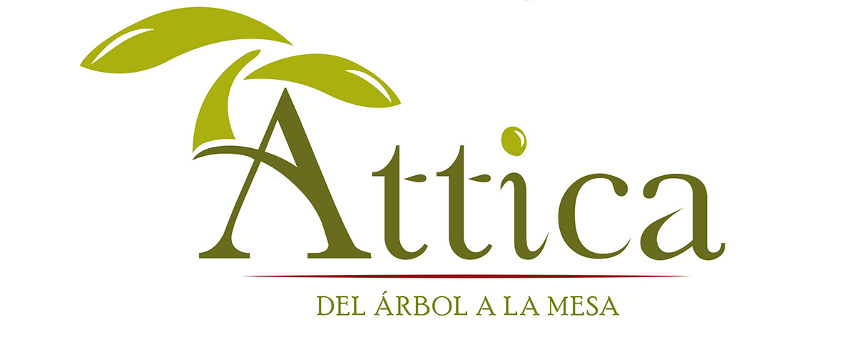
This is the logo for Attica.
Attica is a gourmet olive oil product.
From the tree to the table
Here is the beginning process of how this logo came about.
The Logo Process
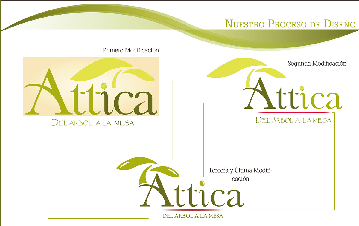
The Reason behind the isotype and logotype itself:
1- The name arises from the place Original where were discovered the first plantations Olive: ATTICA, Greece.
2 - The illustration through a olive cultivation symbolizes an olive tree to shape our product.
3- This slogan describes the route of olive ends deliciously this product. transition olive color green to red black.
4- The olive is our logo key because symbolizes renewal, resistance and peace

The Color Palette

The Finish Product

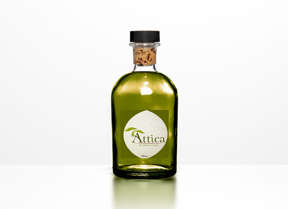
Appreciate and Enjoy it
Thank you!


