Having just received some roughs for their PET 600 bottle from another agency, Coca-Cola asked B-Side to improve the overall look and feel of the campaign, as well as the creativity behind the copywriting. The idea was to communicate the 3 occasions in which the 600 bottle is consumed:
We came up with a way to communicate this without falling into the obvious, but we couldn't go much further either, so we found some pretty common insights, related to each of the three situations mentioned above.
We came up with a way to communicate this without falling into the obvious, but we couldn't go much further either, so we found some pretty common insights, related to each of the three situations mentioned above.
Aesthetically, the client often complained about the overwhelming presence of the backgrounds in their previous outdoor campaigns, but they still wanted to communicate street related situations. This soon became my first challenge.
I chose a more chromatically desaturated, clean, almost artificially made situation, and included just the few necessary objects for the viewer to identify each context.

Copy: Open it with your music. Enjoy it ice-cold on the street.

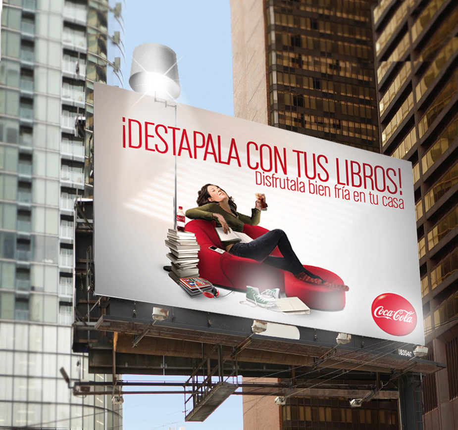
Copy: Open it with your books. Enjoy it ice-cold at home.

Copy: Open it with wi-fi. Enjoy it ice-cold at the bar
The following are some layout variants. The client wanted some bottle opening up close and more people involved in the scenes as well.

Copy: enjoy it ice-cold between home and work
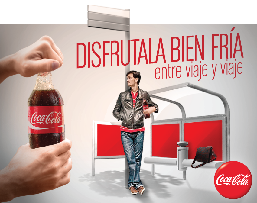
Copy: enjoy it ice-cold in between buses

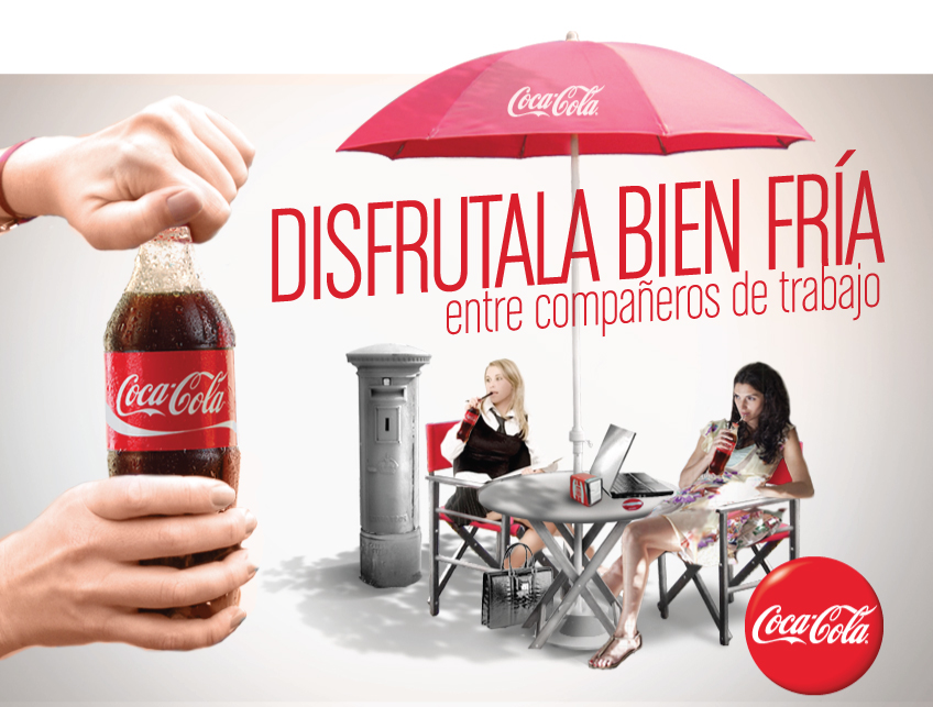
Copy: enjoy it ice-cold between work mates
Copy: enjoy it ice-cold between work mates

Copy: enjoy it ice-cold between college subjects

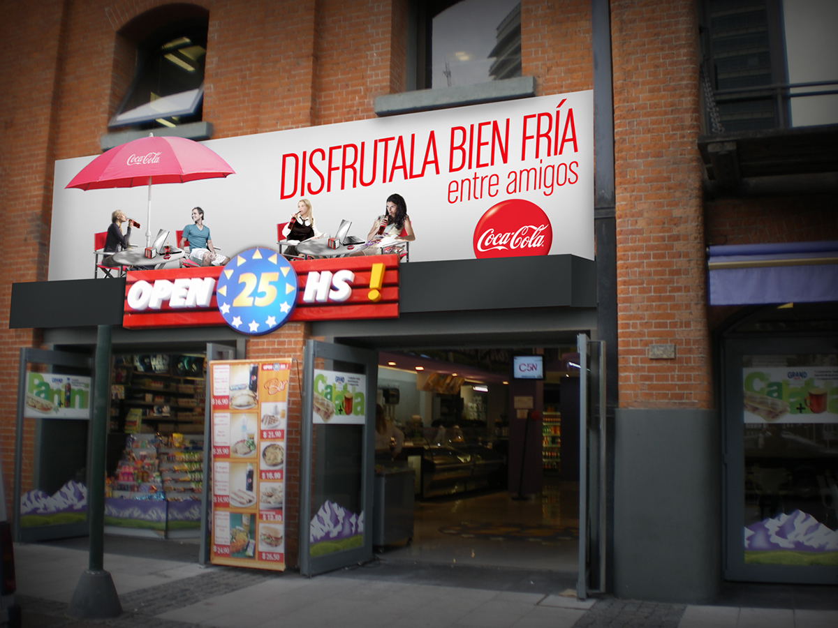
Copy: enjoy it ice-cold between friends
The following are some non-traditional applications for the billboards, which basically consist of pop up elements, such as the lamp (which is meant to turn on at night), the umbrella and the bus stop. We also designed a fake second floor for a corner shop.