


My Campaign calls;” Palette Mahkam”. The idea is to introduce myself not only as a graphic designer, also as an experienced fine artist.
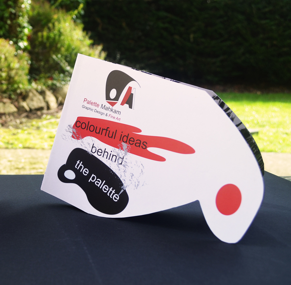
First idea was to have an eye-catching motto/slogan which suits my campaign. Personally, this part is all about business and how an advertisement can affect others. So, what I tried to do was to make the slogan sleek by using short, straightforward words, but meaningful at the same time. My motto appeared to be “Colourful Ideas Behind the Palette”. As a fine artist, I wanted to show my skills and background in fine art as well, so I was thinking of using palette as a symbol. As we all may know, artists use variety of colours on paper or canvases or other materials to express their thoughts. Basically whatever is in their mind is supposed to be appearing on the public view. I used magic word “Behind”, to make the motto a bit more thoughtful and simply draw more attention to my art work samples.
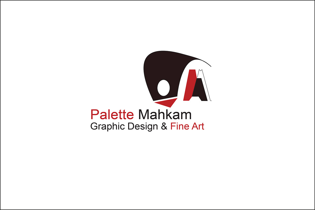
Brand Identity for Palette Mahkam Campaign. I have created a logo as just a symbol of palette with two initial letters of my name and surname. I am planning to introduce myself as a conceptual –logo designer, which logically means skills in typography and creation of brand Identities. I love any kind of designs that comes with a bit thought behind it, and that would be my main strength. I decided to use “Palette Mahkam” under logo as an individual item to just be clear about my company and campaign, not my name. The design feature of business card is curved shape to show versatility and softness of the theme. Colours that I played with are white, black, grey and red, and the reason for using those was that I wanted at least one neutral colour to keep my hand open to manoeuvre with design style.
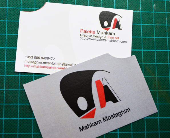
I have created a logo as just a symbol of palette with two initial letters of my name and surname. I am planning to introduce myself as a conceptual –logo designer, which logically means skills in typography and creation of brand Identities. I love any kind of designs that comes with a bit thought behind it, and that would be my main strength. I decided to use “Palette Mahkam” under logo as an individual item to just be clear about my company and campaign, not my name. Business Card for Freelance Graphic Company 'Palette Mahkam'
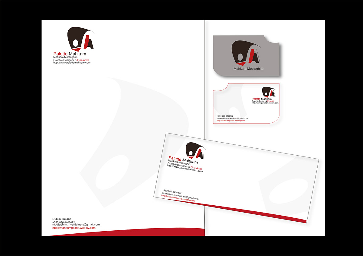
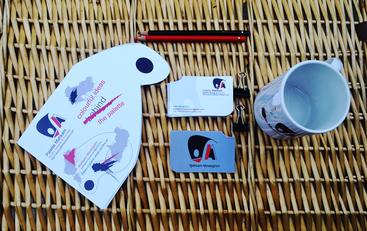


Colours that I played with are white, black, grey and red, and the reason for using those was that I wanted at least one neutral colour to keep my hand open to manoeuvre with design style. I intended simply play with negative and positive space. Another reason was that the name of slogan was “colourful ideas”, so I could use any colours, so would be better off playing with darkest and lightest colour in palette to give all variety of using colours between and transfer this idea in the end to the audiences.
Brochure Design for Palette Mahkam-2012

Brochure Design
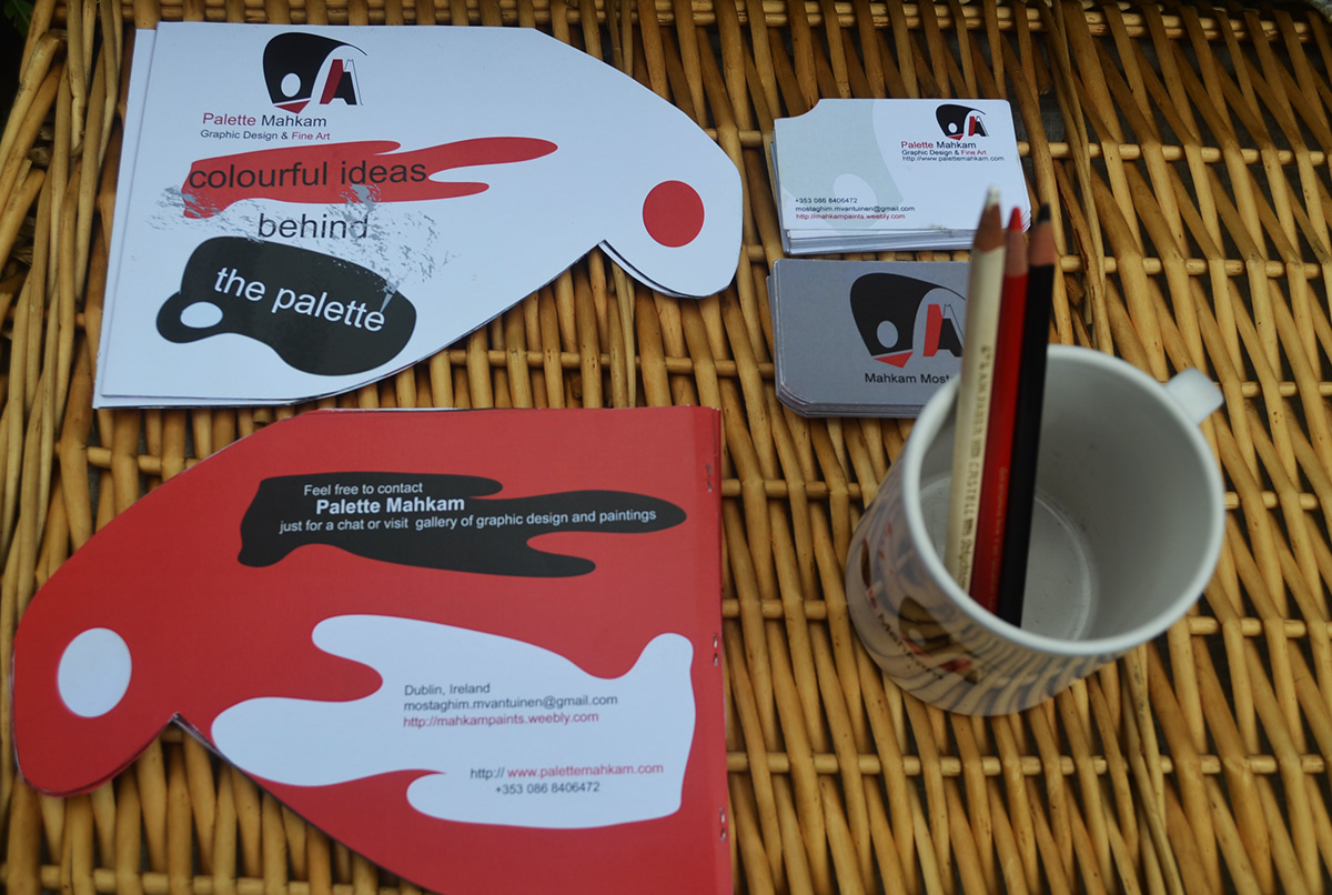
Flyer design and brochure match with the shape of business card and palette is shape in abstract from to be shown. In my opinion it has always been more appreciated to be not too simple, and straightforward in your design, as it is supposed to be thoughtful and creative. So I go with abstract structure generally.


For outdoor media campaign, I used bus stop billboard, which I think is one the greatest place for a fine art and graphic exhibition or campaign to be appeared. Opposite to flyer and brochure colours, I, on purpose used splash of colourful brushes into a white palette to make it more eye-catching as it is supposed to be in a very large space.

Thanks for watching


