

Re theming the App for Winter
I rethemed (didn't draw original) the already existing assets to create a winter scheme. The style was focused on winter rather than Christmas so it could be used beyond Christmas. or the splash screen I wanted it to give the feeling of snow falling at night, dark but the logo immuniates the screen.
Splash Screen
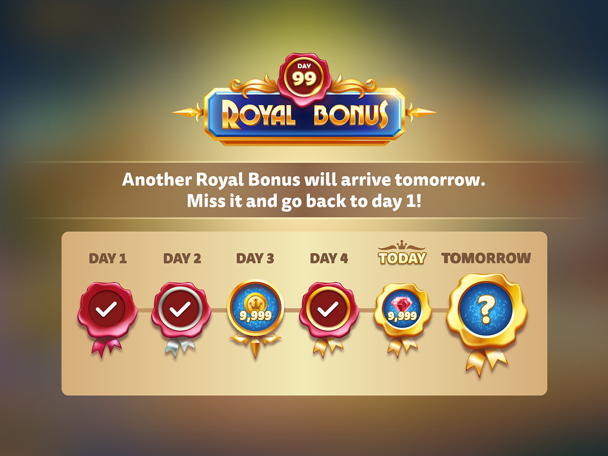
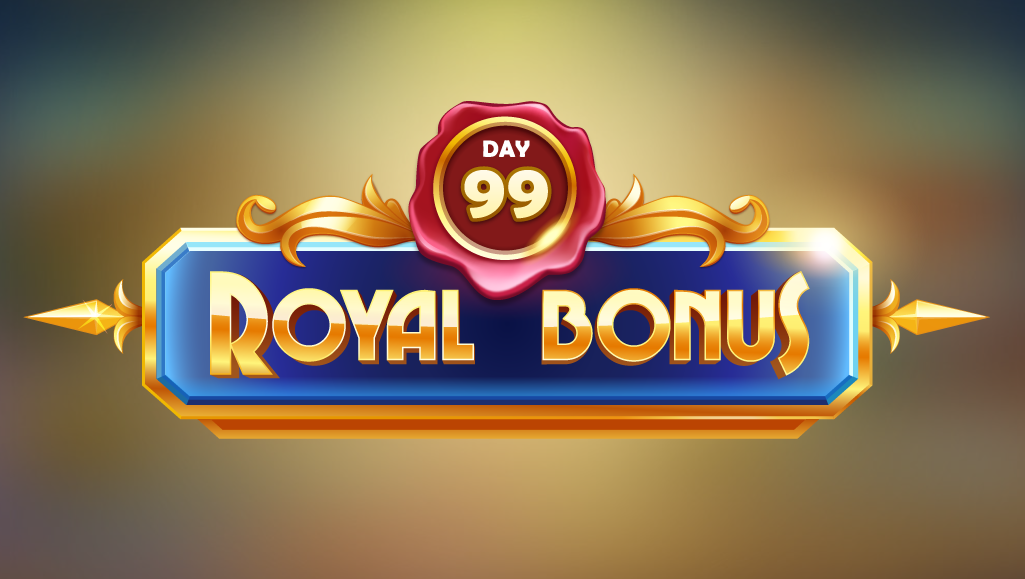
Royal Bonus
Designed the full feature form wireframe flow to final UI art assets Illustrations and some animations. The feature gives user an incentive to return consecutively each day, and including an element of mystery and fun, avoiding the usual calendar style layouts most other social games have.
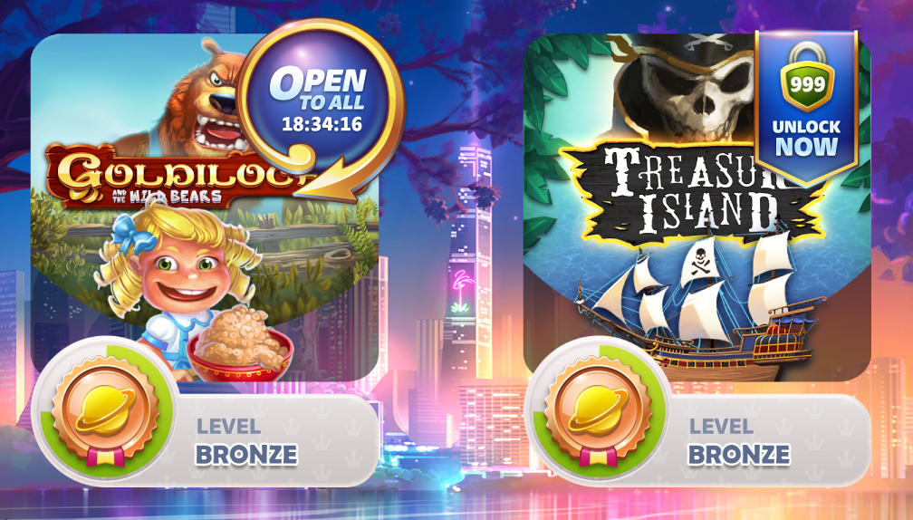
Open to All / Pay to Unlock Widgets
Designed flow, wireframes and final UI art asset for widgets. Open to all gives game access to all users for a limited time. Pay to Unlock allows the user to pay for instant permanent access to a game. This also included a popup to "sell" the game.
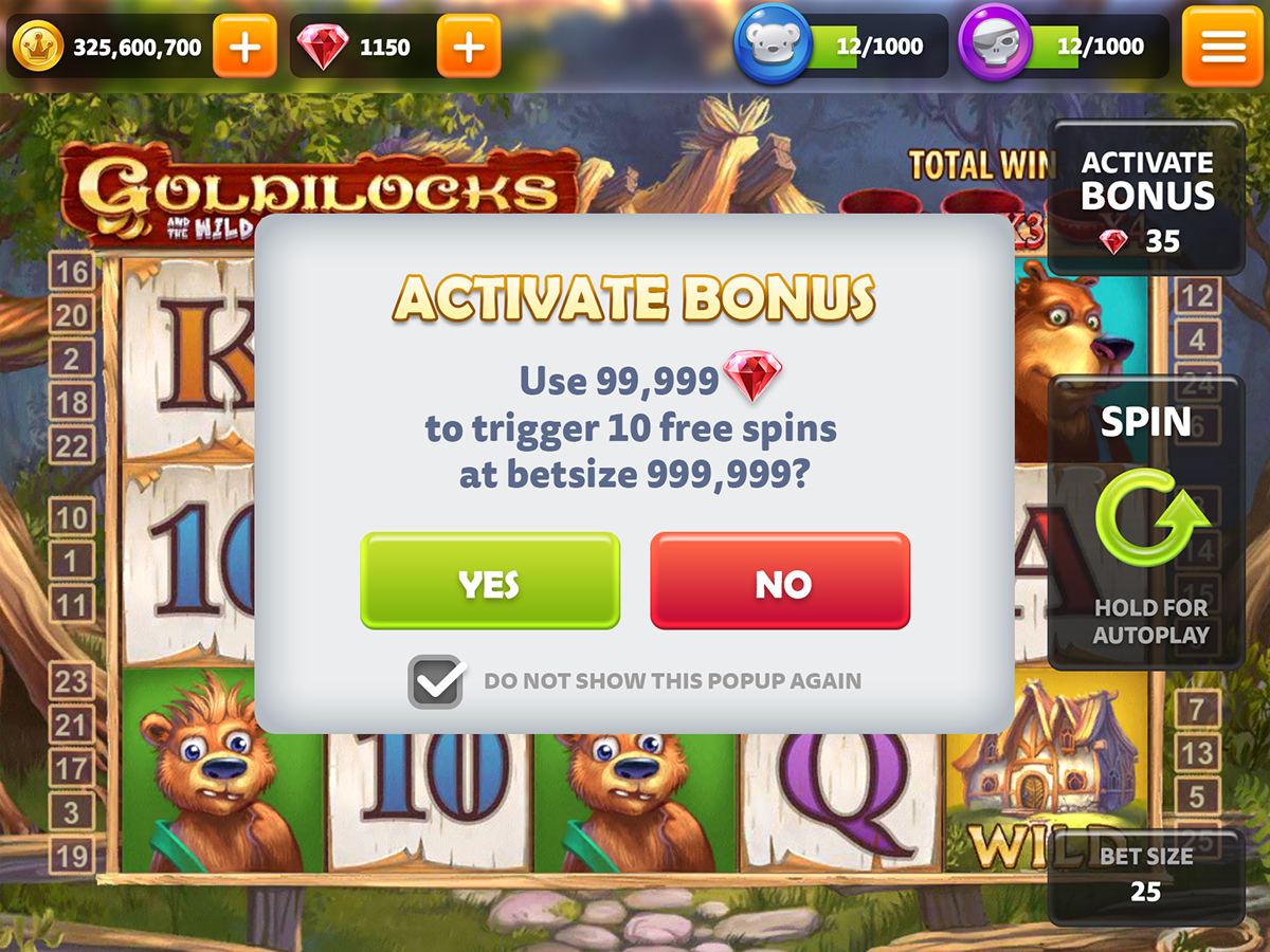
Popup - Use Gems Confirmation
Using the existing style I created a confirmation popup for when the user taps on "activate bonus." This is to prevent unwanted spending of the gems which are a premium currency. What the user was about to do with their gems was essential to this popup, it was important to design so it notified the user without putting them off from going ahead with the action.
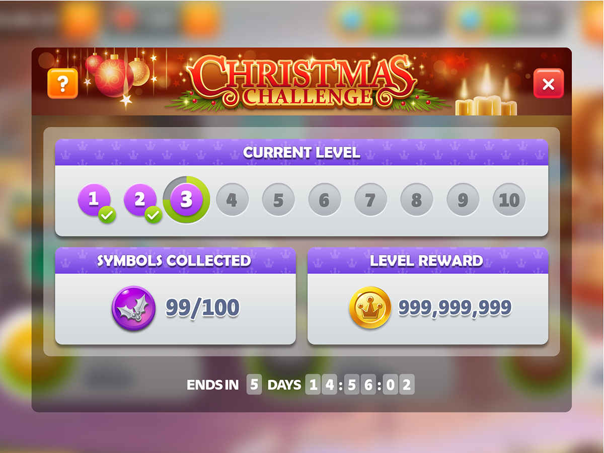
Popups - Challenges Progress
My task here was to improve the Layout of the already existing popups. The two challenges work the same way - one changes weekly and the other one belongs to each game. To make it clearer to the user that these two different popups in fact are displaying the same type of progress. I unified the layout between the two, colour coding them to their symbols to create a more clear seperation. I added a progress ring around the current stage, to prevent confusion on what the user has already achieved.
My task here was to improve the Layout of the already existing popups. The two challenges work the same way - one changes weekly and the other one belongs to each game. To make it clearer to the user that these two different popups in fact are displaying the same type of progress. I unified the layout between the two, colour coding them to their symbols to create a more clear seperation. I added a progress ring around the current stage, to prevent confusion on what the user has already achieved.
Slot Game Challenge
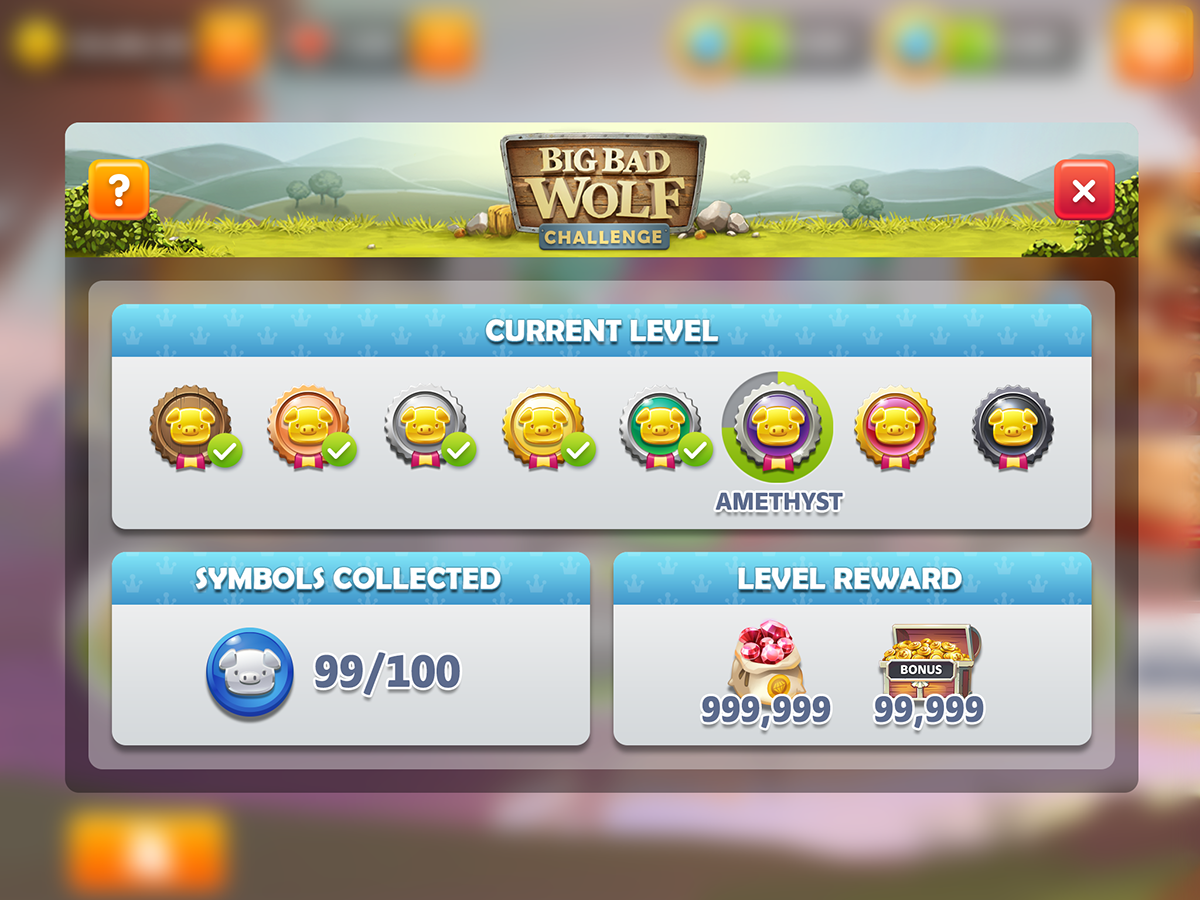
Weekly Game Challenge
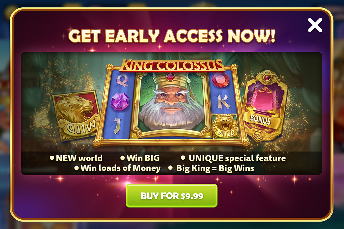
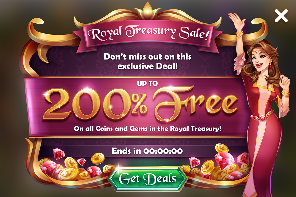
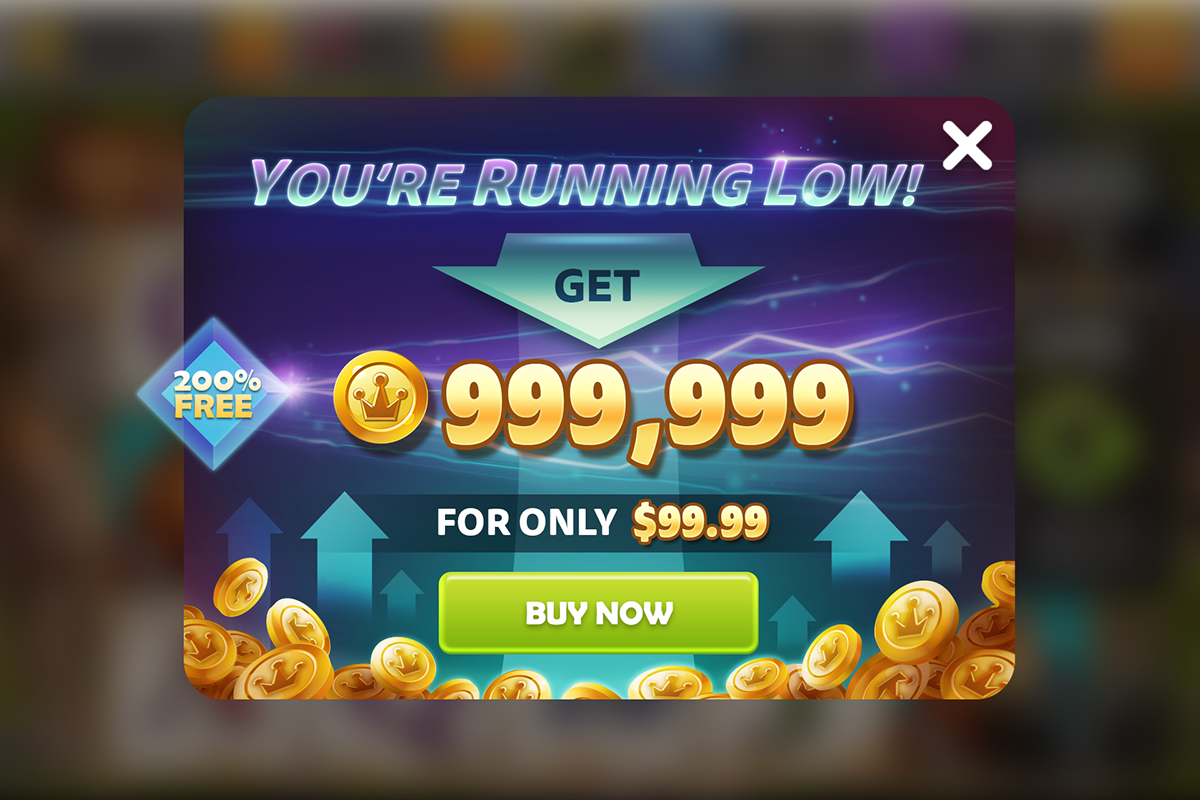
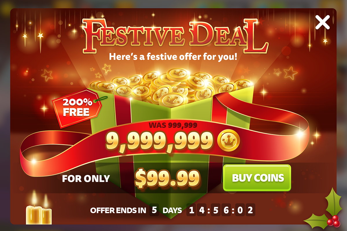
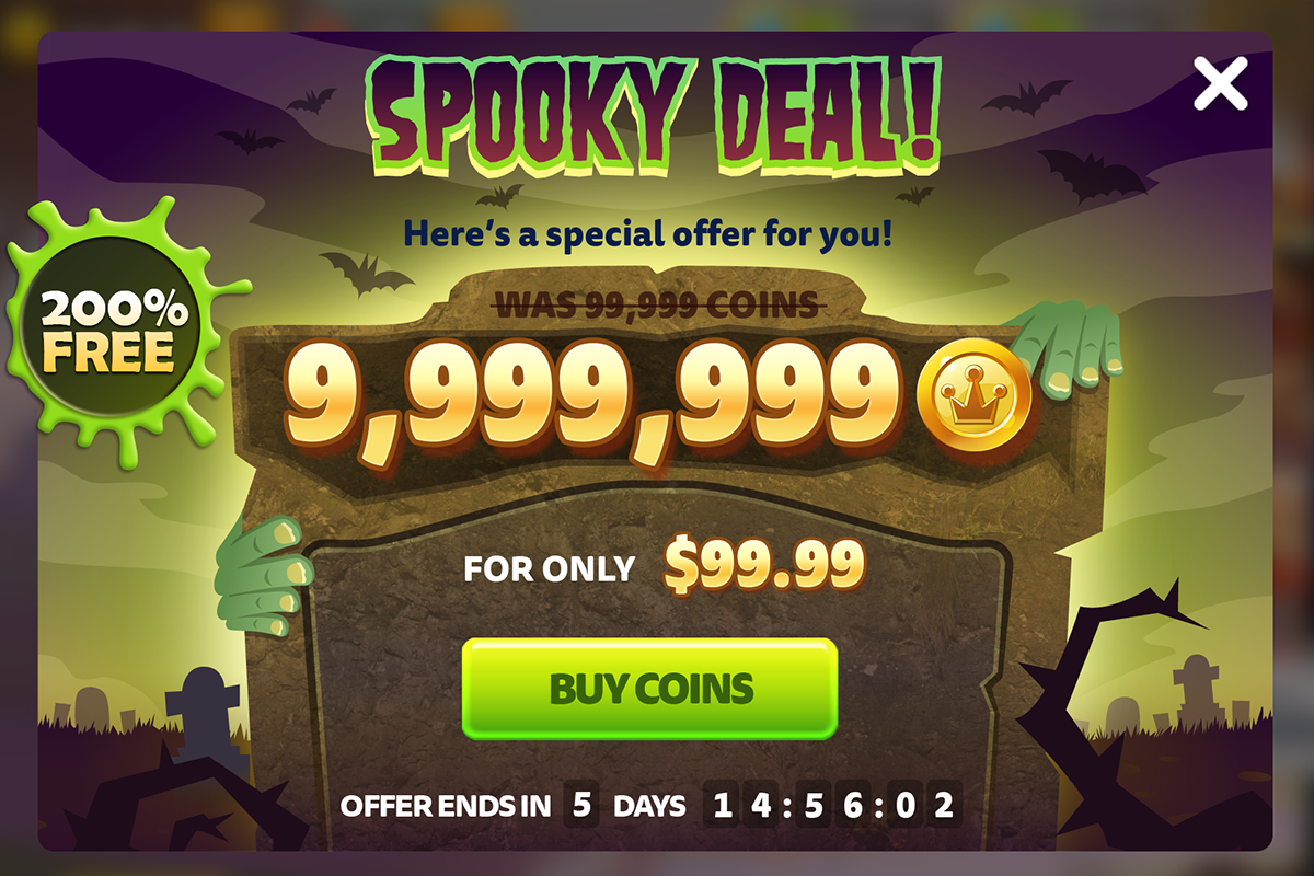
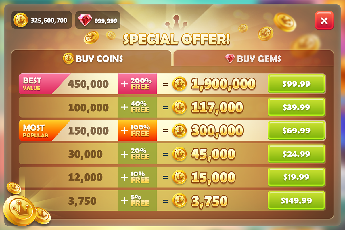
Popups - Promotional Purchase
The main focus on these popups is the coin amount and price. The fonts of these elements and buttons are designed to be particularly strong and bold, to make them standout easily over any future promotional skins. They are designed with their own look and feel to stand out to the user, still adopting key traits from the default UI, to keep it still consistent. There are two layouts so they can be both used, so the user doesn't see the same one too often, although they are reskinned on a weekly basis.
The main focus on these popups is the coin amount and price. The fonts of these elements and buttons are designed to be particularly strong and bold, to make them standout easily over any future promotional skins. They are designed with their own look and feel to stand out to the user, still adopting key traits from the default UI, to keep it still consistent. There are two layouts so they can be both used, so the user doesn't see the same one too often, although they are reskinned on a weekly basis.

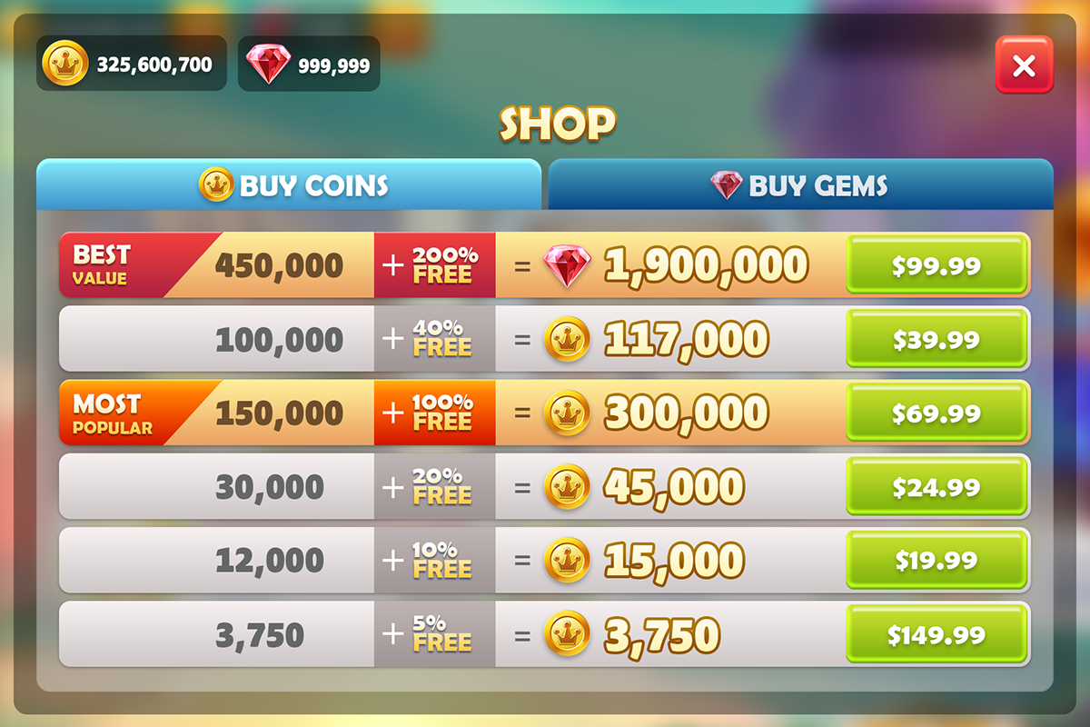
Popup - Shop
I created the layout of one of the most important screens in the app - th screen where the user makes their ingame purchases. I went with a "spreadsheet" style because it allows for a very clean layout, this allows the user to compare price points with ease, to minimise confusion. The layout of a price is in order of importance to the user, it was important to keep the coin amount next to the price as that's what they will look at the most. Value stickers highlight better deals and there is extra information to break down what the deal is giving. The Gems tab is in the same layout. This is also reskinnable.
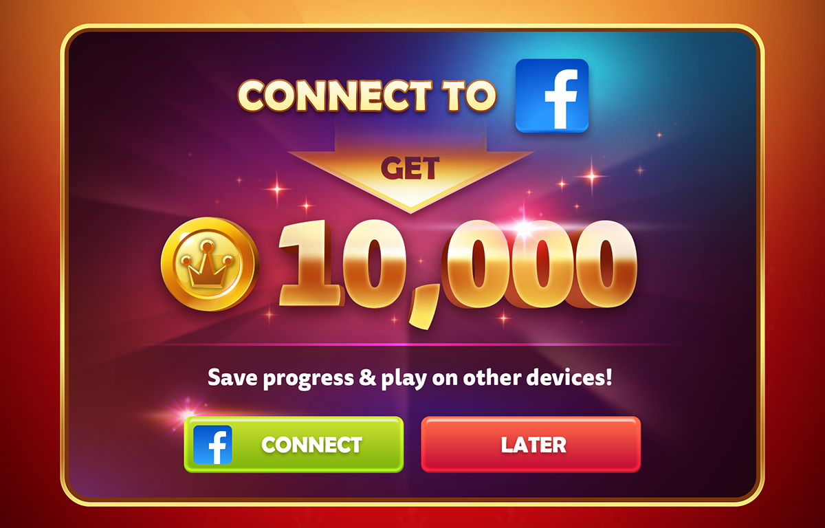
Connect to Facebook - Popup
Designed the wireframe and final art. The purpose of this popup was to encourage to connect to facebook and received a 10,000 coin bonus.
Animations
The style of the animations throughout the app are generally bouncy and snappy. This give the animated assets plenty of life without interrupting the game experience too much.


