
Sienna Red is a locally owned shop in Little Rock, Arkansas by the Rivermarket District. Little Rock is known for its art culture and southern comfort, so our business would like to bring a new experience for visitors that is unlike any other. Our shop is meant to be a replica of the Lascaux Caves in France. These caves are currently closed to visitors, but Sienna Red has found a way to bring this magnificent piece of history back to life. In our gallery you will find works of prehistoric art from the Paleolithic era, while our book shop offers first edition novels as well as art history books. Guests can stay for an afternoon or spend an entire day at their leisure. While our shop might be small in size, our atmosphere is larger than life.
The name of the company was developed when I studied the history of the Lascaux Caves and learned that sienna was used to paint the walls of the caves during the Paleolithic time period.
The story behind the logo takes a leap into Paleolithic history. The two "dancing" figures are in fact the outline of the map of the Lascaux Caves in France. When the two figures are placed together, the negative space creates an arrowhead, which is another reference to the Paleolithic time period.
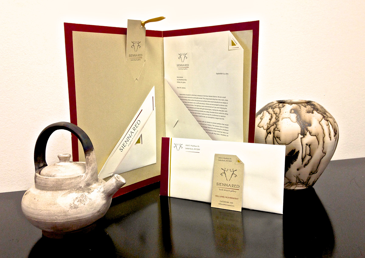
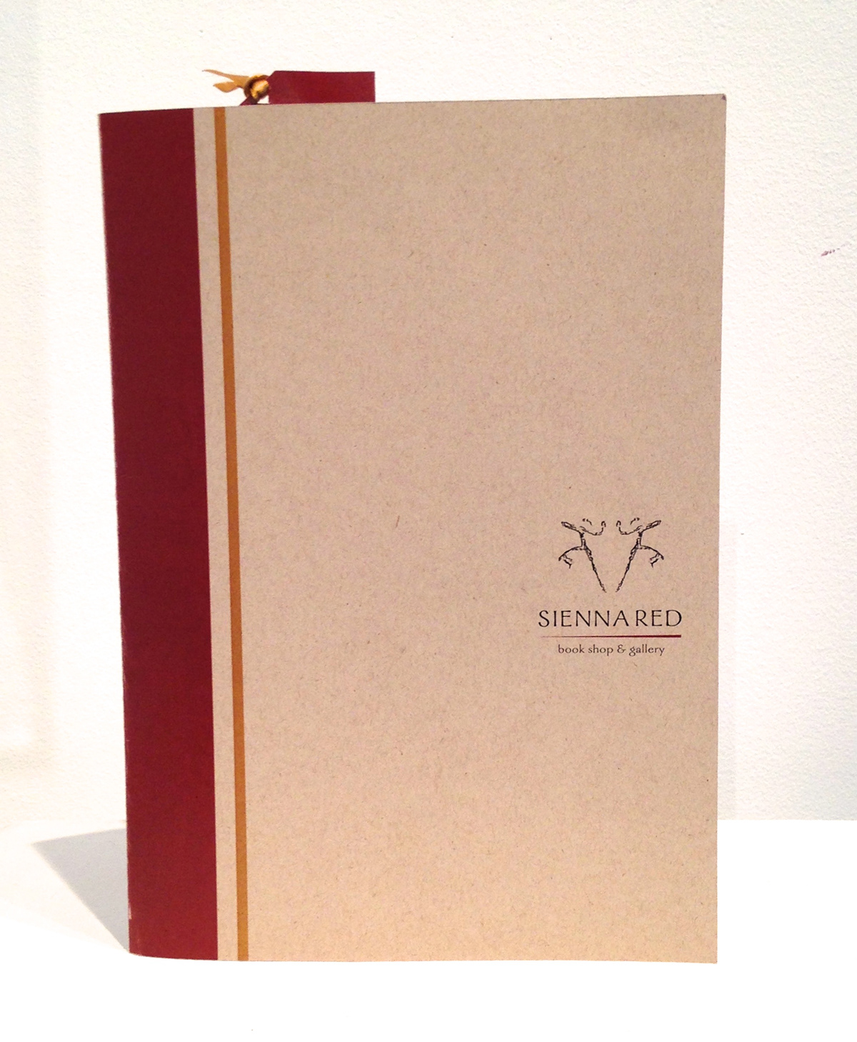

The stationery suite that I created is meant to reflect a book. The pocketfolder is the outside binding of a vintage hardback covered book, while the bookmark is placed inside the pocketfolder in a way that it shows when the pocketfolder is closed as if it were a real bookmark. While the pocketfolder is the outside of the book, everything inside the pocketfolder is meant to represent the pages, which is why the business card and the letterhead can be seen with one corner "folded down" like saving a page in a book.
I chose a deep red to reflect the true nature of the color sienna and a golden paper to reference the gold stitching or panels that are found in old first edition books. Also, as cream linen paper was used for the letterhead and the envelope so that the texture of book pages was conveyed.

