

Concept
I am a fan of Hootsuite and what they are creating. I do not work for them, but I am a long time user of their products. I began using Hootsuite when it was first launched as an Adobe Air application, using it to manage my various Twitter personas. Back then, I had a few different accounts: one under my name, one for my music blog, and one for my music producing alias.
This past fall, I was priveleged to be able to attend the Adobe Max conference in LA. Because I wanted to engage other designers, I decided to dust off my social media profiles. I had only been using the default Twitter app as I mostly only post under my own name, but I wanted to give the Hootsuite iOS app a shot to see how it handled multiple profiles.
When I loaded up the app, I was surprised to see that accounts were all siloed, with one screen acting as a landing page to each account's functions, each siloed themselves. This approach makes the user deal with each account and each function separately which killed the flow for me. I wondered if there might be a better way to organize the app for a user with needs like mine.
When I launch the Hootsuite app, I am not looking to do the nitty-gritty analysis and granular examination of my accounts: I'm on an iPhone with a small screen (even if I'm using a 6+). If I want to do that sort of work, I'll use my laptop or iPad. What I want to see is a quick overview of stuff that I need to engage with right now. Then I want to be able to respond quickly and be on my way.
I have come up with two main ideas to serve this need: (1) a unified feed that combines all accounts at once, and (2) an app-wide focus on clearing actionable items (I use the Hoot as an anchor for this concept). I have not taken into account the technical considerations that may prevent this approach, I have merely tried to design the experience to best serve a user like me without any constraints. While I have used some of the design language in the current app, I have also injected some new elements.
However, this design study is less about the visual design (of which it is very basic) and more about the flow of information that would serve a user like me well. That is not to say that there are necessarily many users like me out there and I don't have access to the metrics and user interviews either way.
Lastly, this design study is a work in progress and I will be updating it constantly since I can never leave well enough alone. I am in no way affiliated with Hootsuite as a company. I do not mean offence to their design team, unlike the many angry Twitter users they feature in their fun hate tweets video, but I did want to explore what might make the app more useful for my admittedly narrow needs.
I hope you also find what I'm proposing useful and I'd be interested to hear your take. I appreciate you taking the time to look at this project. - Sean
Storyboard & Sketches
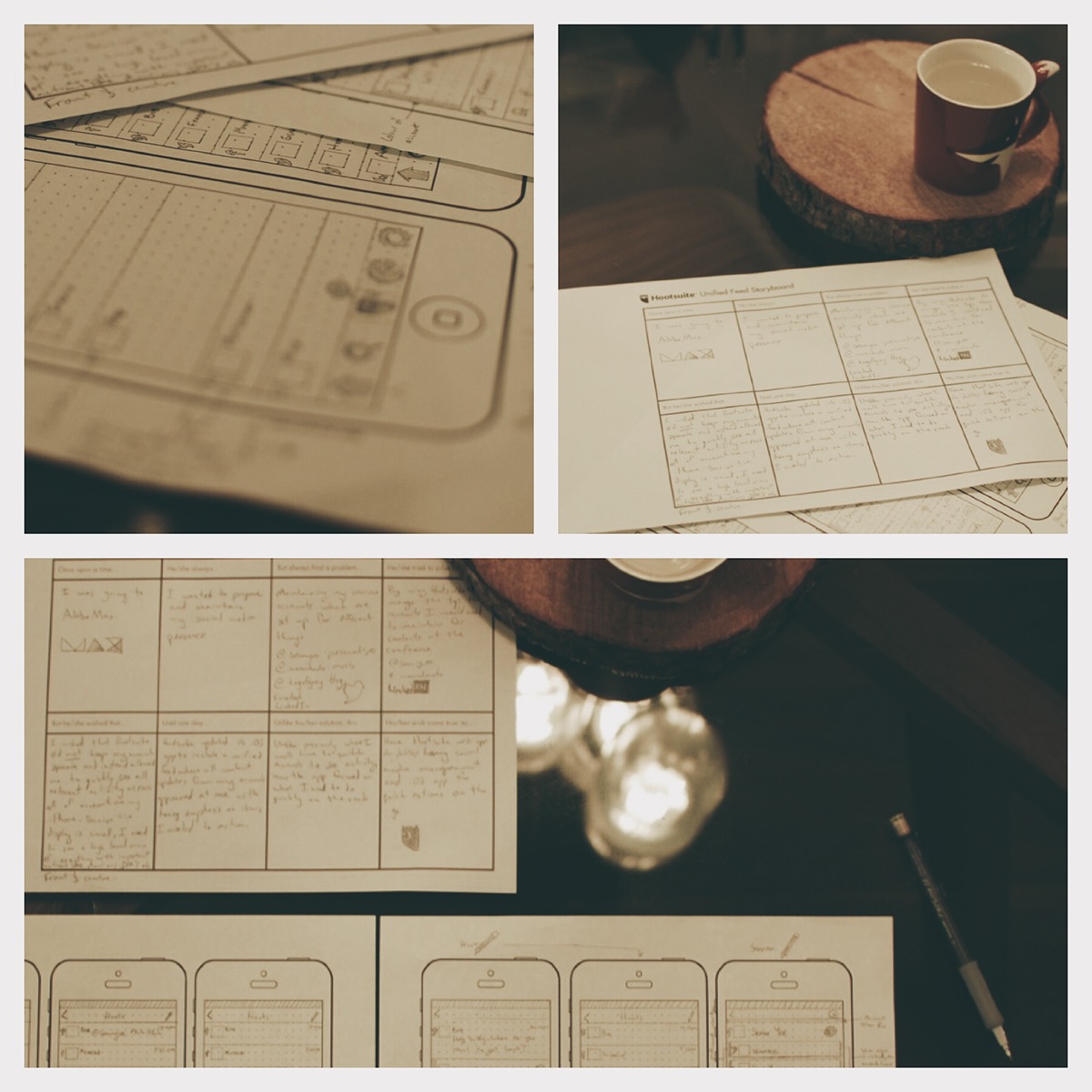
I began the process by creating a storyboard that outlined the perceived problems and possible solutions. Writing a document in a narrative helps make sure the process is thought out of end to end. Also, while trying to create a compelling narrative, I feel that it forces me to communicate concisely and with empathy.
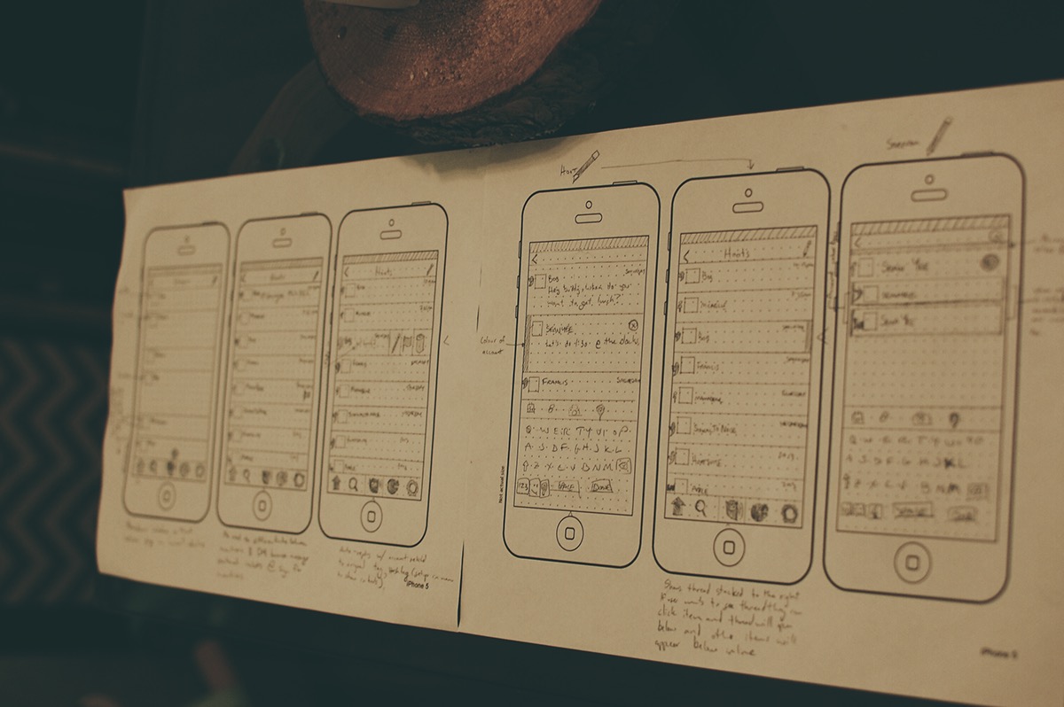
After completing the storyboard, I began sketching key scenes that I hope explain best what changes I'm proposing. During the sketching phase, I came up with six screens.
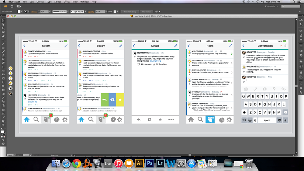
Once I had sketched out the direction I wanted to go on paper, I began the process of drafting the ideas in Illustrator. In the process of creating the illustration, I was further able to fix inconsistencies and reduce friction from what I had sketched out and refine some of the ideas presented in the paper sketches.
Designs
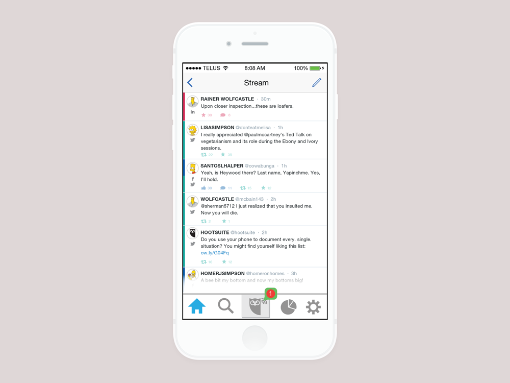
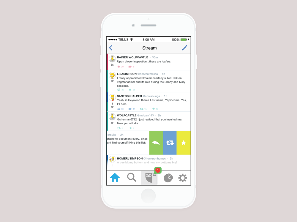
The unified feed (I have called it the Stream here to maintain consistency with the current iOS app) combines all your accounts together into one activity list. Each account that is being pulled in has a user-defined colour on the left margin to allow the user to quickly parse what post is from where. In addition, the account type (LinkedIn, Twitter, FB, etc) is shown with an icon below the profile pictures. In some cases where content has been cross-posted to multiple accounts from the same user, the left coloured margin is split to represent each account and there are multiple service icons below the profile picture. Quick information is shown below the post for each account type and is appropriate for the social media service. A user can create a new post by tapping the pencil icon in the top right, and is then taken to the post screen which is the same as the current iOS app so I have not included a screen for it in this project. Note that there is a badge icon showing the new activity over the Hoots icon which is placed front and centre. The main action in this redesign is towards dealing with new activity that is targeting the user. This could be direct messages, mentions, and more.
A user can drag a post from right to left to access quick buttons that are appropriate to the social media service. In this example, the post is from Twitter, so the user can reply, retweet, or favourite the post.
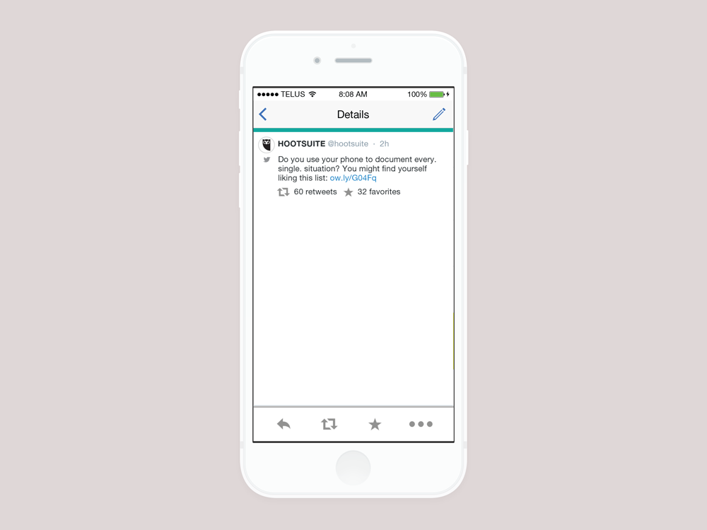
This screen shows the results of clicking a post, instead of using the drag interaction. From this screen, the same and more options are available for action on the post.
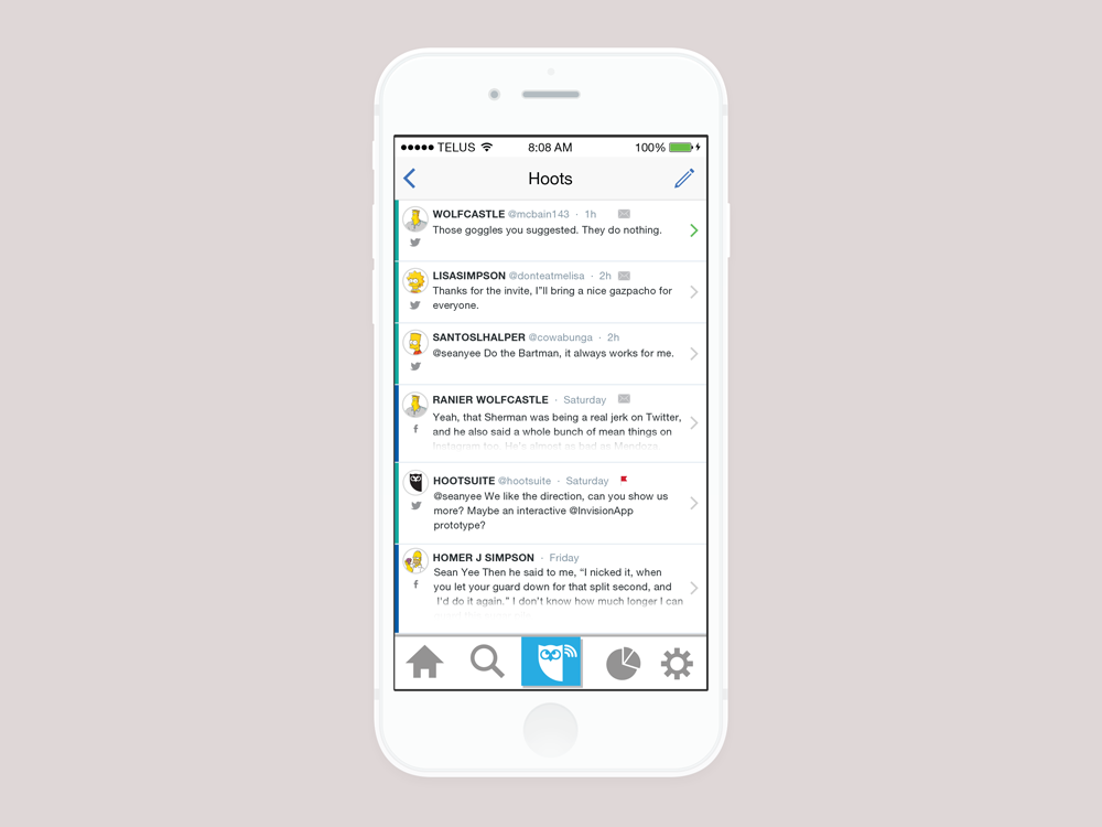
This is the money shot, the Hoots screen. This displays all directly relevant posts for the user. It combines mentions, and messages. The green arrow on the right side of the top post indicates that this is the new post that was previously shown on the badge icon. The mail icon marks that this activity type is a message. This distinction is important so that a user does not accidentally make a response public that he or she thought was a message. The red flag icon is a post that has been previously tagged as important by the user.
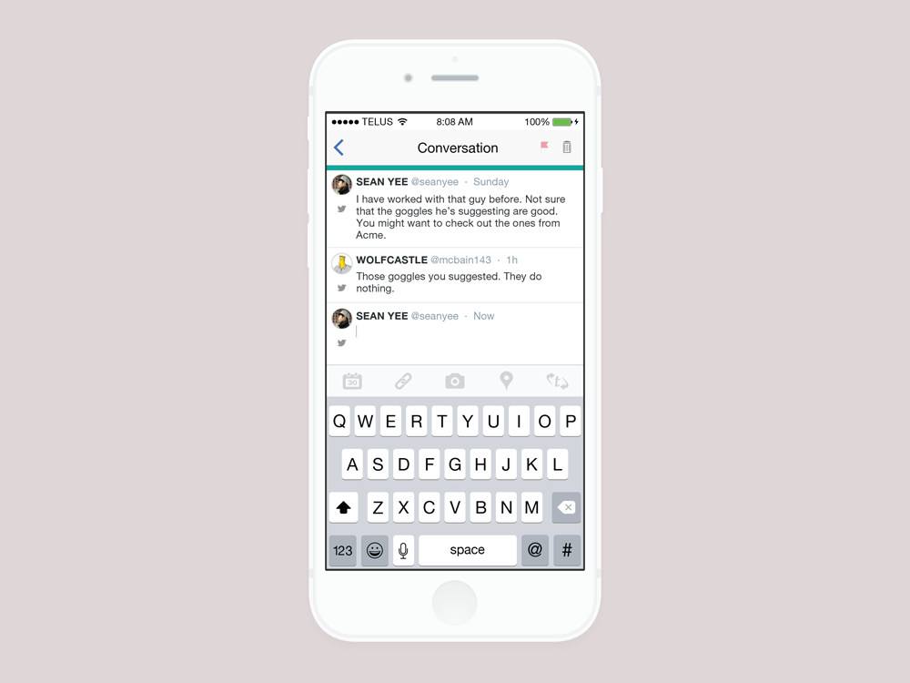
This screen shows the result of tapping into a Conversation. Message threads can be responded to, tagged as important, or deleted.
Thank you for reading!


