The GMABFC logo underwent a process of a couple months. I was working solo for a while just illustrating different ideas when I came up with my first great idea. Actually find some ribbon, make the cancer logo and photograph the ribbon. I did that and wow what texture I discovered and lighter and darker hues. This gave depth and definition to the ribbon.
Then, it was deciding how to make the ribbon a part of the logo...keep the true identity that everyone identifies with yet branch off into a beautiful and graceful new creation...that's true design!! Keep it simple, and be excruciatingly beautiful.
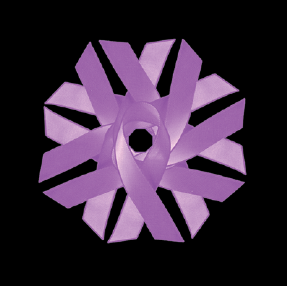
I then started working with a team member that took an interest in the design. He said "what if we change the ribbon... and then I went back to the basic ribbon, lavendar being the color that represents 'all cancers,' and I started playing...
The Swirl came to mind from something as simple as hearing someone say: "What if we turn it 180 degrees, and as I turned it thinking 'this is not it' to myself yet trying it even though my design instinct was 'never.... It became the swirl instantly. I could see as I turned it that this was processing step by step into the right design logo from one line: "turn the ribbon..." IN that moment, I tried to forget the rest because I was seeing with my "creative sense"... Repetition, Grace, Beauty, Shape, and light and dark tones emerged as I copied and turned, copied and turned. I hope you can see with me the process that shaped this design. I must also give credit to the team for suggesting 'place the outside border shape at the center of the logo.' That solved yet another design problem and here is what the design reveals...
The ribbons above was the original photographed "Swirl" which was a pink ribbon that I added the dark Lavendar to.
The ribbons below have a "Linen" texture applied in Photoshop.
Labeled the "Linen Series" which makes for greater variation in light and dark color or contrast:


The "LINEN" Series. Sample of the texture swatch. Shows the linen effect as well as the light to dark tones.

For a while, this was the logo design. I met with a senior visionary that actually made sketches for me to work from. We knew we liked the "sun" background idea and we liked it being a circle with the text above and below and adding a tagline. Once we added it to the mockup web page, our director decided to push harder to see what we could come up with. As a team, we were back to the drawing board. It would be another month and after the holidays before we would reconvene and work through the top logo which came together over one session, with many illustration hours spent on other ideas—all important to the creative process...