

THE PROJECT
This project was a study of Typography in which we were given a typeface and was assigned as the head designer. We were to create a marketing campaign to promote The Met’s (The Metropolitan Museum of Art) upcoming retrospective of a typeface, Gotham.
As the head designer, I was in charge of the design and development of the visual campaign from discovery, brainstorming, development, to deployment. I made a total of 20 different collaterals.
The collaterals is as follows:
Brochure (1)
Tickets (6)
Posters (6)
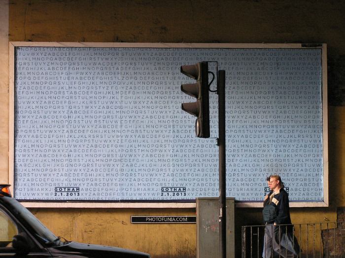
Billboards (2)
Transits Shelter Sign (1)
Bus Side (2)
TV commercials (2)
*Giveaway: Type Specimen (1)
*Not included in the initial marketing campaign.
Brochure (1)
Tickets (6)
Posters (6)
Billboards (2)
Transits Shelter Sign (1)
Bus Side (2)
TV commercials (2)
*Giveaway: Type Specimen (1)
*Not included in the initial marketing campaign.
Campaign launch date was from December 14th, 2012 – February 28th, 2013
Event date was from February 1st – February 28th, 2013.
Event date was from February 1st – February 28th, 2013.
Project Detail: GOTHAM
_________________________________________________________________________________________
THE STRATEGY
December 14, 2012
· Release Transit Shelter Poster: “GOTHAM: In Type We Trust”
December 21, 2012
· Release Pre-Sale tickets
· Release Bus side Banner 1
December 28, 2012
· Release “G” Poster
December 31, 2012
· Release GOTHAM: Curiosity commercial
· Release Bus side Banner 2
January 4, 2013
· Release “O” Poster
January 11, 2013
· Release “T” Poster
January 18, 2013
· Release GOTHAM: In Detail commercial
· Release Billboard
· Release “H” Poster
January 25, 2013
· Release “A” Poster
February 1, 2013
· RETROSPECTIVE PREMIERE
· Release “M” Poster
· Release GOTHAM Brochure
_________________________________________________________________________________________
TV COMMERCIALS
“GOTHAM: Curiosity”
Air Date: December 31, 2012.
This is the first commercial that will air. It is a teaser commercial designed to invoke curiosity and do some research of what the commercial is about and what GOTHAM is. I have chosen the release date of New Years Eve because most of everyone will be at home with their families and friends. They will be near a TV screen waiting for the countdown so it’s a great opportunity to tap into a big group of audience.
Note: All the logos shown in the video use the typeface Gotham.
"GOTHAM: In Detail"
Air Date: January 18, 2013.
This second video will air two weeks before the Event opening of the Retrospective. It is designed to give the audience a glimpse of what GOTHAM is about and give them a little bit of background on it as well.
Air Date: January 18, 2013.
This second video will air two weeks before the Event opening of the Retrospective. It is designed to give the audience a glimpse of what GOTHAM is about and give them a little bit of background on it as well.
THE LOGO/IDENTITY
The uniform scattered type in this design is part of the identity of the retrospective marketing campaign and is present in the other collateral.


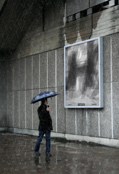
TRANSIT SHELTER POSTER
This is the first collateral that would be released to the public. The release date was December 14th, 2012, which lands on a friday. I’ve chosen this date because it’s the weekend and it’s two weeks before Christmas and a plethora of people would be out and about in malls, public transits and whatnot and I wanted to capitalize on the shoppers and commuters.

POSTERS
These are street posters that will be released weekly starting on December 28 through the event premiere on February 1, 2012. Beginning with the letter “G” and ending with the letter “M” spelling out GOTHAM. They will start popping up around the nation and with a heavy concentration of New York City in a form of semi-guerilla type marketing.