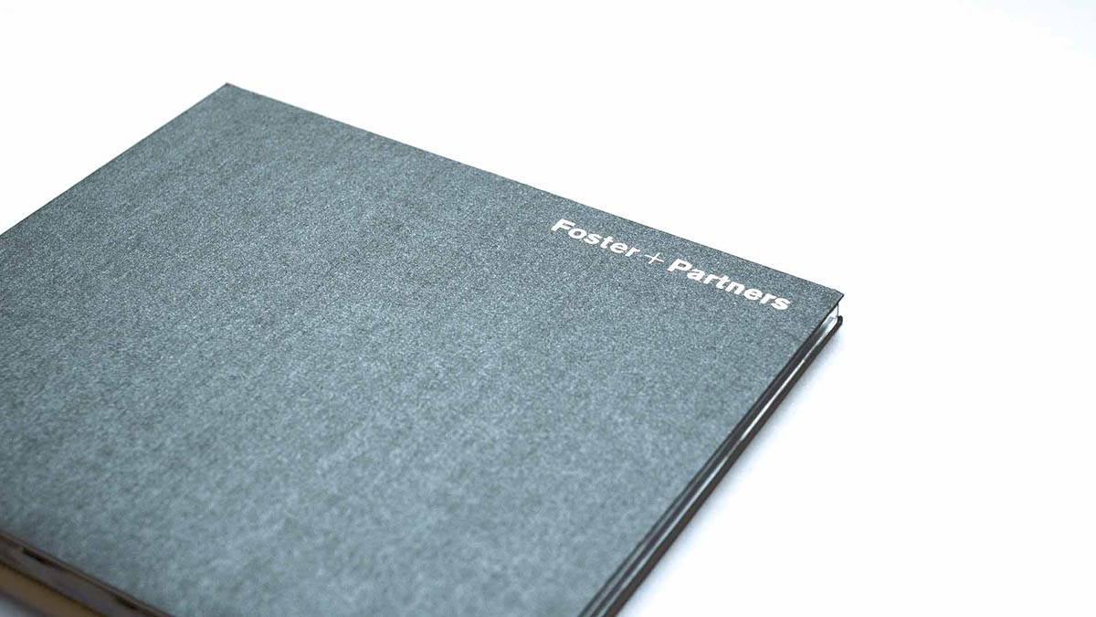
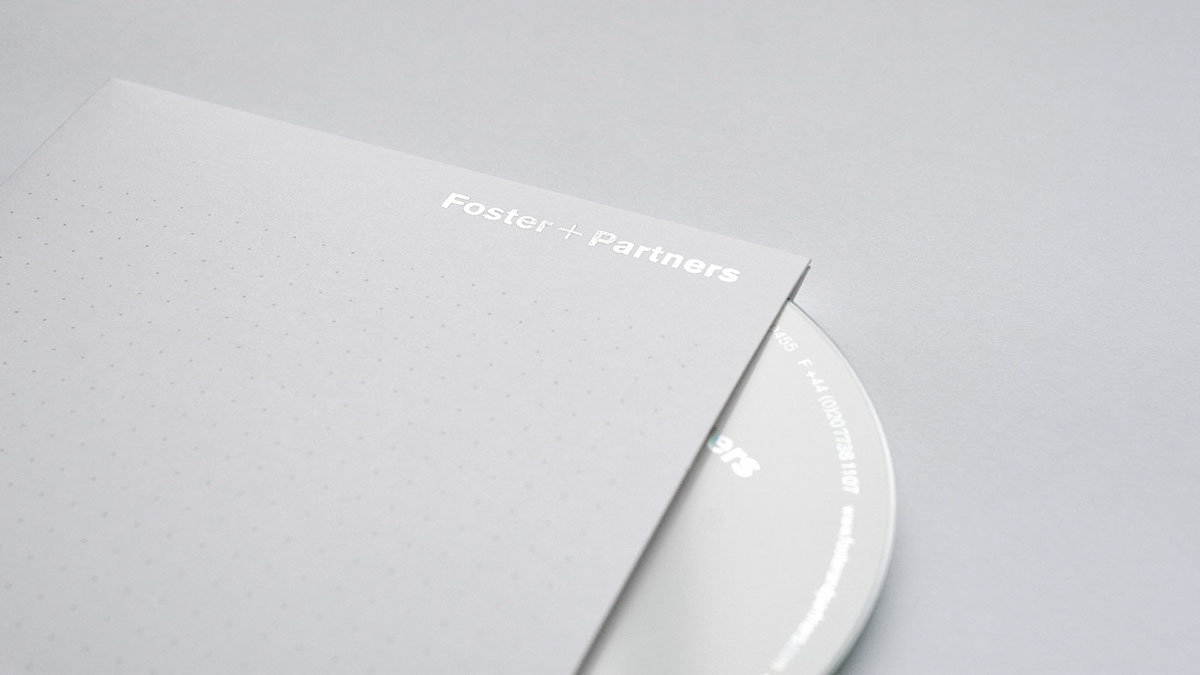
Foster + Partners Identity
For many years the Foster + Partners identity had been based on Otl Aichers Rotis typeface. Much like Fosters architecture, the identity had inspired many young architects who were beginning to 'outfoster' the practice by using the same typeface, colours and disciplined approach to typography.
A thorough redesign re-established Foster + Partners as the rightful leaders in their field and was implemented across all areas of the business including website and intranet, reports and publications, signage and protective clothing as well as office supplies and stationery.


