Sign painter, Leo Beukenboom, Amsterdam
The full story of Leo Beukenboom is below the images

David Quay – a visit to the Rembrant of letters
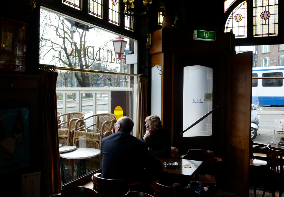
When I first started to visit Amsterdam I fell in love with the traditional brown cafés with wooden floors sprinkled with white sand and ‘Persjes’, small Persian carpets on the tables instead of tablecloths. Many of the cafés had their name painted directly on to their glass windows in a very distinctive script. Slowly the names are disappearing, and those that are left are slowly fading through window cleaning. Ramiro told me about an old retired sign painter, Leo Beukeboom, who painted many of the cafés on request from the Heineken Brewery. The art of sign writing is now virtually dead. Leo was the last and nobody wanted to be his apprentice (ah!) and those few that are still sign writing are in Leo’s eyes ‘Clumsy clods’! Ramiro had a long conversation with him and here I give the edited version. I also visited Leo to talk to him myself, and became immediately captivated by the animated stories of his life. Often Leo would burst into singing old Dutch or German songs; Leo’s mother was German and came from a poor family arriving in Amsterdam in 1923 with only a suitcase. She was an accomplished pianist and knew all the German classic writers – Goethe, Schiller, Rilke – and she learnt to speak perfect Dutch without an accent, which helped her during the war years when Germans were heavily despised. Leo also speaks perfect Dutch. This surprised me as he lives in an area where the equivalent of English Cockney is spoken. He only speaks a few words of English, but loves his tawny English port!
Leo has probably done more in branding Amsterdam than any design group could possibly do. Over thirty years he has painted thousands of cafés and restaurants using his own particular letter style. Now we live in an age when the same plastic peel-off letters cover the whole globe; Leo’s lettering was always different for every assignment. He was always required to paint the Heineken logo in Egyptian. He painted it from memory and every one is slighty different. Leo hates the way everything is becoming standardised and is losing its character.
Ramiro Espinoza: Leo Beukeboom – Bars, beer and belettering
Leo Beukeboom was born in 1943 in De Pijp, Amsterdam, a working-class area built in the late nineteenth century behind the Heineken Brewery. At its heart was, and still is, the Albert Cuyp market. Leo had seven sisters and two brothers. The family of twelve lived in an apartment of three small rooms in Van Ostadestraat. Leo adds: ‘We were poor, but I came from a very warm nest, we were a good Catholic family. I lived there, up three flights of stairs above the prostitutes.’ The prostitutes are still there today!
Leo continues about his further education: ‘I wanted to go the Radio Technical School in Hilversum, but it was far too expensive for my parents. I then tried to join the Film Academy, but I had only finished basic secondary school level so I went to the Grafisch Lyceum, Amsterdam, instead. After graduation my mother read a job advert in the newspaper for a handy young man, who was good at drawing. It was at Koersen’s, a printers owned by Mr Koersen who was a well known member of the ‘Tweede Kamer’, Second House for the political party KVP ‘Katholieke Volks Partij’, People’s Catholic Party, from 1956–1962. During the war they printed ‘Het Parool’ – the resistance, and therefore illegal newspaper.
So now I was a compositor and attending a course in layout at the Grafisch Lyceum in the evening. Then one day at work, a letter tray slipped out of my hands and fell on the floor. I was quite small and the tray was very heavy. I laughed my head off – there were thousands of letters all over the floor. Mr Koersen himself called me into his office: “Mr. Beukeboom, you are fired!” Okay. Two or three weeks later I found another job at the printers Van Velzen, on the Ruysdealkade, a very cosy, small printing office, with a pleasant boss, I felt at home. Van Velzen was a commercial printer and they printed amongst other things menus for the Apollo Hotel.
When I was nineteen I had to do National Service, but I refused the military and did two years’ social service in Eindhoven instead. Meanwhile I received my layout certificate from the Grafisch Lyceum and finished my social service in Eindhoven, but I did not go back to Van Velzen. I then wanted to start up as a small tradesman, and first I thought about the profession of ‘ochtendster’ (scrap metal dealer). I went out every morning and evening looking for scrap iron, lead and copper on the streets. Wandering around finding bits and pieces, filling my bicycle carriers and selling it in the morning. Every day I earned a bit of pocket money.
When I was sixteen I started to paint signs for pub owners, like small announcements for billiards tournaments. I made big boards for the butcher shop: ‘Roast beef for sixty cents a kilogram’. So, in the end I didn’t become an ochtendster, otherwise I would have been an antique dealer by now, ha ha! That’s also a beautiful profession, isn’t it?
At the Grafisch Lyceum we drew basic letters. Ornamental letters came secondary, but we did not do any calligraphy; that I did for thirty-five years painting windows! We drew the letters using a pencil and filled them in with Indian ink. We also determined the page size, designed the layout, letters, text columns and all the other material included. I did some calligraphy with a pen on board. On the Albert Cuyp market they all knew me,
“Leo can do paintwork for you, boards, windows, the lot!”
At Grafisch Lyceum, Amsterdam, we received Letterproef catalogues published by Tetterode, a company that sold type and printing. It was our graphic design bible and was simply divided in five categories: Garamond, Bodoni, Egyptian, Gothic and Ornamental typefaces. From these five categories you could extract all the different letter types – everything you wanted to create.
I remember a Mr Vleugels. He was a very good layout teacher, a real graphic artist. What he said, he really believed in. He spoke with a calm voice, he showed something and he could describe it perfectly. He asked you: “What exactly do you see?” In that way, he taught you to remember things thoroughly and be able to reproduce it. I work now by intuition.
In painting letters I became conscious of the unity and opposites, letting black and white ‘gear’ into each other. Form and counter form … it’s the cosmos, those figures, they are working with each other … on the one side it’s letting the matter dominate; on the other it’s letting space dominate. You make those two, in proportion, just slightly touching, complementing each other. My work, it’s a kind of meditation, for sure it is! Space and matter, they supplement each other. The Chinese are really good at that and know how to make a perfect balance. Later I did some letter painting for several Chinese restaurants in Amsterdam. I had to paint these characters, hundreds of them. They just asked me: “Can you paint that?”and my answer was always: “Of course I can, no problem.” Afterwards they all told me I was a good Chinese letter painter, I did learn to read and understand some of the characters. Of course I cannot read them all but I knew how they moved and the way the Chinese hold their pencils, yin and yang.
In 1965, an old school friend of mine was in the lettering business, making signs, ‘Sale is on, everything has to go’. He had a lot of work for me, but it was common, screaming colours, done with water paint – much too vulgar for me. Then an old school mate came along. He was the window dresser for the Heineken brewery and told me they were looking for a sign writer. Their old employee, ‘Ome Jan’, Uncle Jan had just retired. They decided to put the work out instead of hiring a new employee. They asked me, “Leo, are you interested?” Well, of course I wanted that!
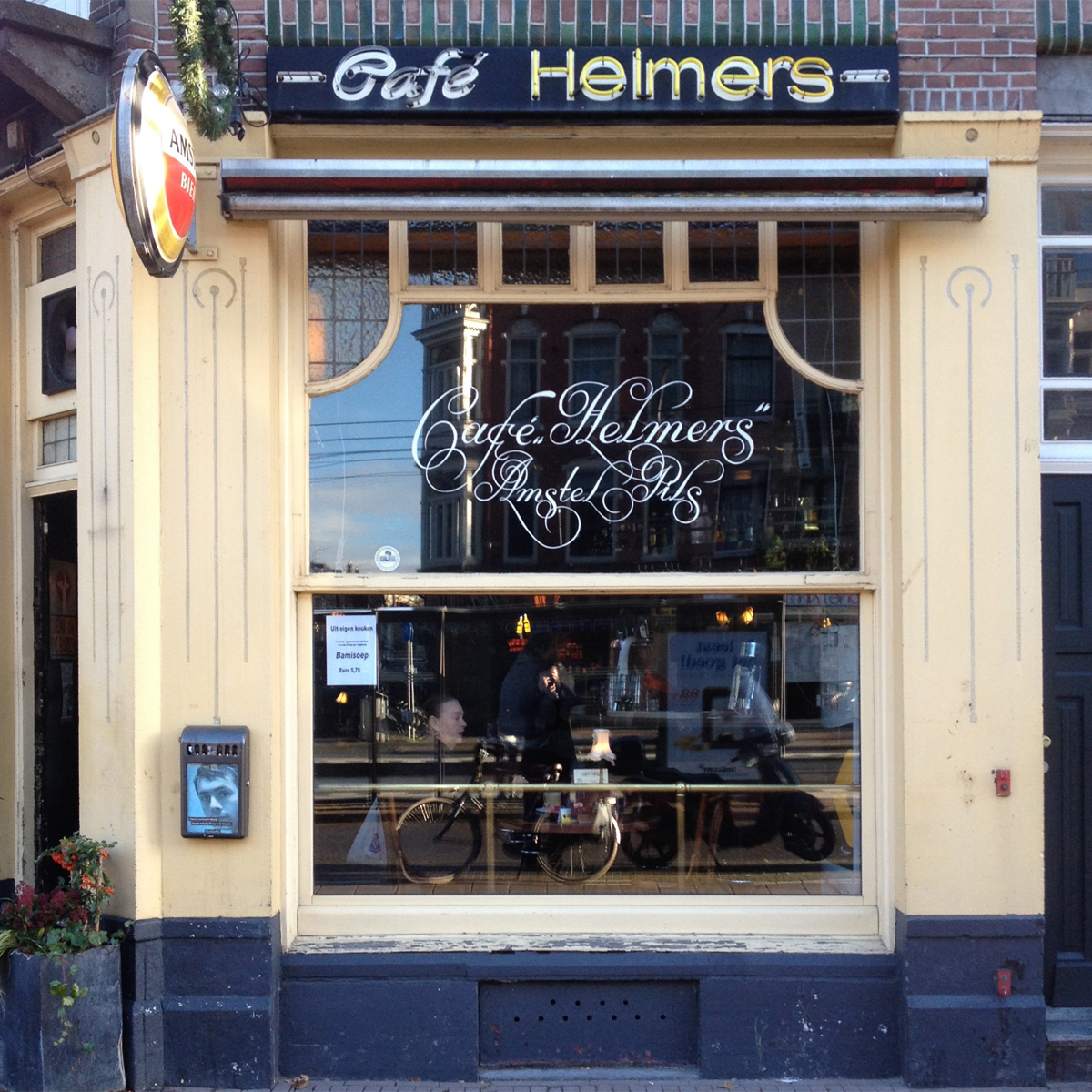
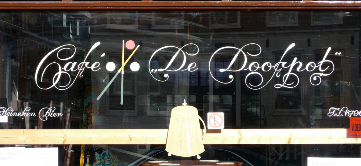
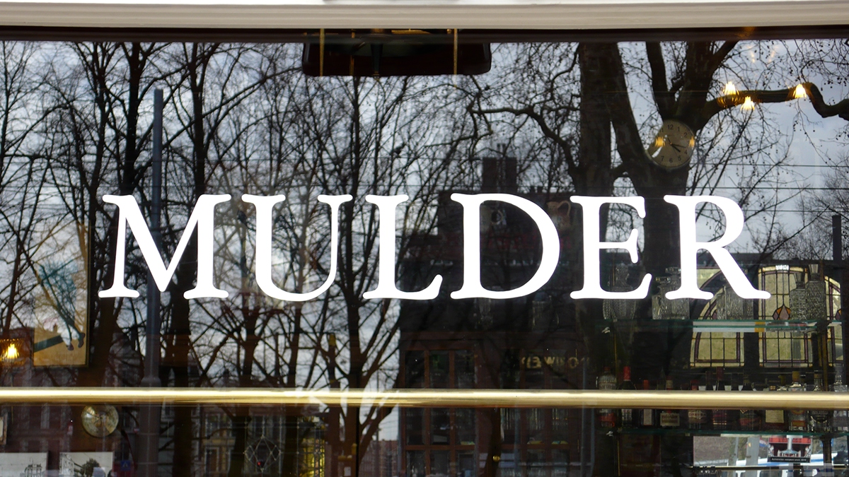
My first window in 1967 was on the Constantijn Huygensstraat, on the corner of the Jacob van Lennepkade, now called Café de Muizeval (mousetrap). The brewery came to have a look, and said: “Well, it looks good, neat, and the pub owners are satisfied.” So, from that day on they gave me assignments, carte blanche. “Could you do a window here? Do you want to go there?” I worked independently, they came to me, and I answered all their requests. Although everyone called the pub De Muizeval it wasn’t its proper name. The actual name was the Cheerio, but there was this small mousetrap included in the sign, so it was nicknamed De Muizeval. Later it had new owners, and they decided to re-name the original name. I went back and painted De Muizeval on the window, really big!
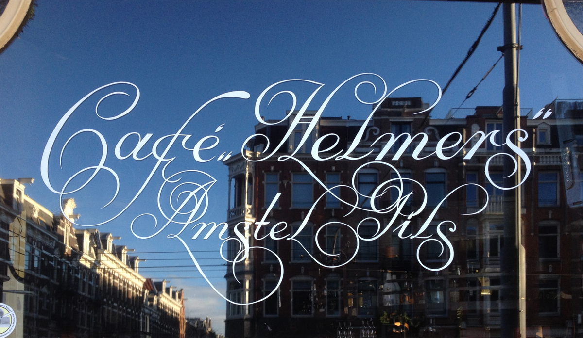
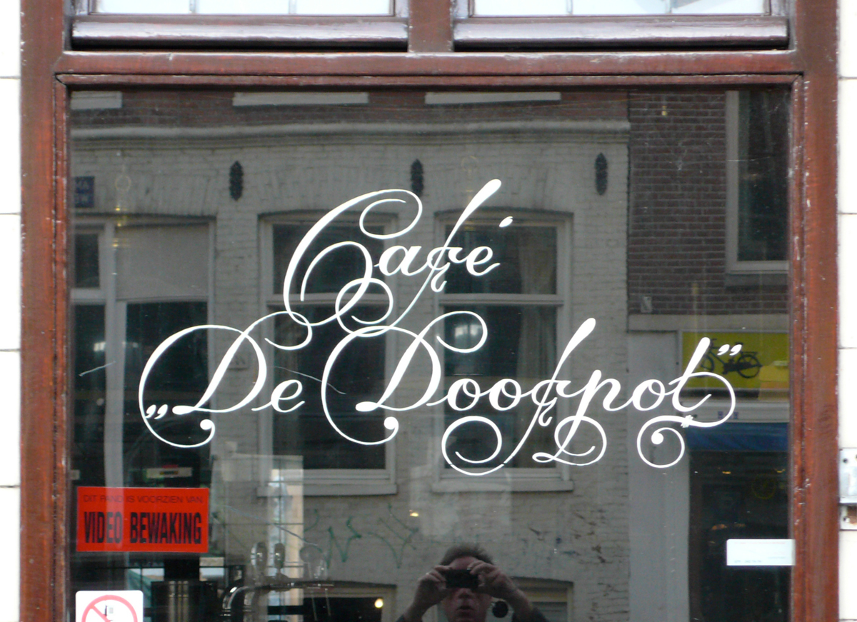
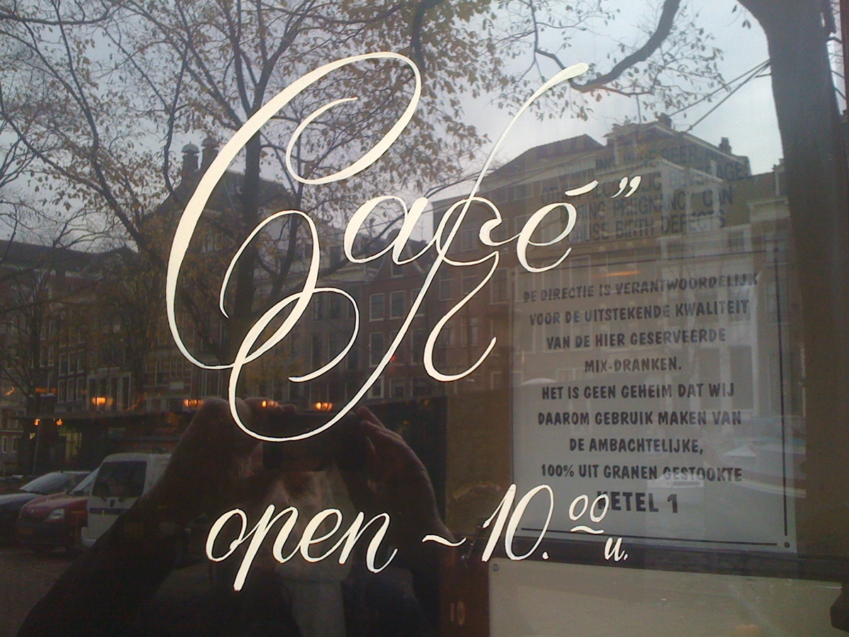
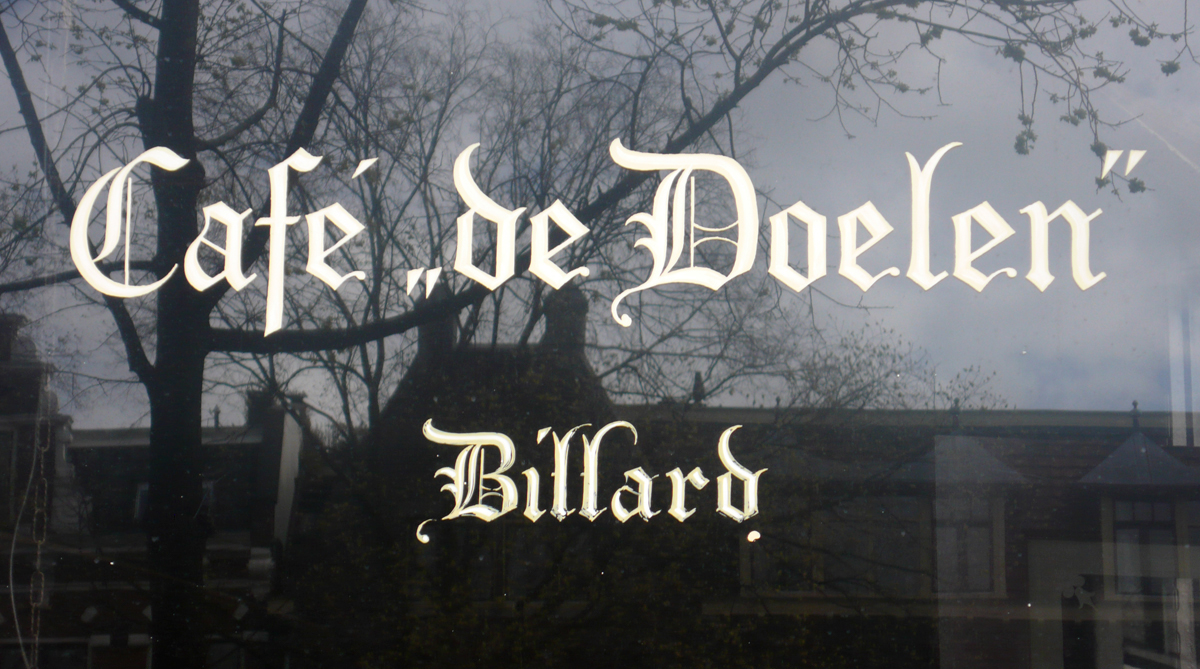
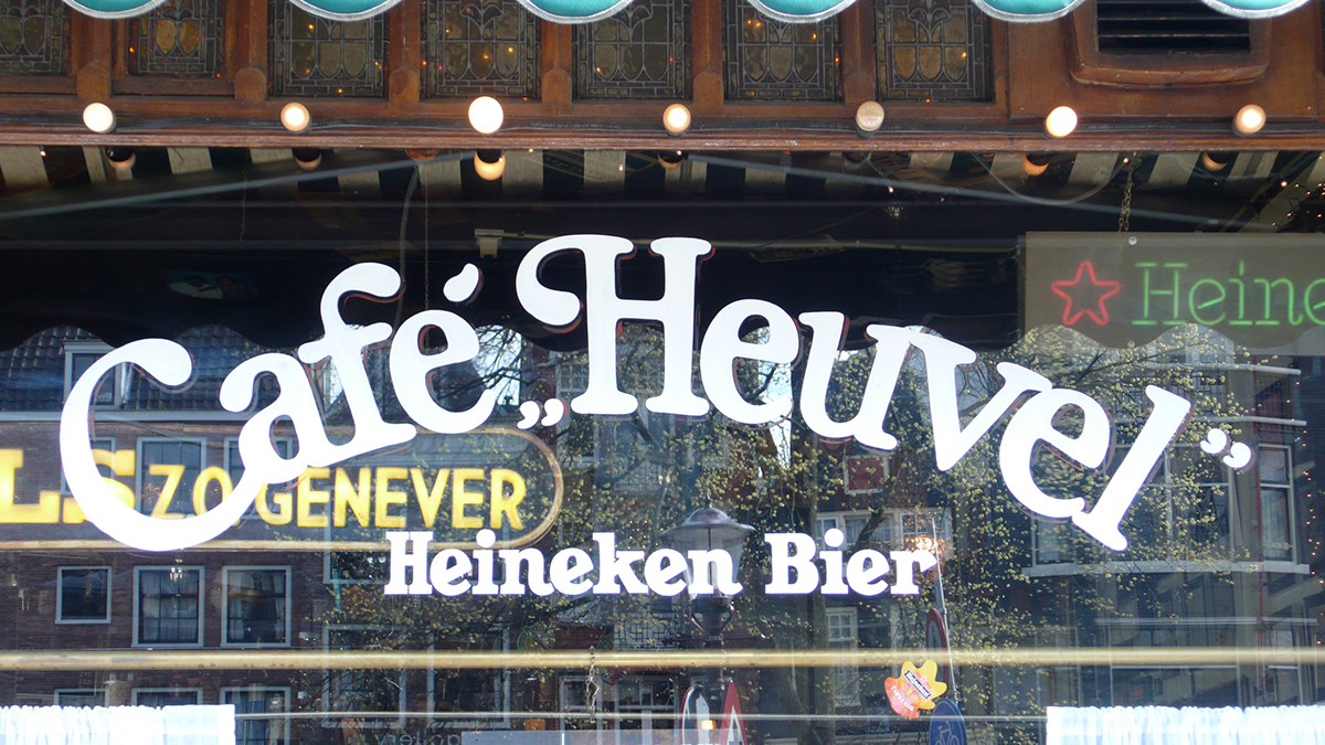
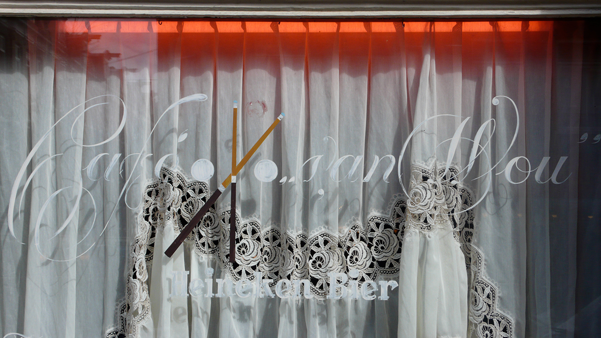
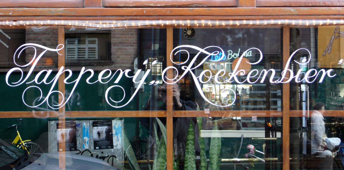
The pubs of the Heineken Brewery used more ornamental letters for their windows. Ome Jan used ornamental letters, so did I but for other pubs, like Café Dopey’s, I used a variation of Garamond. It was during my time at the Grafisch Lyceum, Amsterdam, that I really got to like Garamond capitals and made my own variation of the typeface. The letter you use on a pub window depends on the type of pub. If you have a traditional brown café, with lace curtains on copper curtain rods, with stained glass windows, you choose a nice, ornamental curly letter*, because it fits in with the environment. It is not the information that counts, because everyone can tell it’s a café, but it’s about decoration, about creating an atmosphere. For the lettering on the traditional brown cafés I developed my own script based on the calligraphy of Jan van den Velde.
Heineken gave me carte blanche, but the letters ‘Heineken’ always had to be painted in Egyptian. Most café owners didn’t have a clue about design, so when I discussed the design with them I always took a piece of paper and drew examples in different letter types for them. Most times I drew three types: one in curly letters, one in Garamond and one in italic. I showed them what would look best on their window. Of course I would try to nudge them carefully to choose the curly style. But, after all, it was their decision that counted.
I do not have a favourite style; that depends on the café. But I have a real affinity with Garamond. The windows of Café Alverna on the Bilderdijkstraat are in Garamond. What I really liked there, was the people who owned the pub and worked there. I worked with pleasure there, it was quiet, nice and friendly. Those owners had their own opinion, they knew what they wanted, and that was my cup of tea. We spoke the same language, those people were small tradesmen too, and they had style, oh yes. Nice, I still sometimes have a drink there.
I have many interesting stories to tell, and here is one: It happened at Café Flora, on the Amstelstraat. I had just finished doing some lettering for the sandwich shop Het Kappertje, when a café on the other side of the road asked me to do their window too. So I take my little ladder with me, my brush that was still on my pot of paint, and moved everything across the road. They asked me if it was okay to do it right away, I said “Of course, no problem”. It was about four or five-thirty, I measured with my piece of chalk, painted the window, was paid and then it happened: a big bang and jingling of glass … someone just threw a bar stool through the window of Café Flora. They put in a new window, and after a couple of days I went back and I painted the same thing again.
A Belgian café owner saw my work in Amsterdam, he especially liked my curly letter type. He was visiting Café de Geus (it doesn’t exist anymore, different owners). He asked for the name of the painter, and they gave him my number. He called me from Belgium with the request to come over and do some work for him. He said: “Eating, dining, sleeping … no problem, and don’t be modest when you make your invoice!” That is so typically Belgian, they’re much more generous than the Dutch. I stayed in a lovely hotel and the food was fantastic. The year after, he had more work to do, and the year after that too. The man was called Mr Van den Boekaerd and his wife was called Trudy and she was German. He took me to his cafés, I painted a lot of windows there. They were all fond of my curly letter type. I believe it was 1990. Three summers in a row, I painted about eighty windows in Gent and some in Kortrijk as well.
I really learned to appreciate Belgian beer over there. Van den Boekaerd asked me what my favourite beer was. He figured out which beer suited me best. He came up with a Westmalle, and it was my favourite indeed! In 1990 you couldn’t buy it in Amsterdam. I learned to like it in Gent, drinking it from those beautiful big round beakers.
I’ve always used the same gloss paint, although it’s improved over the years – from Univerf a shop near the Albert Cuyp, on the Gerard Douplein. Very nice people, I’ve known the family for years, the father for thirty-five years, and now his sons, one of them is called Ron. I can remember when his father had a small paint shop. It has changed a lot now. I’ve always bought my brushes from Van der Linde, a shop on the Rozengracht — they have drawers full of brushes. I always looked for the marten, the synthetic marten, those were better then the real marten. Real marten brushes are more expensive, and they say they are the best, but not for me. Whenever I cleaned them the hairs split, and they had to stay straight up. So I used the imitation marten, which is made of ox hair. Most sign painters use a maulstick, a little ball on a stick to steady your hand. But I never used a maulstick, I just painted from the wrist.
I worked during spring, summer and autumn, and sometimes in winter, as long as thetemperature was above zero. When it was freezing it was too cold to work. I think three degrees is cold enough to stay indoors! I used to live in Gerard Doustraat and had my atelier round the corner in Hemonystraat, in the basement. Very nice place, but in the end it was far too big a space for me. I had so much stuff there, and a piano! Every Friday night and Sunday afternoon friends would come over to play the piano, sing, perform, play games, table tennis, chess etc. It was a bit of a community centre, a lot of fun. We had ‘graanjenever’, grain gin; when it was freezing the fridge used to be full of it. I lived there from 1972 until 1990, for almost twenty years. I also played a bit with wood, creating all sorts of things, just for fun. Carpentry at the end of the day was a nice compensation to the concentrated work of sign writing during the day. I loved it! I also kept chickens in the back garden and supplied eggs to all my neighbours. Since 1990 I’ve Iived and worked from the ground floor of my house in Govert Flinckstraat.
Five years ago I gave up work after suffering a stroke. I do feel a bit handicapped, it’s so annoying. This arm it has been asleep (tingling) for five years now. I don’t understand why the doctors don’t bother to look further to find the cause of it. I’m convinced that it can be cured. They gave me physiotherapy, but it was terrible, totally childish and useless, like throwing a ball back and forth … stupid! I’ve never been to a doctor, never used any medication. And out of the blue, you go to bed feeling healthy, you wake up, stretch, and then you feel your legs tingle … and it doesn’t go away, it stays like that
for ever … it always tingles, twenty-four hours a day.
Looking back I always enjoyed my work and made a good living from it. I always started my working day at noon. It was freedom, to have my sleep, drink my coffee, read the papers … start work at noon. In the summertime I worked sometimes until nine, nine-thirty. Most cafés weren’t open till noon so I went there in the afternoon, and worked till sunset. In cafés they don’t have strict working hours, that suited me perfectly. Even now not being able to go out regularly I am never bored, never depressed and have always been on the sunny side of life!’
The visual landscape of Dutch design is very much a typographic one, where type is often the main focus of the design process. The recent branding of Amsterdam created by Kessels Kramer is a case in point. Large three-dimensional metal letters ‘I amsterdam’ sit on the banks of the IJ and on Museumplein where it is a favourite with the tourists. The new branding campaign is either liked or hated by Amsterdam residents. The most common complaint is that if Amsterdam is so proud of itself, why is the logo in English? But of course it has to be in English to be international – that’s marketing!

