
The character that I choice to design was a knight from a fantasy setting. The key element of this character are that they are based partly on athentic Medieval plate armor. They use a sword and wear a clock of some kind over there armor. To go against the "Knight in shining armor" clichie, the knight will be damaged in some way and have a worn and seasoned look. There armor may in some way be insemetrical.
The moodboard contain images of damaged metal. photographes of real world knights armor and artwork of simler character designs that fit with my plans.

The environment that I choose to create was a fantasy tower in a gray rocky mountainside. Other key element include having a cold, drab and oppressive atmosphere. Also showing signs that the tower is unpleasant in purpose (cages suspended outside, spikes and dark colours, skeletons). also to include a water feature (waterfall or stream). also a gray cloudy sky.
The moodboard: made up of image like realy life old towers, cloudy skys, wet/dark rock. fantasy tower depicted in artwork and films. waterfall and sreams.

A page of initial ideas and doodels explore how the knights armor will look and function.

Another page of doodle focusing more on the helmet of the character. An area of the character I was have issues with in terms of design.


A page of environment thumbnails. At first I was exploring an interier, science fiction cityscape and landscape with a city in the background. but some time after I would choice a fantasy tower as my environment. A recuring theme is having a figure into the forground looking at the tower. the reason for this is to show the scale of the tower and to build more of a narrative in the image.

A charcoul drawing exploring a knight shape, design and movement.

A charcoal drawing looking at different shapes and themes that tower may have and also looking how they would look from different perspectives.

A selection of silhouettes exploring the shape and pose of the character. I feel numbers 6, 10, 11 and 12 best reprecent how character may look in its final design final design.

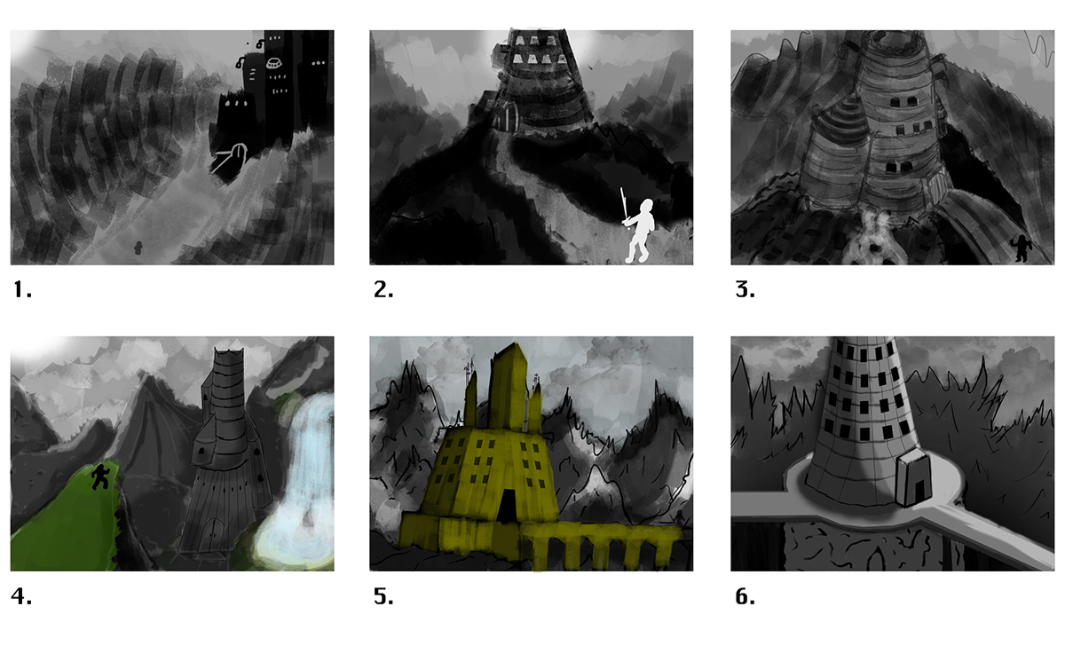
Envroment thumb taking a more indepth look at the potenchile prepectvies and towers. The one i would eventuly choice is number 2. Numbers 4 and 5 were attempts at adding colour to the image with out it changing the mood of the final piece.

A more indepth look at what the character may look like. Looking at elements like colour, accsesorys and position. The first figure is the closest to the final product. A big part of the knights design was to be wearing more athentic medievil plate armor and you would otherwise fine in other fatanty universe. but to still leave it open for more creative design solutions.

This image is to show progress to the final piece. starting with an anatomy sketch and then a sketch of the character outfit.

Showing the progress of the envroment. first with a perspective grid and then a rough outline of what the image will be made up of.

The early progress of the final sheet

The final character turnaround with title and annotation.

Final character sheet

Final environment design with title and annotation.

