


Brief
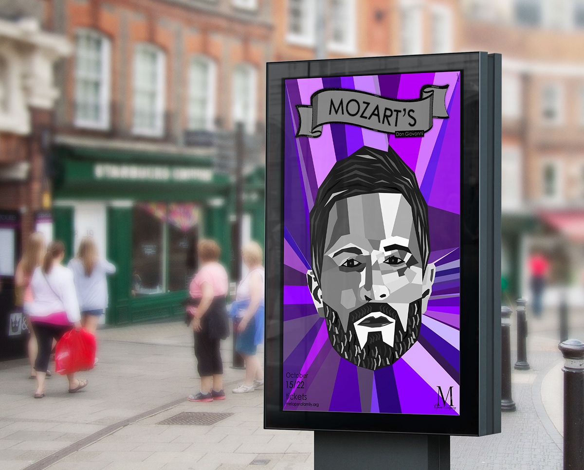
This ad is part of the course project from a class I took some time ago. It was intended to highlight the fall’s presentation of Don Giovanni, an opera by Mozart. Besides, the poster should bring a contemporary and dynamic look to the opera as well as obviously attract the public.
This ad is part of the course project from a class I took some time ago. It was intended to highlight the fall’s presentation of Don Giovanni, an opera by Mozart. Besides, the poster should bring a contemporary and dynamic look to the opera as well as obviously attract the public.
Idea
I wanted to depict Don’s fragility and emptiness of character, how he’s always surrounded by life and amusement and yet he winds up alone. This explains the contrast between grayscale and colors. Colors, by the way, which I chose to put Don Giovanni in context, in autumn.
I wanted to depict Don’s fragility and emptiness of character, how he’s always surrounded by life and amusement and yet he winds up alone. This explains the contrast between grayscale and colors. Colors, by the way, which I chose to put Don Giovanni in context, in autumn.

Version 1*
Notice how most of the lines on Don’s face does not connect, how everything seems casual, random. Everything’s fragile, about to fall apart.


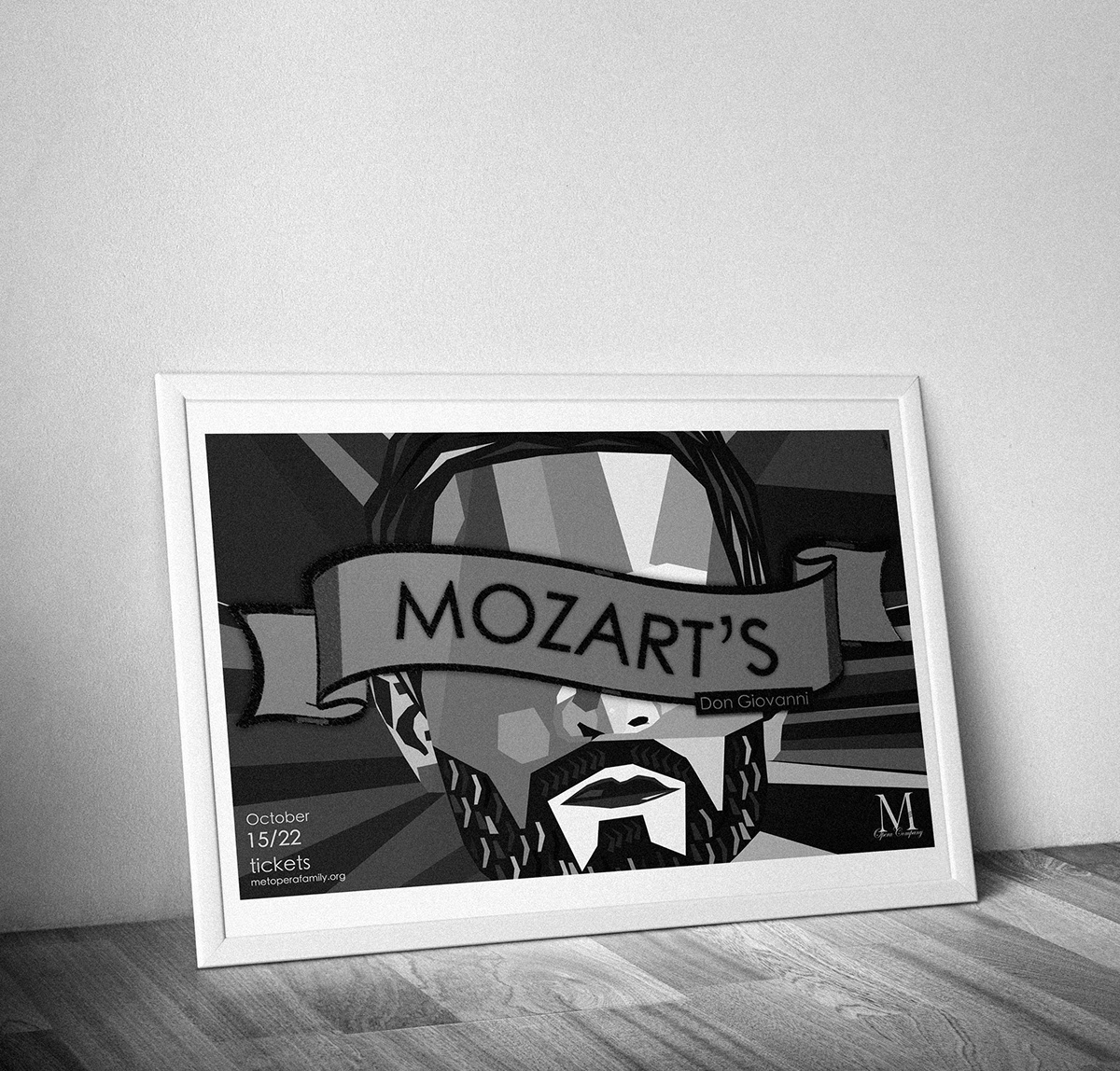
Version 2*
This second version conveys even less life. I particularly chose to hide from the audience what’s perhaps the first thing to characterize individuals: the eyes. I made it horizontal to adapt to more places it could be hung.

*The Metro Company is fictitious.


