Typography cards:
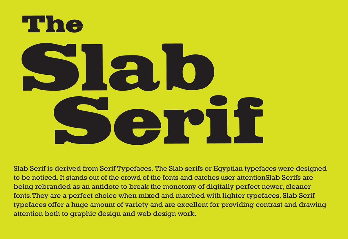
The Slab Serifs
In a world of retina displays, we often forget that the web is still very much a place of pixels. Whilst some devices are certainly capable of outputting beautifully rendered pages, any web designer worth their salt will be aware of the commonality for poorer quality displays.
Slab-serifs are a high-contrast, horizontally biased style of type that are not only highly legible, they also produce well-defined lines of text, reinforcing the baseline grid.
Slab-serifs seem to experience a revival every hundred years or so. Given the current rate of technological change, slab-serifs look like being popular for another decade, before they grow tired and hibernate for another century.
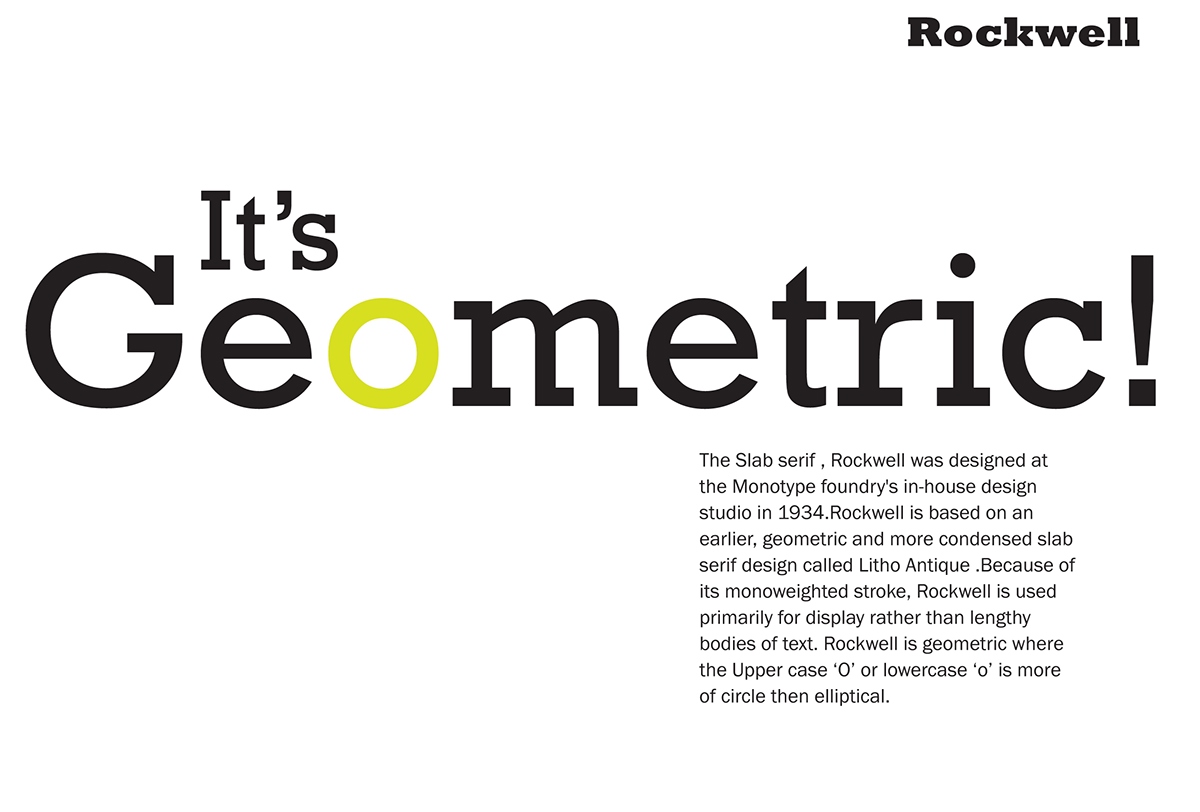
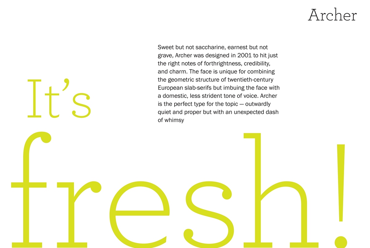
A series of Typo cards were designed study the genre of Slab serifs that are not only legend by themselves but also a source of inspiration for typographers who look at Slab serifs as the best typeface worth reviving to meet their current needs in typography.
Faculty Guide : Aarathi Abraham and Mr. Sajith Gopinath