

Client
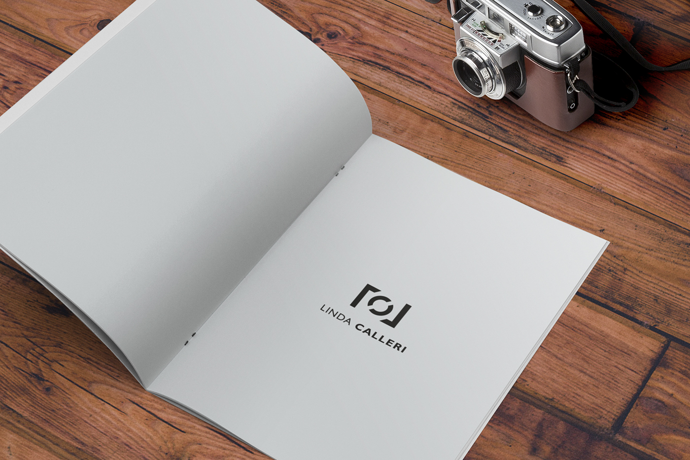
LINDA CALLERI
LINDA CALLERI
Website
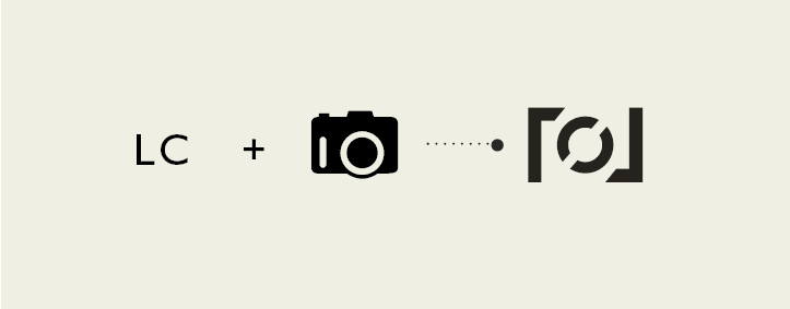
IT- L'ambigramma preso in esame di studio in questo iter-progettuale riguarda un concept che rivede lo studio e l’anatomia della fotografia vista nel duplice aspetto oggettivo degli strumenti fotografici e della composizione del lettering. Il lavoro è stato reso fluido attraverso una continuità omogenea dal rapporto tra la figura e la composizione tipografica. Il briefing e corrispettivo concept sono stati curati da me.
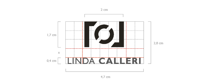
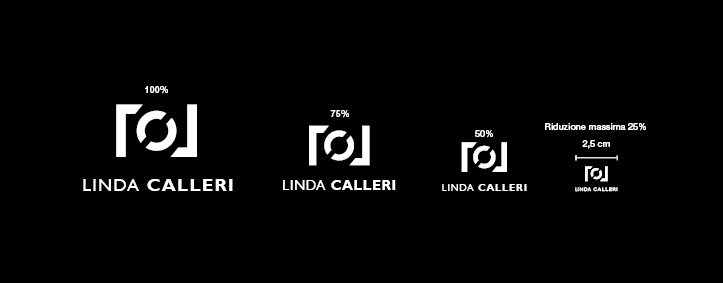
Nelle sezioni verrà definito il campo ottimale per l’uso corretto delle varie tipologie cromatiche e dimensionali dell'ambigramma.
Nelle sezioni verrà definito il campo ottimale per l’uso corretto delle varie tipologie cromatiche e dimensionali dell'ambigramma.
EN- The ambigram examined in this design process involves a concept that reviews the study and anatomy of photography seen in the dual objective aspect of photographic tools and composition of the lettering.
The work was made fluid through a homogeneous continuity from the relationship between the figure and typographic composition. The briefing and corresponding concept have been made by me.
The work was made fluid through a homogeneous continuity from the relationship between the figure and typographic composition. The briefing and corresponding concept have been made by me.
The sections will define the optimum range for the proper use of various types of color and dimensional of the ambigram.
LOGO PRIMARIO
POSITIVO // NEGATIVO

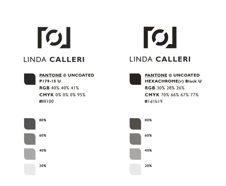
PIGMENTI UTILIZZATI
CONCEPT
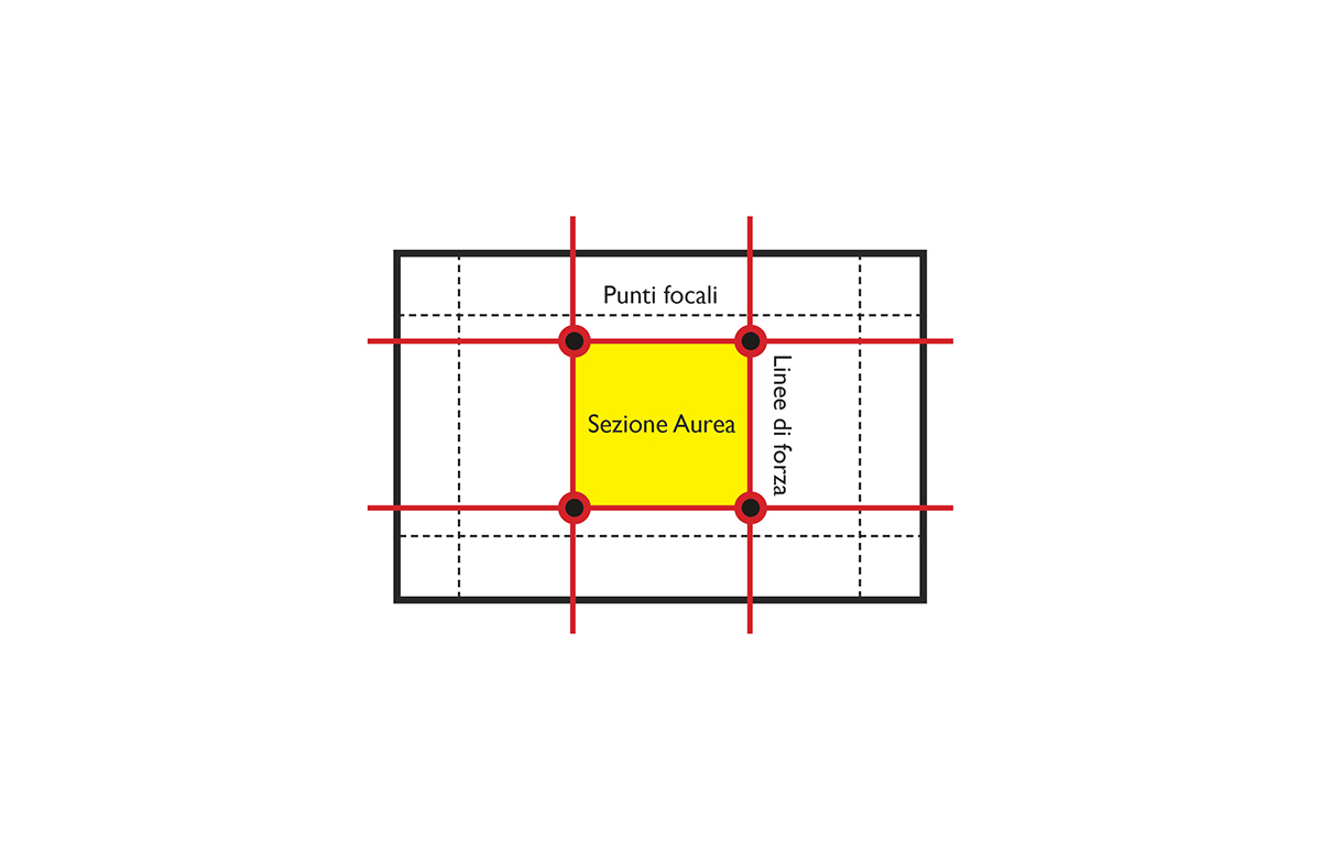
Il concept condotto riguarda la profonda visitazione del rettangolo, e le sue regole matematiche e geometriche applicate alla griglia dei terzi. L’idea di origine è stata quella di unire la passione per il lettering a quella oggettivo del disegno vettoriale in questo caso una reflex fotografica, tipica forma rettangolare che ha essa, da ciò rievoca le forme laterali della carcassa fotografica per poi interrompersi per via della rotondità dell’incastro dell’obiettivo fotografico in modo da ritorvare l’equilibrio con la composizione del lettering.
The led concept concerns a deep visitation of the rectangle, and its rules of mathematics and geometry applied to the grid of the third. The original idea has been to combine a passion for the lettering to that objective of the vector drawing in this case an SLR camera, with its typical rectangular shape, evoking the lateral shapes of the camera body and then stops because of roundness of the joint of the camera lens in order to regain balance with the composition of lettering
The led concept concerns a deep visitation of the rectangle, and its rules of mathematics and geometry applied to the grid of the third. The original idea has been to combine a passion for the lettering to that objective of the vector drawing in this case an SLR camera, with its typical rectangular shape, evoking the lateral shapes of the camera body and then stops because of roundness of the joint of the camera lens in order to regain balance with the composition of lettering

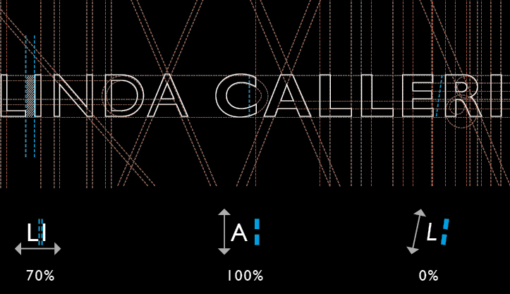
Il logotipo istituzionale è composto dai due elementi del nome proprio, con fuoco visivo situato al variare della variante tipografica, dal regular al bold - LINDA CALLERI - inclinato in angolazione piatta e con esclusiva modifica al 70% di crenatura e/o altri interventi di distanziamento.
The corporate logo is composed by two elements of the proper name, with visual focus located at different typographic variation, from regular to bold - LINDA CALLERI - tilted on a flat angle with exclusive change to 70% of kerning and/or other spacing interventions.
The corporate logo is composed by two elements of the proper name, with visual focus located at different typographic variation, from regular to bold - LINDA CALLERI - tilted on a flat angle with exclusive change to 70% of kerning and/or other spacing interventions.
PARAMETRI, MISURAZIONI E VERIFICHE FINALI
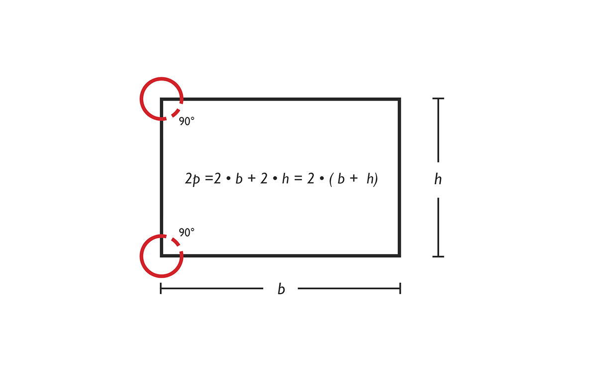
AREA DI RISPETTO
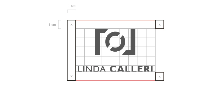
Per “Area di rispetto" si intende la zona intorno al marchio che non deve essere occupata da altri elementi grafici (ad es. testi, immagini, margini della pagina, ecc.). Lo scopo di tale area è quello di preservare la leggibilità ottimale del marchio. Nel nostro caso viene definita sulla base dell’unità di misura “x”. corrispondente alla distanza tra la base e l’altezza.
"Area of compliance" means the area around the mark that should not be occupied by other graphics (eg . Text, images, page margins , etc . ) . The purpose of this area is to mantain the optimum readability of the mark . in our case this is defined on the basis of the measuring unit " x " . corresponding to the distance between the base and the height .
"Area of compliance" means the area around the mark that should not be occupied by other graphics (eg . Text, images, page margins , etc . ) . The purpose of this area is to mantain the optimum readability of the mark . in our case this is defined on the basis of the measuring unit " x " . corresponding to the distance between the base and the height .
METODOLOGIA PROGETTUALE COSTRUZIONE MARCHIO // METHODOLOGY PROJECT CONSTRUCTION MARK
Fase 1/5
Rettangolo perimetro
Fase 1/5
Rettangolo perimetro
Inizio dallo studio della figura geometrica del rettangolo. Come dimostrato nella prima fase, il rettangolo denota il quadrilatero con tutti gli angoli interni congruenti tra loro (e quindi retti).
Rectangle perimeter I start from studying the shape of the rectangle. As demonstrated in the previous phase, the rectangle denotes the quadrilateral with all interior angles congruent between them (and thus right angles).
Rectangle perimeter I start from studying the shape of the rectangle. As demonstrated in the previous phase, the rectangle denotes the quadrilateral with all interior angles congruent between them (and thus right angles).
Fase 2/5
Reticolato esterno e griglie basate sulla regola dei terzi
Reticolato esterno e griglie basate sulla regola dei terzi
Successivamente adotto un sistema di griglia che rispetti la regola dei terzi, dividendomi di 1/3 lo spazio, per poi ricavare la differenza che occorre per posizionare la larghezza che contenga le iniziali “L” e “C” nelle tre colonne.
External netting and grids based on the rule of thirds Subsequently I use a grid system that respects the rule of thirds , dividing of 1/3 the space to obtain the necessary difference to position the width that contains the initials " L" and " C " in the three columns.
External netting and grids based on the rule of thirds Subsequently I use a grid system that respects the rule of thirds , dividing of 1/3 the space to obtain the necessary difference to position the width that contains the initials " L" and " C " in the three columns.
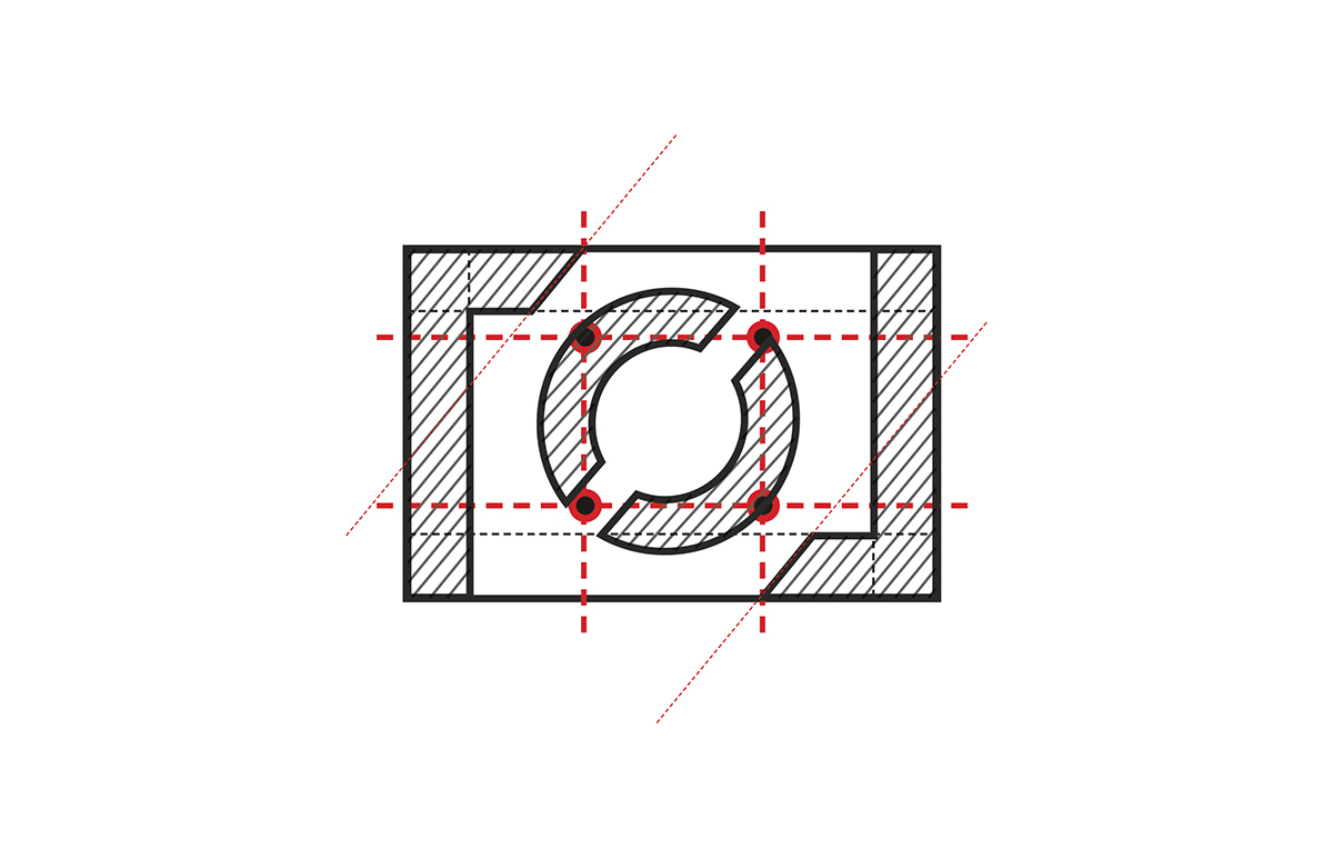
Fase 3/5
Strutturazione marchio
Strutturazione marchio
Attraverso un lavoro di sezione ed estrazioni geometriche ho trattato la forma esterna del marchio in un profilo che delinea i lati del rettangolo, assumendo tramite i segmenti obliqui di interruzioni segnate di colore rosso la caratteristica forma "L".
Structuring brand Through a section work and geometric drawings I treated the external shape of the mark in a profile outlining the sides of the rectangle, by taking the oblique segments interruptions, marked in red the characteristic shape " L ".
Structuring brand Through a section work and geometric drawings I treated the external shape of the mark in a profile outlining the sides of the rectangle, by taking the oblique segments interruptions, marked in red the characteristic shape " L ".
Fase 4/5
Rifilature sagome e contorni
Rifilature sagome e contorni
Nello spazio ricavato ho estratto attraverso un lavori di tratteggi dei segmenti le sezioni ricavate dalle linee di forza e dalle guide esterne.
Trimmings silhouettes and contours In the obtained space I extracted through a work hatch of the segments, sections derived from lines of force and the external guides .
Trimmings silhouettes and contours In the obtained space I extracted through a work hatch of the segments, sections derived from lines of force and the external guides .
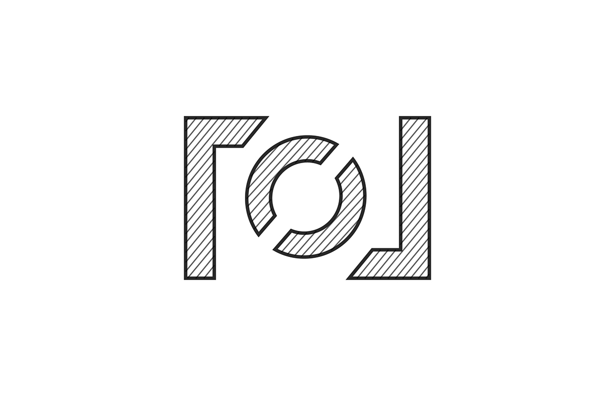
Fase 5/5
Prototipo marchio completo.
Prototype complete brand.
Prototype complete brand.


COSTRUZIONE LOGOTIPO
CARATTERE ISTITUZIONALE
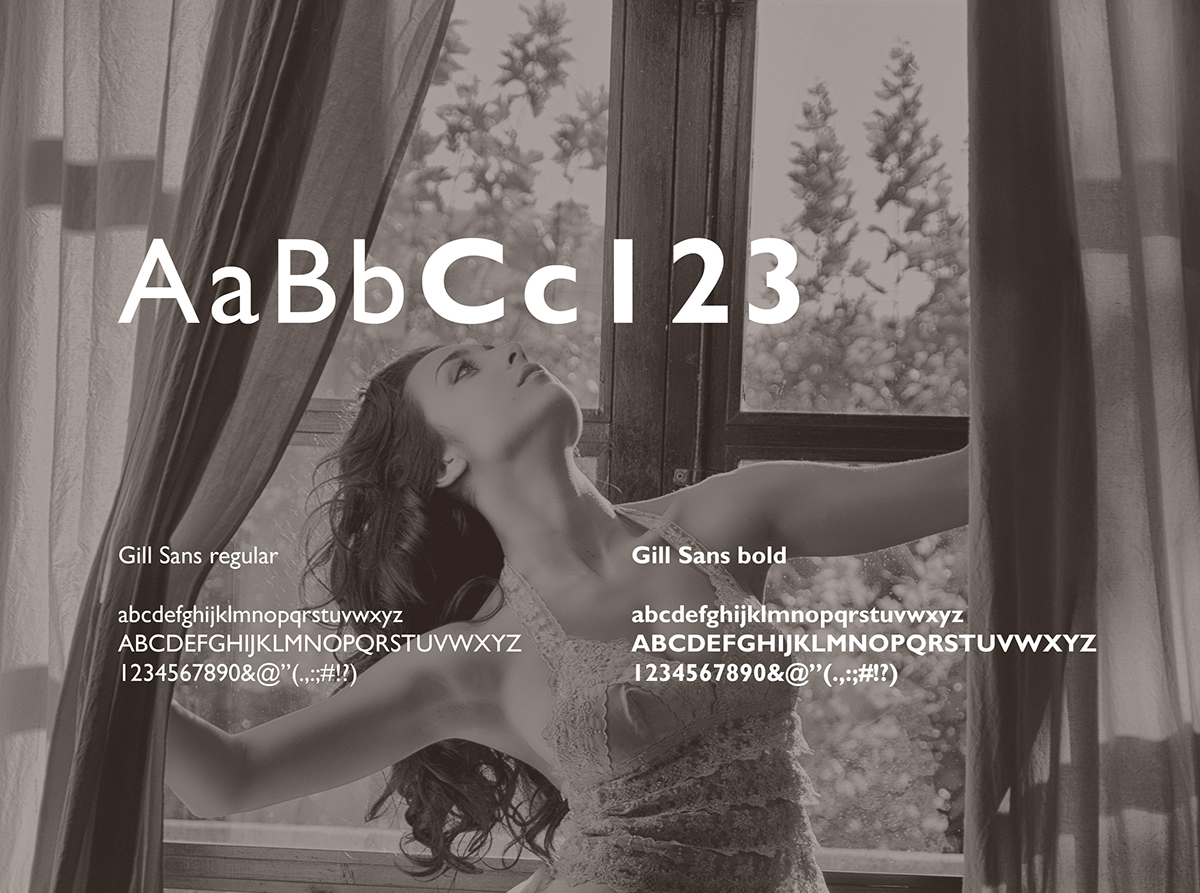
Il carattere tipografico designato per il logotipo Linda Calleri è il Gill Sans, disegnato da Eric Gill e prodotto dalla Monotype, per volontà del consulente tipografico dell’azienda Stanley Morison, nel 1928 declinato nelle varianti Regular, Regular Italic, Bold e Bold Italic.
The typeface for the designated logo Linda Calleri is the Gill Sans, designed by Eric Gill and produced by Monotype, by the will of typographic consultant company Stanley Morison in 1928 declined in Regular, Regular Italic, Bold and Bold Italic variants.
The typeface for the designated logo Linda Calleri is the Gill Sans, designed by Eric Gill and produced by Monotype, by the will of typographic consultant company Stanley Morison in 1928 declined in Regular, Regular Italic, Bold and Bold Italic variants.
PROVE DI LEGGIBILITÀ
ABBINAMENTO FOTOGRAFICO